DayPilot Lite for React
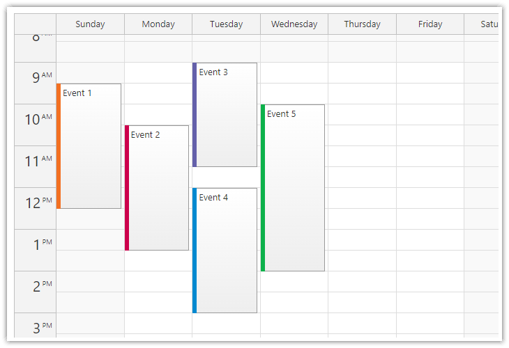
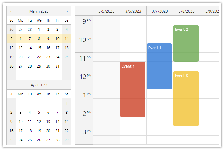
DayPilot Lite for JavaScript is a library of JavaScript/HTML5 event calendar/scheduler components that can display day/week/month calendar views. It includes a React version.
What's New
Release History
Online Demo

Online Demo
Features
- Calendar/scheduler views: day, week, work week, month, resource calendar
- Event creation using drag and drop
- Drag and drop event moving and resizing
- Integrated delete icon
- Event duration bar with customizable color
- Date picker with free/busy days highlighting, free-hand range selection, day cell customization
- CSS themes (use theme builder to create your own theme)
- Event customization (text, HTML, colors...)
- Built-in XSS protection
- Localization support
- TypeScript definitions
Tutorials
React Weekly Calendar Tutorial

React Weekly Calendar Tutorial (Open-Source)
React application that displays a weekly event calendar using an open-source DayPilot React calendar component. Includes a date picker for changing the visible week. The calendar/scheduler appearance is customized using CSS.
React Resource Calendar with Editable Columns

React Resource Calendar with Editable Columns (Open-Source)
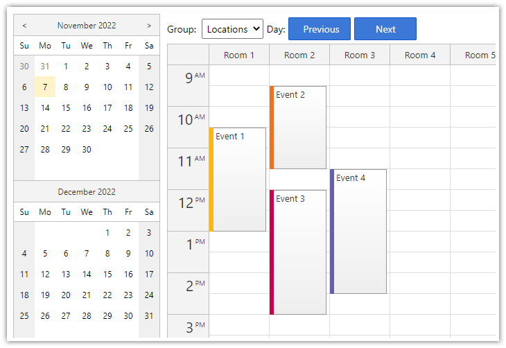
How to use the open-source React resource calendar component to create a scheduling application for multiple groups of resources (locations, people, tools). Add a date picker and next/previous buttons that let users change the visible date.
React Calendar with Date Picker

React Calendar with Date Picker (Open-Source)
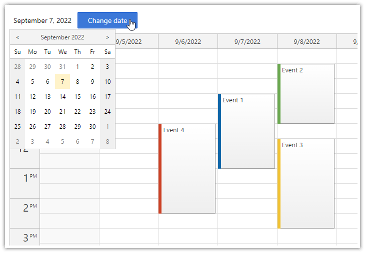
How to use a popup date picker to select a date displayed by the React Calendar component.
Example
import React, {Component} from 'react';
import {DayPilot, DayPilotCalendar} from "@daypilot/daypilot-lite-react";
class Calendar extends Component {
constructor(props) {
super(props);
this.calendarRef = React.createRef();
this.state = {
viewType: "Week",
timeRangeSelectedHandling: "Enabled",
onEventClick: async args => {
const modal = await DayPilot.Modal.prompt("Update event text:", args.e.text());
if (!modal.result) { return; }
const e = args.e;
e.data.text = modal.result;
this.calendar.events.update(e);
},
};
}
calendar() {
return this.calendarRef.current.control;
}
componentDidMount() {
this.setState({
startDate: "2022-09-07",
events: [
{
id: 1,
text: "Event 1",
start: "2022-09-07T10:30:00",
end: "2022-09-07T13:00:00"
},
{
id: 2,
text: "Event 2",
start: "2022-09-08T09:30:00",
end: "2022-09-08T11:30:00",
barColor: "#6aa84f"
},
]
});
}
render() {
return (
<DayPilotCalendar
{...this.state}
ref={this.calendarRef}
/>
);
}
}
export default Calendar;
Documentation
CSS Themes
The Theme Designer lets you create and download your own CSS theme using an online visual tool.
License
Apache License 2.0

