Fylgja - Dialog


The dialog combines 3 components in 1, it a modal by default,
and with a small change it's a offcanvas,
notification popup aka the snackbar.
This code is super tiny compared to other solutions,
and it's super flexible.
Use it to have a modal on desktop and offcanvas on mobile,
simply by changing a few CSS variables.
Installation
npm install @fylgja/dialog
Then include the component in to your code via;
@use "@fylgja/dialog";
@import "@fylgja/dialog";
How to use
To use the dialog simply create a html dialog element and a button,
that can open the dialog.
<button onclick="document.querySelector('#dialog-modal').showModal()">Open</button>
<dialog id="dialog-modal">..</dialog>
<button onclick="document.querySelector('#dialog-snackbar').show()">Open</button>
<dialog id="dialog-snackbar" class="snackbar">..</dialog>
<button onclick="document.querySelector('#dialog-offcanvas').showModal()">Open</button>
<dialog id="dialog-offcanvas" class="offcanvas">..</dialog>
Use the .dialog-inner
if your content will be to big for specific screen sizes.
This will allow scrolling the content inside the dialog-inner.
You can combine this with a header and/or footer,
that always will be visible when you are scrolling.
<dialog id="dialog-modal">
    <div>Modal Title</div>
    <div class="dialog-inner"></div>
    <div><button>Sumbit</button></div>
</dialog>
Support
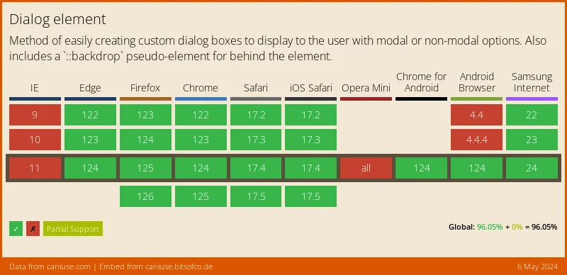
You will need the polyfill until the html dialog is supported fully
-> github.com/GoogleChrome/dialog-polyfill.

Config
As with almost all of our components.
CSS variables can be configured to add your own look/style.
For direct control of the base styles,
use the following SCSS variables can you modify.
$enable-dialog-polyfill: true !default;
$dialog-index: 9 !default;
$dialog-offset: 2em !default;
$dialog-max-width: calc(100% - #{$dialog-offset}) !default;
$dialog-max-height: $dialog-max-width !default;
$dialog-radius: 0.3em !default;
$dialog-padding: 2em !default;
$dialog-elevation: var(--elevation-z6) !default;
$dialog-bg: var(--color-bg, #{$root-bg}) !default;
$dialog-color: inherit !default;
$dialog-backdrop: rgba(black, 0.2) !default;
$dialog-snackbar-from: end !default;
$dialog-snackbar-offset: 1em !default;
$dialog-offcanvas-radius: 0 !default;
Tips
If you need to use the older solutions, that don't use the HTML Dialog.
But you do like to use the Fylgja Dialog styles.
You can use the class .dialog or use your own version,
by using the two extend classes available to you;
@use "@fylgja/dialog/helper" as *;
@use "@fylgja/dialog/keyframes";
.dialog {
@extend %dialog;
&[open] {
visibility: hidden;
transition: visibility 0s 200ms;
animation: dialog-hide 200ms;
}
&:not([open]) {
animation: dialog-show 300ms;
transition: none;
}
}
.backdrop {
@extend %backdrop-polyfill;
}
You do still have to make your own logic for the open and closed styles.
As seen above.


