Security News
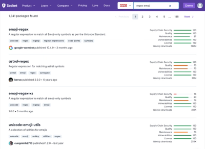
Weekly Downloads Now Available in npm Package Search Results
Socket's package search now displays weekly downloads for npm packages, helping developers quickly assess popularity and make more informed decisions.
@gemeente-denhaag/checkbox
Advanced tools

Checkboxes are usually used to provide a way for users to make a range of selections (zero, one or more). They can also be used to tell users that they agree to specific terms.
Checkboxes are used for multiple choices, not for mutually exclusive choices. Each checkbox works independently from other checkboxes in the list, therefore checking an additional box does not affect any other selections.
Can be used in forms on a full page or in modals.
Turning the checkbox input on or off can indicate whether you agree to the terms.
Use radio buttons to display a list of options where users can only make one choice
The checkbox consists of:
The checkbox contains the states normal, hover, disabled, error and focus.
Screen readers automatically report the status of the check box.
[technical requirements, such as: label and labelHidden]
[technical requirements]
Checkbox labels must:
Checkboxes must:
Checkboxes must:
Buttons are mainly used for actions such as "Add", "Close", "Cancel" or "Save". Regular buttons similar to links are used for less important or less frequently used actions, such as "View details".
Links are mainly used for navigation and usually appear in or immediately after a sentence.
The HTML displayed for the Button and Link components has meaning. Using these components intentionally and consistently results in:
https://www.nngroup.com/articles/checkboxes-vs-radio-buttons/
https://uxplanet.org/checkbox-and-toggle-in-forms-f0de6086ac41
FAQs
A Checkbox component
We found that @gemeente-denhaag/checkbox demonstrated a healthy version release cadence and project activity because the last version was released less than a year ago. It has 0 open source maintainers collaborating on the project.
Did you know?

Socket for GitHub automatically highlights issues in each pull request and monitors the health of all your open source dependencies. Discover the contents of your packages and block harmful activity before you install or update your dependencies.

Security News
Socket's package search now displays weekly downloads for npm packages, helping developers quickly assess popularity and make more informed decisions.

Security News
A Stanford study reveals 9.5% of engineers contribute almost nothing, costing tech $90B annually, with remote work fueling the rise of "ghost engineers."

Research
Security News
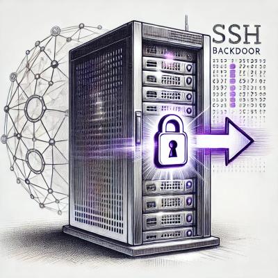
Socket’s threat research team has detected six malicious npm packages typosquatting popular libraries to insert SSH backdoors.