Security News
Weekly Downloads Now Available in npm Package Search Results
Socket's package search now displays weekly downloads for npm packages, helping developers quickly assess popularity and make more informed decisions.
@hitorisensei/react-content-loader-ssr
Advanced tools
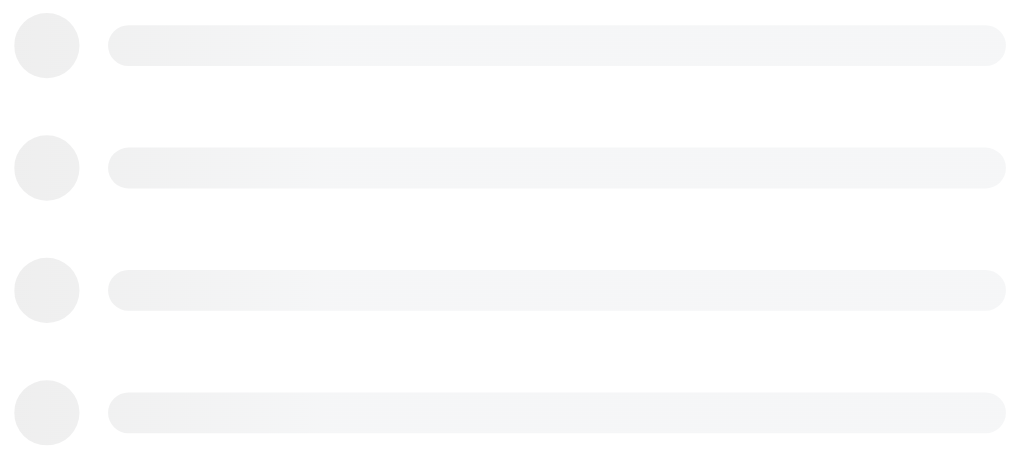
SVG-Powered component to easily create placeholder loadings (like Facebook cards loading), fixed for SSR


SVG-Powered component to easily create placeholder loadings (like Facebook's cards loading).
npm i react-content-loader --save
yarn add react-content-loader
npm i react-content-loader react-native-svg --save
yarn add react-content-loader react-native-svg
CDN from JSDELIVR
There are two ways to use it:
1. Presets, see the examples:
import ContentLoader, { Facebook } from 'react-content-loader'

const MyLoader = () => <ContentLoader />
const MyFacebookLoader = () => <Facebook />
2. Custom mode, see the online tool
const MyLoader = () => (
  <ContentLoader viewBox="0 0 380 70">
    {/* Only SVG shapes */}
    <rect x="0" y="0" rx="5" ry="5" width="70" height="70" />
    <rect x="80" y="17" rx="4" ry="4" width="300" height="13" />
    <rect x="80" y="40" rx="3" ry="3" width="250" height="10" />
  </ContentLoader>
)
Still not clear? Take a look at this working example at codesandbox.io Or try the components editable demo hands-on and install it from bit.dev
react-content-loader can be used with React Native in the same way as web version with the same import:
1. Presets, see the examples:
import ContentLoader, { Facebook } from 'react-content-loader/native'

const MyLoader = () => <ContentLoader />
const MyFacebookLoader = () => <Facebook />
2. Custom mode
To create custom loaders there is an important difference: as React Native doesn't have any native module for SVG components, it's necessary to import the shapes from react-native-svg or use the named export Rect and Circle from react-content-loader import:
import ContentLoader, { Rect, Circle } from 'react-content-loader/native'

const MyLoader = () => (
  <ContentLoader viewBox="0 0 380 70">
    <Circle cx="30" cy="30" r="30" />
    <Rect x="80" y="17" rx="4" ry="4" width="300" height="13" />
    <Rect x="80" y="40" rx="3" ry="3" width="250" height="10" />
  </ContentLoader>
)
Prop name and type | Environment | Description |
|---|---|---|
animate?: boolean Defaults to true | React DOM React Native | Opt-out of animations with false |
title?: string Defaults to Loading interface... | React DOM only | It's used to describe what element it is. Use '' (empty string) to remove. |
baseUrl?: stringDefaults to an empty string | React DOM only | Required if you're using <base url="/" /> document <head/>. This prop is common used as: <ContentLoader baseUrl={window.location.pathname} /> which will fill the SVG attribute with the relative path. Related #93. |
speed?: number Defaults to 1.2 | React DOM React Native | Animation speed in seconds. |
interval?: number Defaults to 0.25 | React DOM React Native | Interval of time between runs of the animation, as a fraction of the animation speed. |
viewBox?: string Defaults to undefined | React DOM React Native | Use viewBox props to set a custom viewBox value, for more information about how to use it, read the article How to Scale SVG. |
gradientRatio?: number Defaults to 1.2 | React DOM only | Width of the animated gradient as a fraction of the view box width. |
rtl?: boolean Defaults to false | React DOM React Native | Content right-to-left. |
backgroundColor?: string Defaults to #f5f6f7 | React DOM React Native | Used as background of animation. |
foregroundColor?: string Defaults to #eee | React DOM React Native | Used as the foreground of animation. |
backgroundOpacity?: number Defaults to 1 | React DOM only | Background opacity (0 = transparent, 1 = opaque) used to solve an issue in Safari |
foregroundOpacity?: number Defaults to 1 | React DOM only | Animation opacity (0 = transparent, 1 = opaque) used to solve an issue in Safari |
style?: React.CSSProperties Defaults to {} | React DOM only | |
uniqueKey?: string Defaults to random unique id | React DOM only | Use the same value of prop key, that will solve inconsistency on the SSR, see more here. |
See all options live
import { Facebook } from 'react-content-loader'

const MyFacebookLoader = () => <Facebook />

import { Instagram } from 'react-content-loader'

const MyInstagramLoader = () => <Instagram />

import { Code } from 'react-content-loader'

const MyCodeLoader = () => <Code />

import { List } from 'react-content-loader'

const MyListLoader = () => <List />

import { BulletList } from 'react-content-loader'

const MyBulletListLoader = () => <BulletList />

For the custom mode, use the online tool.
const MyLoader = () => (
  <ContentLoader
    height={140}
    speed={1}
    backgroundColor={'#333'}
    foregroundColor={'#999'}
    viewBox="0 0 380 70"
  >
    {/* Only SVG shapes */}
    <rect x="0" y="0" rx="5" ry="5" width="70" height="70" />
    <rect x="80" y="17" rx="4" ry="4" width="300" height="13" />
    <rect x="80" y="40" rx="3" ry="3" width="250" height="10" />
  </ContentLoader>
)

In order to avoid unexpected behavior, the package doesn't have opinioned settings. So if it needs to be responsive, have in mind that the output of the package is a regular SVG, so it just needs the same attributes to become a regular SVG responsive, which means:
import { Code } from 'react-content-loader'

const MyCodeLoader = () => (
  <Code
    width={100}
    height={100}
    viewBox="0 0 100 100"
    style={{ width: '100%' }}
  />
)
As the main component generates random values to match the id of the SVG element with background style, it can encounter unexpected errors and unmatching warning on render, once the random value of id will be generated twice, in case of SSR: server and client; or in case of snapshot test: on the first match and re-running the test.
To fix it, set the prop uniqueKey, then the id will not be random anymore:
import { Facebook } from 'react-content-loader'

const MyFacebookLoader = () => <Facebook uniqueKey="my-random-value" />
When using rgba as a backgroundColor or foregroundColor value, Safari does not respect the alpha channel, meaning that the color will be opaque. To prevent this, instead of using a rgba value for backgroundColor/foregroundColor, use the rgb equivalent and move the alpha channel value to the backgroundOpacity/foregroundOpacity props.
{/* Opaque color in Safari and iOS */}
<ContentLoader
  backgroundColor="rgba(0,0,0,0.06)"
  foregroundColor="rgba(0,0,0,0.12)">


{/_ Semi-transparent color in Safari and iOS _/}
<ContentLoader
    backgroundColor="rgb(0,0,0)"
    foregroundColor="rgb(0,0,0)"
    backgroundOpacity={0.06}
    foregroundOpacity={0.12}>
Using the base tag on a page that contains SVG elements fails to render and it looks like a black box. Just remove the base-href tag from the <head /> and the issue has been solved.

Old browsers don't support animation in SVG (compatibility list), and if your project must support IE, for examples, here's a couple of ways to make sure that browser supports SVG Animate:
window.SVGAnimateElementdocument.implementation.hasFeature("http://www.w3.org/TR/SVG11/feature#SVG-Animation", "1.1")Fork the repo and then clone it
$ git clone git@github.com:YourUsername/react-content-loader.git && cd react-content-loader
$ npm i: Install the dependencies;
$ npm run build: Build to production;
$ npm run dev: Run the Storybook to see your changes;
$ npm run test: Run all tests: type checking, unit tests on web and native;
$ npm run test:watch: Watch unit tests;
As React Native doesn't support symbolic links (to link the dependency to another folder) and as there is no playground to check your contributions (like storybook), this is recommended strategy to run the project locally:
yarn add react-content-loader react-native-svgreact-content-loader to the project just cloned, like:
import ContentLoader, { Rect, Circle } from './react-content-loader/native'Commit messages should follow the commit message convention so, changelogs could be generated automatically by that. Commit messages are validated automatically upon commit. If you aren't familiar with the commit message convention, you can use yarn commit (or npm run commit) instead of git commit, which provides an interactive CLI for generating proper commit messages.
FAQs
SVG-Powered component to easily create placeholder loadings (like Facebook cards loading), fixed for SSR
The npm package @hitorisensei/react-content-loader-ssr receives a total of 0 weekly downloads. As such, @hitorisensei/react-content-loader-ssr popularity was classified as not popular.
We found that @hitorisensei/react-content-loader-ssr demonstrated a not healthy version release cadence and project activity because the last version was released a year ago. It has 1 open source maintainer collaborating on the project.
Did you know?

Socket for GitHub automatically highlights issues in each pull request and monitors the health of all your open source dependencies. Discover the contents of your packages and block harmful activity before you install or update your dependencies.

Security News
Socket's package search now displays weekly downloads for npm packages, helping developers quickly assess popularity and make more informed decisions.

Security News
A Stanford study reveals 9.5% of engineers contribute almost nothing, costing tech $90B annually, with remote work fueling the rise of "ghost engineers."

Research
Security News
Socket’s threat research team has detected six malicious npm packages typosquatting popular libraries to insert SSH backdoors.