REACT NATIVE IMAGE ZOOM


A performant and customizable image zoom component
built with Reanimated v2 and TypeScript. 🌃 🚀
Demo:
Features
- Smooth Zooming Gestures: Smooth and responsive zooming functionality, allowing users to zoom in and out of images using intuitive pinch and pan gestures.
- Customizable Zoom Settings: With the
minScale and maxScale props, you can set the minimum and maximum zoom levels for your images, giving you precise control over the zooming experience. - Reset zoom and snap back: The component automatically resets zoom and snaps back to the initial position when the gesture ends.
- Interactive Callbacks: The component provides interactive callbacks such as
onInteractionStart, onInteractionEnd, onPinchStart, onPinchEnd, onPanStart, and onPanEnd that allow you to handle image interactions and customize the user experience. - Reanimated: Compatible with
Reanimated v2. - Written in TypeScript: The library is written in
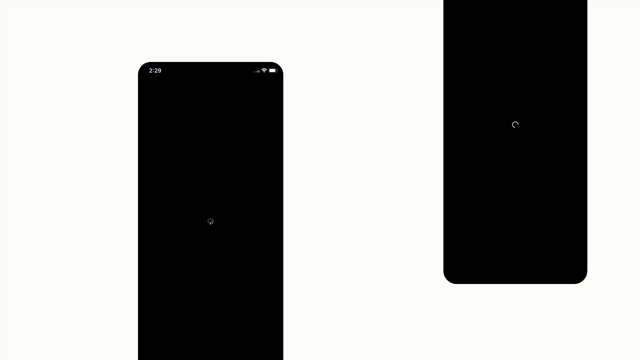
TypeScript, providing type safety and improving the maintainability of your code. - Customizable Loader: You can customize the default loader or provide your own custom loader using the
activityIndicatorProps and renderLoader props, giving you full control over the loading state of the image. - Full React Native Image Props Support: The component supports all React Native Image props, making it easy to integrate with existing code and utilize all the features that React Native Image provides.
Getting Started
To use the ImageZoom component, you first need to install the package via npm or yarn. Run either of the following commands:
npm install @likashefqet/react-native-image-zoom
yarn add @likashefqet/react-native-image-zoom
🚨 🚨 Please note that this library is built with React Native Reanimated v2 and uses React Native Gesture Handler. If you haven't installed Reanimated and Gesture Handler yet, please follow the installation instructions for Reanimated and Gesture Handler.
Usage
First, import the ImageZoom component from the @likashefqet/react-native-image-zoom library:
import { ImageZoom } from '@likashefqet/react-native-image-zoom';
To use the ImageZoom component, simply pass the uri prop with the URL of the image you want to zoom:
<ImageZoom uri={imageUri} />
<ImageZoom
  uri={imageUri}
  minScale={0.5}
  maxScale={3}
  onInteractionStart={() => console.log('Interaction started')}
  onInteractionEnd={() => console.log('Interaction ended')}
  onPinchStart={() => console.log('Pinch gesture started')}
  onPinchEnd={() => console.log('Pinch gesture ended')}
  onPanStart={() => console.log('Pan gesture started')}
  onPanEnd={() => console.log('Pan gesture ended')}
  renderLoader={() => <CustomLoader />}
/>
Properties
All React Native Image Props &
| Property | Type | Default | Description |
|---|
| uri | String | '' (empty string) | The image's URI, which can be overridden by the source prop. |
| minScale | Number | 1 | The minimum scale allowed for zooming. |
| maxScale | Number | 5 | The maximum scale allowed for zooming. |
| minPanPointers | Number | 2 | The minimum number of pointers required to enable panning. |
| maxPanPointers | Number | 2 | The maximum number of pointers required to enable panning. |
| isPanEnabled | Boolean | true | Determines whether panning is enabled within the range of the minimum and maximum pan pointers. |
| isPinchEnabled | Boolean | true | Determines whether pinching is enabled. |
| onInteractionStart | Function | undefined | A callback triggered when the image interaction starts. |
| onInteractionEnd | Function | undefined | A callback triggered when the image interaction ends. |
| onPinchStart | Function | undefined | A callback triggered when the image pinching starts. |
| onPinchEnd | Function | undefined | A callback triggered when the image pinching ends. |
| onPanStart | Function | undefined | A callback triggered when the image panning starts. |
| onPanEnd | Function | undefined | A callback triggered when the image panning ends. |
| containerStyle | Object | {} | The style object applied to the container. |
| imageContainerStyle | Object | {} | The style object applied to the image container. |
| activityIndicatorProps | Object | {} | The ActivityIndicator props used to customize the default loader. |
| renderLoader | Function | undefined | A function that renders a custom loading component. Set to null to disable the loader. |
Changelog
Please refer to the Releases section on the GitHub repository. Each release includes a detailed list of changes made to the library, including bug fixes, new features, and any breaking changes. We recommend reviewing these changes before updating to a new version of the library to ensure a smooth transition.
Author
Support
If you need further assistance, feel free to reach out to me by email at @likashefi.
License
The library is licensed under the MIT License.


