Research
Security News
Quasar RAT Disguised as an npm Package for Detecting Vulnerabilities in Ethereum Smart Contracts
Socket researchers uncover a malicious npm package posing as a tool for detecting vulnerabilities in Etherium smart contracts.
@mimio/div-100vh
Advanced tools
Div100vh React componentThis is a workaround for iOS Safari and other mobile browsers.
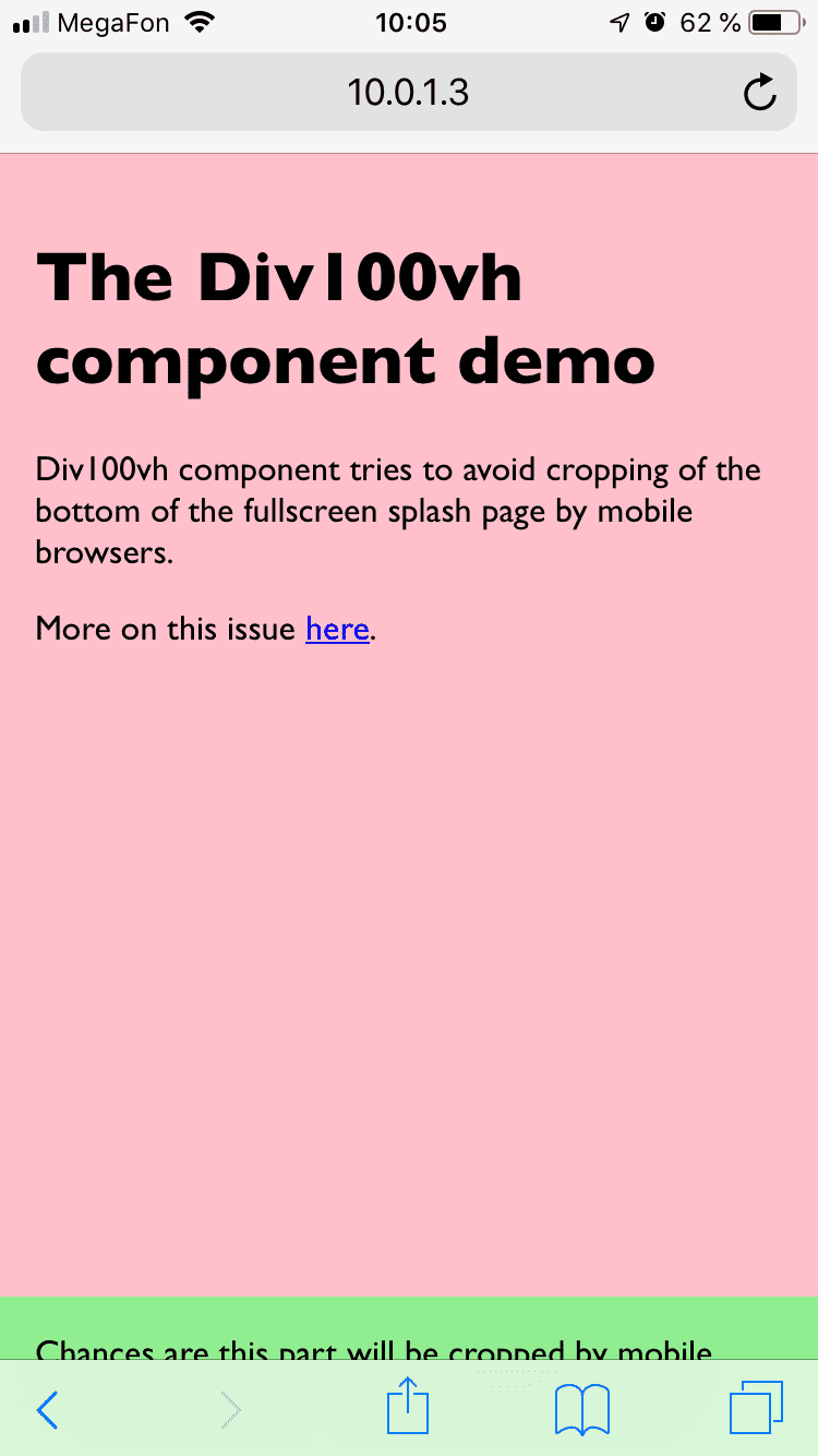
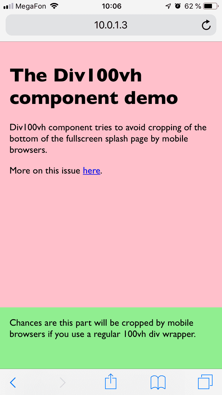
At the top of the page, mobile browsers cover bottom of 100vh page with "browser chrome" (that's the name for browser navigation/context buttons, don't confuse with the browser from Google), effectively cropping it. If you have something important at the bottom of your splash screen, chances are it will not be visible/available until user scrolls.
More on this issue here.
<div style={{height: '100vh'}}> | <Div100vh> |
|---|---|
 |  |
Browse https://react-div-100vh.netlify.com on your phone!
npm install --save react-div-100vh or yarn add react-div-100vh<Div100vh> as you would with a normal <div style={{height: '100vh'}}>, but this time mobile browsers should display the whole page on load:import Div100vh from 'react-div-100vh'
const MyFullscreenComponent = () => (
<Div100vh>
<marquee>Your stuff goes here</marquee>
</Div100vh>
)
rvh unitsIf you want to set min-height (or any other property) instead, you can use made up rvh ("real viewport height") units in values of an object passed to style prop. Div100vh will find any style declarations with this unit and calculate the value as a percentage of window.innerHeight:
  <Div100vh style={{minHeight: '50rvh'}}>
    <marquee>This is inside a div that takes at least 50% of viewport height.</marquee>
  </Div100vh>
If you don't specify style prop, it works as if you specified {height: '100rvh'};
<Div100vh> is equivalent to <Div100vh style={{height: '100rvh'}}>.
If you do pass anything to the style prop, no implicit style is applied. You can do something like:
<Div100vh
  style={{maxHeight: '70rvh', color: 'blue'}}
  onClick={() => console.log('hi')}
>
  <p>my content here</p>
</Div100vh>
The rest of the props are passed unchanged to the underlying div that Div100vh renders.
<div> elementsYou can also pass an as prop to render other elements than <div>s - for example, <main>, <section>, <footer>, et cetera.
<Div100vh as="main">
  <p>Some main content</p>
</Div100vh>
❗ Keep in mind that this works best with block-level elements, as inline-level elements don't respond to the CSS
heightproperty.
Please note that most likely you will want to set body {margin: 0} css, unless you use some css reset that does it for you.
FAQs
A React component that aims to solve '100vh' issue in mobile browsers
The npm package @mimio/div-100vh receives a total of 0 weekly downloads. As such, @mimio/div-100vh popularity was classified as not popular.
We found that @mimio/div-100vh demonstrated a not healthy version release cadence and project activity because the last version was released a year ago. It has 3 open source maintainers collaborating on the project.
Did you know?

Socket for GitHub automatically highlights issues in each pull request and monitors the health of all your open source dependencies. Discover the contents of your packages and block harmful activity before you install or update your dependencies.

Research
Security News
Socket researchers uncover a malicious npm package posing as a tool for detecting vulnerabilities in Etherium smart contracts.

Security News
Research
A supply chain attack on Rspack's npm packages injected cryptomining malware, potentially impacting thousands of developers.

Research
Security News
Socket researchers discovered a malware campaign on npm delivering the Skuld infostealer via typosquatted packages, exposing sensitive data.