Security News
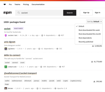
npm Updates Search Experience with New Objective Sorting Options
npm has a revamped search experience with new, more transparent sorting options—Relevance, Downloads, Dependents, and Publish Date.
@mui/x-data-grid-premium
Advanced tools
The Premium plan edition of the Data Grid Components (MUI X).
@mui/x-data-grid-premium is a powerful data grid component for React applications, part of the Material-UI (MUI) library. It offers advanced features for handling large datasets, complex data operations, and customizations, making it suitable for enterprise-level applications.
Column Grouping
Column grouping allows you to group columns under a common header, making it easier to manage and visualize related data.
import * as React from 'react';
import { DataGridPremium } from '@mui/x-data-grid-premium';
const columns = [
{ field: 'id', headerName: 'ID' },
{ field: 'firstName', headerName: 'First name' },
{ field: 'lastName', headerName: 'Last name' },
{ field: 'age', headerName: 'Age', type: 'number' },
{ field: 'fullName', headerName: 'Full name', valueGetter: (params) => `${params.row.firstName || ''} ${params.row.lastName || ''}` },
];
const rows = [
{ id: 1, lastName: 'Snow', firstName: 'Jon', age: 35 },
{ id: 2, lastName: 'Lannister', firstName: 'Cersei', age: 42 },
{ id: 3, lastName: 'Lannister', firstName: 'Jaime', age: 45 },
{ id: 4, lastName: 'Stark', firstName: 'Arya', age: 16 },
{ id: 5, lastName: 'Targaryen', firstName: 'Daenerys', age: null },
{ id: 6, lastName: 'Melisandre', firstName: null, age: 150 },
{ id: 7, lastName: 'Clifford', firstName: 'Ferrara', age: 44 },
{ id: 8, lastName: 'Frances', firstName: 'Rossini', age: 36 },
{ id: 9, lastName: 'Roxie', firstName: 'Harvey', age: 65 },
];
export default function ColumnGroupingGrid() {
return (
<div style={{ height: 400, width: '100%' }}>
<DataGridPremium rows={rows} columns={columns} />
</div>
);
}Tree Data
Tree data allows you to display hierarchical data in a tree structure, making it easier to navigate and understand parent-child relationships.
import * as React from 'react';
import { DataGridPremium } from '@mui/x-data-grid-premium';

const columns = [
  { field: 'id', headerName: 'ID' },
  { field: 'name', headerName: 'Name' },
  { field: 'age', headerName: 'Age', type: 'number' },
];

const rows = [
  { id: 1, name: 'John Doe', age: 25, parentId: null },
  { id: 2, name: 'Jane Doe', age: 30, parentId: 1 },
  { id: 3, name: 'Sam Smith', age: 20, parentId: 1 },
  { id: 4, name: 'Alice Johnson', age: 35, parentId: null },
];

export default function TreeDataGrid() {
  return (
    <div style={{ height: 400, width: '100%' }}>
      <DataGridPremium rows={rows} columns={columns} treeData getTreeDataPath={(row) => row.parentId} />
    </div>
  );
}
Aggregation
Aggregation allows you to perform operations like sum, average, min, and max on column data, providing quick insights into your dataset.
import * as React from 'react';
import { DataGridPremium } from '@mui/x-data-grid-premium';

const columns = [
  { field: 'id', headerName: 'ID' },
  { field: 'name', headerName: 'Name' },
  { field: 'quantity', headerName: 'Quantity', type: 'number', aggregation: 'sum' },
];

const rows = [
  { id: 1, name: 'Apple', quantity: 10 },
  { id: 2, name: 'Banana', quantity: 20 },
  { id: 3, name: 'Cherry', quantity: 30 },
];

export default function AggregationGrid() {
  return (
    <div style={{ height: 400, width: '100%' }}>
      <DataGridPremium rows={rows} columns={columns} />
    </div>
  );
}AG Grid is a fully-featured and highly customizable data grid for React. It offers a wide range of features including sorting, filtering, grouping, and aggregation. Compared to @mui/x-data-grid-premium, AG Grid is known for its performance and extensive feature set, but it may require more configuration.
React Table is a lightweight and flexible library for building tables in React. It provides hooks for managing table state and rendering, making it highly customizable. While it doesn't offer as many built-in features as @mui/x-data-grid-premium, it excels in flexibility and ease of use.
React Data Grid is a powerful grid component for React with features like sorting, filtering, and grouping. It is similar to @mui/x-data-grid-premium in terms of functionality but offers a different API and customization options.
This package is the Premium plan edition of the Data Grid components. It's part of MUI X, an open-core extension of MUI Core, with advanced components.
Install the package in your project directory with:
npm install @mui/x-data-grid-premium
This component has the following peer dependencies that you need to install as well.
"peerDependencies": {
  "@mui/material": "^5.15.14 || ^6.0.0",
  "react": "^17.0.0 || ^18.0.0 || ^19.0.0",
  "react-dom": "^17.0.0 || ^18.0.0 || ^19.0.0"
},
Visit https://mui.com/x/react-data-grid/ to view the full documentation.
v8.0.0-alpha.2
Nov 29, 2024
We'd like to offer a big thanks to the 17 contributors who made this release possible. Here are some highlights ✨:
<ChartDataProvider /> and <ChartsSurface /> components are now fully divided — Learn more.Special thanks go out to the community contributors who have helped make this release possible: @dloeda, @headironc, @jedesroches, @k-rajat19, @lauri865, @mathzdev, @nphmuller, @zinoroman. Following are all team members who have contributed to this release: @arminmeh, @alexfauquette, @cherniavskii, @flaviendelangle, @JCQuintas, @KenanYusuf, @LukasTy, @MBilalShafi, @oliviertassinari.
<!--/ HIGHLIGHT_ABOVE_SEPARATOR /--><GridOverlays /> component is not exported anymore.indeterminateCheckboxAction prop has been removed. Clicking on an indeterminate checkbox "selects" the unselected descendants.apiRef.current.resize() method was removed.rowSelectionPropagation prop has been changed to { parents: true, descendants: true } which means that the selection will be propagated to the parents and descendants by default.
To revert to the previous behavior, pass rowSelectionPropagation as { parents: false, descendants: false }.estimatedRowCount is used, the text provided to the Table Pagination component from the Material UI library is updated and requires additional translations. Check the example at the end of Index-based pagination section.FAQs
The Premium plan edition of the Data Grid Components (MUI X).
The npm package @mui/x-data-grid-premium receives a total of 119,954 weekly downloads. As such, @mui/x-data-grid-premium popularity was classified as popular.
We found that @mui/x-data-grid-premium demonstrated a healthy version release cadence and project activity because the last version was released less than a year ago. It has 14 open source maintainers collaborating on the project.
Did you know?

Socket for GitHub automatically highlights issues in each pull request and monitors the health of all your open source dependencies. Discover the contents of your packages and block harmful activity before you install or update your dependencies.

Security News
npm has a revamped search experience with new, more transparent sorting options—Relevance, Downloads, Dependents, and Publish Date.

Security News
A supply chain attack has been detected in versions 1.95.6 and 1.95.7 of the popular @solana/web3.js library.

Research
Security News
A malicious npm package targets Solana developers, rerouting funds in 2% of transactions to a hardcoded address.