Security News
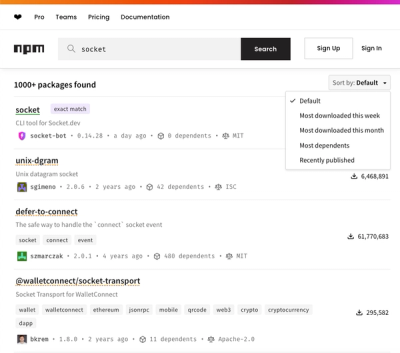
npm Updates Search Experience with New Objective Sorting Options
npm has a revamped search experience with new, more transparent sorting options—Relevance, Downloads, Dependents, and Publish Date.
@mui/x-date-pickers
Advanced tools
The @mui/x-date-pickers package provides date and time selection components that integrate with Material-UI. It allows developers to implement date pickers, time pickers, date-time pickers, and calendar views with ease, offering a consistent design language and user experience aligned with Material Design guidelines.
DatePicker
The DatePicker component allows users to select a date from a calendar dialog.
import * as React from 'react';
import TextField from '@mui/material/TextField';
import { DatePicker } from '@mui/x-date-pickers/DatePicker';
function BasicDatePicker() {
const [value, setValue] = React.useState(null);
return (
<DatePicker
label="Basic example"
value={value}
onChange={(newValue) => {
setValue(newValue);
}}
renderInput={(params) => <TextField {...params} />}
/>
);
}TimePicker
The TimePicker component provides a way for users to select a time.
import * as React from 'react';
import TextField from '@mui/material/TextField';
import { TimePicker } from '@mui/x-date-pickers/TimePicker';

function BasicTimePicker() {
  const [value, setValue] = React.useState(null);

  return (
    <TimePicker
      label="Basic example"
      value={value}
      onChange={(newValue) => {
        setValue(newValue);
      }}
      renderInput={(params) => <TextField {...params} />}
    />
  );
}
DateTimePicker
The DateTimePicker combines date and time selection in one control.
import * as React from 'react';
import TextField from '@mui/material/TextField';
import { DateTimePicker } from '@mui/x-date-pickers/DateTimePicker';

function BasicDateTimePicker() {
  const [value, setValue] = React.useState(null);

  return (
    <DateTimePicker
      label="Basic example"
      value={value}
      onChange={(newValue) => {
        setValue(newValue);
      }}
      renderInput={(params) => <TextField {...params} />}
    />
  );
}
Calendar
The Calendar component displays a full calendar view for date selection without a text field.
import * as React from 'react';
import { Calendar } from '@mui/x-date-pickers/Calendar';

function BasicCalendar() {
  const [date, setDate] = React.useState(new Date());

  return (
    <Calendar
      date={date}
      onChange={(newDate) => setDate(newDate)}
    />
  );
}react-datepicker is a simple and reusable datepicker component for React. It is similar to @mui/x-date-pickers but does not require Material-UI and has its own styling and layout.
react-dates is an accessible, easily internationalizable, mobile-friendly datepicker library for the web. It is different from @mui/x-date-pickers in that it is built by Airbnb and has a different design aesthetic.
antd, or Ant Design, is a design system that includes a DatePicker component. It is similar to @mui/x-date-pickers but is part of a larger design system with a different design language.
react-day-picker is a flexible date picker component for React. Unlike @mui/x-date-pickers, it does not rely on Material-UI and offers more customization options for the calendar component.
This package is the community edition of the date and time picker components. It's part of MUI X, an open-core extension of MUI Core, with advanced components.
Install the package in your project directory with:
npm install @mui/x-date-pickers
Then install the date library of your choice (if not already installed). The pickers currently support the following date libraries:
// date-fns
npm install date-fns
// or dayjs
npm install dayjs
// or luxon
npm install luxon
// or moment
npm install moment
This component has the following peer dependencies that you will need to install as well.
"peerDependencies": {
  "@mui/material": "^5.8.6",
  "@mui/system": "^5.8.0",
  "react": "^17.0.0 || ^18.0.0",
  "react-dom": "^17.0.0 || ^18.0.0"
},
After completing the installation, you have to set the dateAdapter prop of the LocalizationProvider accordingly.
The supported adapters are exported from @mui/x-date-pickers.
import { LocalizationProvider } from '@mui/x-date-pickers/LocalizationProvider';
// date-fns
import { AdapterDateFns } from '@mui/x-date-pickers/AdapterDateFns';
// or for dayjs
import { AdapterDayjs } from '@mui/x-date-pickers/AdapterDayjs';
// or for luxon
import { AdapterLuxon } from '@mui/x-date-pickers/AdapterLuxon';
// or for moment
import { AdapterMoment } from '@mui/x-date-pickers/AdapterMoment';

function App({ children }) {
  return <LocalizationProvider dateAdapter={AdapterDateFns}>{children}</LocalizationProvider>;
}
Visit https://mui.com/x/react-date-pickers/ to view the full documentation.
FAQs
The community edition of the Date and Time Picker components (MUI X).
The npm package @mui/x-date-pickers receives a total of 1,742,499 weekly downloads. As such, @mui/x-date-pickers popularity was classified as popular.
We found that @mui/x-date-pickers demonstrated a healthy version release cadence and project activity because the last version was released less than a year ago. It has 14 open source maintainers collaborating on the project.
Did you know?

Socket for GitHub automatically highlights issues in each pull request and monitors the health of all your open source dependencies. Discover the contents of your packages and block harmful activity before you install or update your dependencies.

Security News
npm has a revamped search experience with new, more transparent sorting options—Relevance, Downloads, Dependents, and Publish Date.

Security News
A supply chain attack has been detected in versions 1.95.6 and 1.95.7 of the popular @solana/web3.js library.

Research
Security News
A malicious npm package targets Solana developers, rerouting funds in 2% of transactions to a hardcoded address.