What is @nivo/line?
@nivo/line is a powerful and flexible library for creating line charts in React applications. It provides a wide range of customization options and is built on top of D3.js, making it suitable for creating complex and interactive data visualizations.
What are @nivo/line's main functionalities?
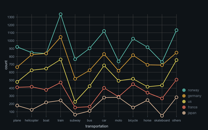
Basic Line Chart
This code demonstrates how to create a basic line chart using the @nivo/line package. The chart is responsive and includes various customization options for axes, colors, and points.
import { ResponsiveLine } from '@nivo/line';
const data = [
{
id: 'japan',
color: 'hsl(348, 70%, 50%)',
data: [
{ x: 'plane', y: 214 },
{ x: 'helicopter', y: 119 },
{ x: 'boat', y: 151 },
{ x: 'train', y: 91 },
{ x: 'subway', y: 190 },
{ x: 'bus', y: 211 },
{ x: 'car', y: 152 },
{ x: 'moto', y: 189 },
{ x: 'bicycle', y: 152 },
{ x: 'horse', y: 8 },
{ x: 'skateboard', y: 197 },
{ x: 'others', y: 107 }
]
}
];
const MyResponsiveLine = () => (
<ResponsiveLine
data={data}
margin={{ top: 50, right: 110, bottom: 50, left: 60 }}
xScale={{ type: 'point' }}
yScale={{ type: 'linear', min: 'auto', max: 'auto', stacked: true, reverse: false }}
axisTop={null}
axisRight={null}
axisBottom={{
orient: 'bottom',
tickSize: 5,
tickPadding: 5,
tickRotation: 0,
legend: 'transportation',
legendOffset: 36,
legendPosition: 'middle'
}}
axisLeft={{
orient: 'left',
tickSize: 5,
tickPadding: 5,
tickRotation: 0,
legend: 'count',
legendOffset: -40,
legendPosition: 'middle'
}}
colors={{ scheme: 'nivo' }}
pointSize={10}
pointColor={{ theme: 'background' }}
pointBorderWidth={2}
pointBorderColor={{ from: 'serieColor' }}
pointLabelYOffset={-12}
useMesh={true}
/>
);
Custom Line Styles
This code demonstrates how to customize the line styles in a line chart using the @nivo/line package. It includes options for line width, point size, and enabling slices for better interaction.
import { ResponsiveLine } from '@nivo/line';

const data = [
  {
    id: 'france',
    color: 'hsl(204, 70%, 50%)',
    data: [
      { x: 'plane', y: 123 },
      { x: 'helicopter', y: 98 },
      { x: 'boat', y: 150 },
      { x: 'train', y: 75 },
      { x: 'subway', y: 200 },
      { x: 'bus', y: 180 },
      { x: 'car', y: 130 },
      { x: 'moto', y: 170 },
      { x: 'bicycle', y: 140 },
      { x: 'horse', y: 10 },
      { x: 'skateboard', y: 190 },
      { x: 'others', y: 100 }
    ]
  }
];

const MyCustomLineStyles = () => (
  <ResponsiveLine
    data={data}
    margin={{ top: 50, right: 110, bottom: 50, left: 60 }}
    xScale={{ type: 'point' }}
    yScale={{ type: 'linear', min: 'auto', max: 'auto', stacked: true, reverse: false }}
    axisTop={null}
    axisRight={null}
    axisBottom={{
      orient: 'bottom',
      tickSize: 5,
      tickPadding: 5,
      tickRotation: 0,
      legend: 'transportation',
      legendOffset: 36,
      legendPosition: 'middle'
    }}
    axisLeft={{
      orient: 'left',
      tickSize: 5,
      tickPadding: 5,
      tickRotation: 0,
      legend: 'count',
      legendOffset: -40,
      legendPosition: 'middle'
    }}
    colors={{ scheme: 'nivo' }}
    lineWidth={4}
    pointSize={12}
    pointColor={{ theme: 'background' }}
    pointBorderWidth={3}
    pointBorderColor={{ from: 'serieColor' }}
    pointLabelYOffset={-12}
    useMesh={true}
    enableSlices='x'
  />
);
Interactive Line Chart with Tooltips
This code demonstrates how to create an interactive line chart with tooltips using the @nivo/line package. The chart includes custom tooltips that display detailed information about each data point.
import { ResponsiveLine } from '@nivo/line';

const data = [
  {
    id: 'usa',
    color: 'hsl(100, 70%, 50%)',
    data: [
      { x: 'plane', y: 200 },
      { x: 'helicopter', y: 150 },
      { x: 'boat', y: 180 },
      { x: 'train', y: 120 },
      { x: 'subway', y: 220 },
      { x: 'bus', y: 170 },
      { x: 'car', y: 140 },
      { x: 'moto', y: 160 },
      { x: 'bicycle', y: 130 },
      { x: 'horse', y: 20 },
      { x: 'skateboard', y: 210 },
      { x: 'others', y: 110 }
    ]
  }
];

const MyInteractiveLineChart = () => (
  <ResponsiveLine
    data={data}
    margin={{ top: 50, right: 110, bottom: 50, left: 60 }}
    xScale={{ type: 'point' }}
    yScale={{ type: 'linear', min: 'auto', max: 'auto', stacked: true, reverse: false }}
    axisTop={null}
    axisRight={null}
    axisBottom={{
      orient: 'bottom',
      tickSize: 5,
      tickPadding: 5,
      tickRotation: 0,
      legend: 'transportation',
      legendOffset: 36,
      legendPosition: 'middle'
    }}
    axisLeft={{
      orient: 'left',
      tickSize: 5,
      tickPadding: 5,
      tickRotation: 0,
      legend: 'count',
      legendOffset: -40,
      legendPosition: 'middle'
    }}
    colors={{ scheme: 'nivo' }}
    pointSize={10}
    pointColor={{ theme: 'background' }}
    pointBorderWidth={2}
    pointBorderColor={{ from: 'serieColor' }}
    pointLabelYOffset={-12}
    useMesh={true}
    enableSlices='x'
    tooltip={({ point }) => (
      <div
        style={{
          background: 'white',
          padding: '9px 12px',
          border: '1px solid #ccc'
        }}
      >
        <strong>{point.serieId}</strong>
        <br />
        {point.data.xFormatted}: {point.data.yFormatted}
      </div>
    )}
  />
);
Other packages similar to @nivo/line
recharts
Recharts is a composable charting library built on React components. It provides a wide range of chart types, including line charts, and is known for its simplicity and ease of use. Compared to @nivo/line, Recharts offers a more straightforward API but may lack some of the advanced customization options available in @nivo/line.
victory
Victory is a modular charting library for React and React Native. It offers a variety of chart types, including line charts, and is designed to be highly customizable and extensible. Victory is comparable to @nivo/line in terms of flexibility and customization, but it may require more configuration to achieve similar results.
chart.js
Chart.js is a popular JavaScript library for creating simple yet flexible charts. It can be used with React through various wrappers like 'react-chartjs-2'. While Chart.js provides a robust set of features for line charts, it is not as tightly integrated with React as @nivo/line, which may result in a less seamless development experience.
