Security News
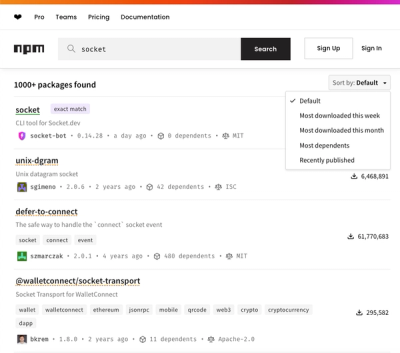
npm Updates Search Experience with New Objective Sorting Options
npm has a revamped search experience with new, more transparent sorting options—Relevance, Downloads, Dependents, and Publish Date.
@react-aria/selection
Advanced tools
@react-aria/selection is a library that provides React hooks for managing selection state in components. It is part of the React Aria collection of hooks and components that help build accessible user interfaces. This package is particularly useful for creating custom selection logic in lists, tables, and other components where users need to select one or more items.
useSelectableCollection
The `useSelectableCollection` hook is used to manage the selection state of a collection of items. It supports multiple selection modes and provides properties and methods to handle item selection.
import { useSelectableCollection } from '@react-aria/selection';
function MyComponent() {
let state = useSelectableCollection({
selectionMode: 'multiple',
disallowEmptySelection: false
});
return (
<div>
{state.collection.map(item => (
<div key={item.key} {...state.getItemProps(item)}>
{item.rendered}
</div>
))}
</div>
);
}useSelectableItem
The `useSelectableItem` hook is used to manage the selection state of an individual item within a collection. It provides properties and methods to handle item selection and focus.
import { useSelectableItem } from '@react-aria/selection';

function SelectableItem({ item, state }) {
  let ref = React.useRef();
  let { itemProps } = useSelectableItem({
    key: item.key,
    ref,
    state
  });

  return (
    <div {...itemProps} ref={ref}>
      {item.rendered}
    </div>
  );
}react-select is a flexible and customizable library for building dropdowns and multi-select components in React. It provides a wide range of features including async options, custom styling, and accessibility. Compared to @react-aria/selection, react-select is more focused on dropdown and select components rather than general selection state management.
downshift is a library that provides primitives to build flexible and accessible autocomplete, combobox, dropdown, and menu components. It offers a high degree of customization and control over the behavior of these components. While downshift is more focused on input-based components, @react-aria/selection provides hooks for managing selection state in a broader range of components.
react-multi-select-component is a simple and lightweight library for creating multi-select dropdowns in React. It offers basic features for multi-selection and customization. Compared to @react-aria/selection, this package is more limited in scope and primarily focused on dropdowns.
This package is part of react-spectrum. See the repo for more details.
FAQs
Spectrum UI components in React
The npm package @react-aria/selection receives a total of 856,142 weekly downloads. As such, @react-aria/selection popularity was classified as popular.
We found that @react-aria/selection demonstrated a healthy version release cadence and project activity because the last version was released less than a year ago. It has 2 open source maintainers collaborating on the project.
Did you know?

Socket for GitHub automatically highlights issues in each pull request and monitors the health of all your open source dependencies. Discover the contents of your packages and block harmful activity before you install or update your dependencies.

Security News
npm has a revamped search experience with new, more transparent sorting options—Relevance, Downloads, Dependents, and Publish Date.

Security News
A supply chain attack has been detected in versions 1.95.6 and 1.95.7 of the popular @solana/web3.js library.

Research
Security News
A malicious npm package targets Solana developers, rerouting funds in 2% of transactions to a hardcoded address.