View on Service NSW GEL Prerelease
(Login credentials required)
Installation
npm install @servicensw/drop-menu --save-dev
How to use
CSS
- PostCSS workflow:
@import '@servicensw/drop-menu'; - Sass/Eyeglass:
@import 'servicensw-drop-menu'; - Native CSS:
@import url('dist/drop-menu.css'); - Link tag:
<link href="dist/drop-menu.css" rel="stylesheet" type="text/css">
ES6
import DropMenu from '@servicensw/drop-menu';

document.addEventListener('DOMContentLoaded', () => {
  const dropMenus = document.querySelectorAll('.drop-button');
  if (dropMenus) {
    dropMenus.forEach((element, index) => {
      const dropMenu = new DropMenu(element, index);
    });
  }
});
HTML
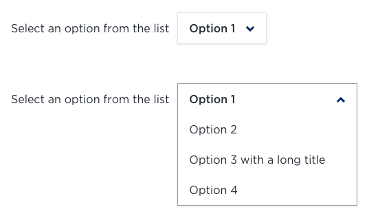
<div class="drop-button__wrapper">
  <p id="dropMenuDescription">Select an option from the list</p>
  <div class="drop-button">
    <ul aria-label="Drop menu" aria-describedby="dropMenuDescription">
      <li><a href="#">Option 1</a></li>
      <li><a href="#">Option 2</a></li>
      <li><a href="#">Option 3</a></li>
      <li><a href="#">Option 4</a></li>
    </ul>
  </div>
</div>
Developer notes
This component is only provided in ES6/Native JS.
Release notes
1.0.3
1.0.2
- index is not mandatory when calling DropMenu class for a single menu on the page.
- Updated documentation.
- Fixed .scss path.
1.0.1
- Don't throw error if element is missing.
- Updated documentation.
1.0.0


