What is @storybook/addon-storysource?
@storybook/addon-storysource is an addon for Storybook that allows you to view the source code of your stories directly within the Storybook interface. This can be particularly useful for documentation purposes and for developers who want to see how a particular story is implemented.
What are @storybook/addon-storysource's main functionalities?
View Story Source Code
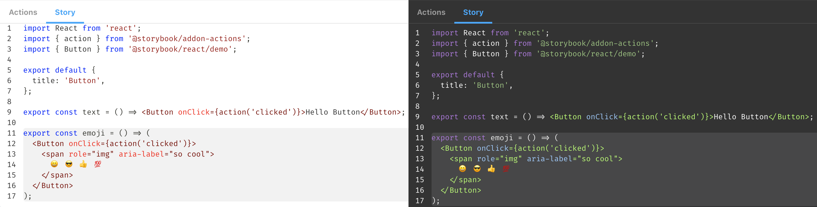
This feature allows you to view the source code of your stories directly within the Storybook interface. By using the `withStorySource` decorator, you can add the source code of the story to the Storybook panel.
import { withStorySource } from '@storybook/addon-storysource';
export default {
title: 'Button',
decorators: [withStorySource],
};
export const Primary = () => <button>Primary</button>;
Primary.story = {
parameters: {
storySource: {
source: '<button>Primary</button>',
},
},
};
Automatic Source Code Extraction
This feature automatically extracts the source code of your stories and displays it in the Storybook panel. By setting `injectStoryParameters` to true, you can enable automatic source code extraction for all stories.
import { addParameters } from '@storybook/react';
import { withStorySource } from '@storybook/addon-storysource';

addParameters({
  storySource: {
    loaderOptions: {
      injectStoryParameters: true,
    },
  },
});

export default {
  title: 'Button',
  decorators: [withStorySource],
};

export const Secondary = () => <button>Secondary</button>;
Other packages similar to @storybook/addon-storysource
@storybook/addon-docs
@storybook/addon-docs provides a comprehensive documentation addon for Storybook. It allows you to write and view documentation alongside your stories, including the ability to view source code, props tables, and more. Compared to @storybook/addon-storysource, @storybook/addon-docs offers a more extensive set of documentation features.
react-docgen
react-docgen is a CLI and library for extracting information from React component files. It can be used to generate documentation for your components, including prop types and default values. While it does not integrate directly with Storybook, it can be used in conjunction with other tools to provide similar functionality to @storybook/addon-storysource.
Storybook Storysource Addon
This addon is used to show stories source in the addon panel.
Framework Support
Getting Started
First, install the addon
yarn add @storybook/addon-storysource --dev
You can add configuration for this addon by using a preset or by using the addon config with webpack
Install using preset
Add the following to your .storybook/main.js exports:
export default {
  addons: ['@storybook/addon-storysource'],
};
You can pass configurations into the addon-storysource loader in your .storybook/main.js file, e.g.:
export default {
addons: [
{
name: '@storybook/addon-storysource',
options: {
rule: {
include: [path.resolve(__dirname, '../src')],
},
loaderOptions: {
prettierConfig: { printWidth: 80, singleQuote: false },
},
},
},
],
};
To customize the source-loader, pass loaderOptions. Valid configurations are documented in the source-loader README.
Theming
Storysource will automatically use the light or dark syntax theme based on your storybook theme. See Theming Storybook for more information.
Displaying full source
Storybook 6.0 introduced an unintentional change to source-loader, in which only the source of the selected story is shown in the addon. To restore the old behavior, pass theinjectStoryParameters: false option.
If you're using addon-docs:
export default {
  addons: [
    {
      name: '@storybook/addon-docs',
      options: {
        sourceLoaderOptions: {
          injectStoryParameters: false,
        },
      },
    },
  ],
};
If not:
export default {
  addons: [
    {
      name: '@storybook/addon-storysource',
      options: {
        loaderOptions: {
          injectStoryParameters: false,
        },
      },
    },
  ],
};
This bug will be resolved in a future version of the addon.


