Research
Security News
Malicious npm Packages Inject SSH Backdoors via Typosquatted Libraries
Socket’s threat research team has detected six malicious npm packages typosquatting popular libraries to insert SSH backdoors.
@storybook/addon-viewport
Advanced tools
Build responsive components by adjusting Storybook’s viewport size and orientation
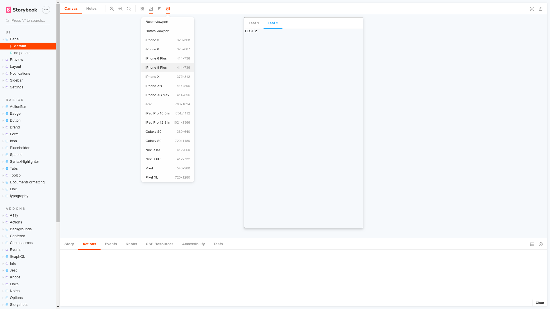
The @storybook/addon-viewport package allows developers to customize the viewport size to simulate different screen sizes in Storybook's UI. This is particularly useful for ensuring that components and layouts are responsive and look good on various devices, from mobile phones to desktop monitors.
Custom Viewport Configuration
This code configures Storybook to use a set of predefined viewports. The INITIAL_VIEWPORTS constant provides a list of common device resolutions that can be used to test the responsiveness of components.
import { INITIAL_VIEWPORTS } from '@storybook/addon-viewport';
export const parameters = {
viewport: {
viewports: INITIAL_VIEWPORTS,
},
};
Adding New Viewports
Developers can add custom viewports to the Storybook configuration. This code sample demonstrates how to add new devices, such as Kindle Fire 2 and Kindle Fire HD, with specific resolutions to the viewport addon.
export const parameters = {
viewport: {
viewports: {
kindleFire2: {
name: 'Kindle Fire 2',
styles: {
width: '600px',
height: '963px',
},
},
kindleFireHD: {
name: 'Kindle Fire HD',
styles: {
width: '533px',
height: '801px',
},
},
},
},
};
This package provides device detection for React applications. It offers hooks and components to conditionally render UI elements based on the device. Unlike @storybook/addon-viewport, it does not integrate with Storybook but can be used within the app's codebase to adapt the UI for different devices.
React-responsive is a package that allows the creation of media queries in React components. It is similar to @storybook/addon-viewport in that it helps in building responsive UIs, but it does so within the context of the app rather than in a Storybook environment.
Storybook Viewport Addon allows your stories to be displayed in different sizes and layouts in Storybook. This helps build responsive components inside of Storybook.
Viewport is part of essentials and so is installed in all new Storybooks by default. If you need to add it to your Storybook, you can run:
npm i -D @storybook/addon-viewport
Then, add following content to .storybook/main.js
:
export default {
addons: ['@storybook/addon-viewport'],
};
You should now be able to see the viewport addon icon in the toolbar at the top of the screen.
The usage is documented in the documentation.
FAQs
Build responsive components by adjusting Storybook’s viewport size and orientation
The npm package @storybook/addon-viewport receives a total of 3,668,822 weekly downloads. As such, @storybook/addon-viewport popularity was classified as popular.
We found that @storybook/addon-viewport demonstrated a healthy version release cadence and project activity because the last version was released less than a year ago. It has 12 open source maintainers collaborating on the project.
Did you know?
Socket for GitHub automatically highlights issues in each pull request and monitors the health of all your open source dependencies. Discover the contents of your packages and block harmful activity before you install or update your dependencies.
Research
Security News
Socket’s threat research team has detected six malicious npm packages typosquatting popular libraries to insert SSH backdoors.
Security News
MITRE's 2024 CWE Top 25 highlights critical software vulnerabilities like XSS, SQL Injection, and CSRF, reflecting shifts due to a refined ranking methodology.
Security News
In this segment of the Risky Business podcast, Feross Aboukhadijeh and Patrick Gray discuss the challenges of tracking malware discovered in open source softare.