Security News
Python Overtakes JavaScript as Top Programming Language on GitHub
Python becomes GitHub's top language in 2024, driven by AI and data science projects, while AI-powered security tools are gaining adoption.
@storybook/components
Advanced tools
The @storybook/components package provides a set of reusable components specifically designed for building UIs in Storybook. These components are used within Storybook's own UI but are also available for developers to use in their own stories. They include basic UI elements such as buttons, inputs, icons, typography, and more complex components like syntax-highlighted code blocks and controls for live-editing component props.
Buttons
Provides styled button components that can be used in stories.
{"import { Button } from '@storybook/components';
export const MyButton = () => <Button>Click me</Button>;"}Typography
Includes components for displaying titles, subtitles, and text with consistent styling.
{"import { Title, Subtitle } from '@storybook/components';

export const MyTypography = () => (
  <>
    <Title>This is a title</Title>
    <Subtitle>This is a subtitle</Subtitle>
  </>
);"}
Form Controls
Contains various form elements like text inputs and textareas for use in stories.
{"import { Input, Textarea } from '@storybook/components';

export const MyForm = () => (
  <>
    <Input placeholder='Enter text' />
    <Textarea placeholder='Enter multiline text' />
  </>
);"}
Icons
Provides a set of icons that can be easily included in stories.
{"import { Icons } from '@storybook/components';

export const MyIcons = () => <Icons icon='check' />;"}
Syntax Highlighter
Allows for the display of syntax-highlighted code blocks within stories.
{"import { SyntaxHighlighter } from '@storybook/components';

export const MyCodeBlock = () => (
  <SyntaxHighlighter language='javascript'>
    {`const myFunction = () => console.log('Hello, world!');`}
  </SyntaxHighlighter>
);"}Ant Design (antd) is a design system and React UI library that provides a multitude of components, similar to @storybook/components, but with a focus on implementing the Ant Design system rather than integrating with Storybook.
Material-UI offers React components that implement Google's Material Design. It is similar to @storybook/components in providing a wide range of UI components but is designed for general application use rather than specifically for Storybook.
React-Bootstrap provides Bootstrap 4 components built with React. It offers a similar set of components to @storybook/components but is tailored to fit into the Bootstrap ecosystem.
Semantic UI React is the official React integration for Semantic UI. It is a collection of components that help create beautiful, responsive layouts using human-friendly HTML, similar to @storybook/components but with a focus on Semantic UI's themes and styles.
FAQs
Core Storybook Components
The npm package @storybook/components receives a total of 6,267,617 weekly downloads. As such, @storybook/components popularity was classified as popular.
We found that @storybook/components demonstrated a healthy version release cadence and project activity because the last version was released less than a year ago. It has 11 open source maintainers collaborating on the project.
Did you know?

Socket for GitHub automatically highlights issues in each pull request and monitors the health of all your open source dependencies. Discover the contents of your packages and block harmful activity before you install or update your dependencies.

Security News
Python becomes GitHub's top language in 2024, driven by AI and data science projects, while AI-powered security tools are gaining adoption.

Security News
Dutch National Police and FBI dismantle Redline and Meta infostealer malware-as-a-service operations in Operation Magnus, seizing servers and source code.

Research
Security News
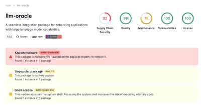
Socket is tracking a new trend where malicious actors are now exploiting the popularity of LLM research to spread malware through seemingly useful open source packages.