Security News
Dutch National Police Disrupt Redline and Meta Malware Operations
Dutch National Police and FBI dismantle Redline and Meta infostealer malware-as-a-service operations in Operation Magnus, seizing servers and source code.
@storybook/react-webpack5
Advanced tools
Storybook for React: Develop React Component in isolation with Hot Reloading.
The @storybook/react-webpack5 npm package is an addon for Storybook, a tool for developing UI components in isolation for React, which allows it to work with Webpack 5. It provides a streamlined development environment for building and testing UI components without needing to embed them in an application. It also includes features for visual testing, documentation, and showcasing components interactively.
Developing UI components in isolation
Allows developers to create stories for their components, which are visual representations of different states of UI components.
import { storiesOf } from '@storybook/react';
import MyButton from './MyButton';
storiesOf('Button', module)
.add('with text', () => <MyButton>Hello Button</MyButton>)
.add('with emoji', () => <MyButton>😀 😎 👍 💯</MyButton>);Custom Webpack configuration
Enables developers to customize the Webpack configuration used by Storybook to match the needs of their project.
module.exports = {
  stories: ['../src/**/*.stories.@(js|jsx|ts|tsx)'],
  addons: ['@storybook/addon-links', '@storybook/addon-essentials'],
  webpackFinal: async (config, { configType }) => {
    // Custom Webpack configuration goes here
    return config;
  }
};
Interactive controls to manipulate component states
Provides a set of tools to create interactive controls for manipulating the props of the components, allowing for dynamic testing of different states.
import { ComponentStory, ComponentMeta } from '@storybook/react';
import MyButton from './MyButton';

export default {
  title: 'Button',
  component: MyButton,
  argTypes: { backgroundColor: { control: 'color' } },
} as ComponentMeta<typeof MyButton>;

const Template: ComponentStory<typeof MyButton> = (args) => <MyButton {...args} />;

export const Primary = Template.bind({});
Primary.args = {
  primary: true,
  label: 'Button',
};Similar to @storybook/react-webpack5, but designed for building UI components in isolation for HTML instead of React. It allows for the development of HTML snippets and does not require a React environment.
This package is for Vue.js developers and offers the same Storybook functionality as @storybook/react-webpack5 but tailored for Vue components. It allows developers to create stories for Vue components and test them in isolation.
This package is a Storybook addon for Angular. It provides the same isolation and component development environment as @storybook/react-webpack5, but it is specifically designed to work with Angular components.
Storybook for React is a UI development environment for your React components. With it, you can visualize different states of your UI components and develop them interactively.

Storybook runs outside of your app. So you can develop UI components in isolation without worrying about app specific dependencies and requirements.
cd my-react-app
npx storybook@latest init
For more information visit: storybook.js.org
Storybook also comes with a lot of addons and a great API to customize as you wish. You can also build a static version of your Storybook and deploy it anywhere you want.
Here are some featured storybooks that you can reference to see how Storybook works:
Support for Create React App is handled by @storybook/preset-create-react-app.
This preset enables support for all Create React App features, including Sass/SCSS and TypeScript.
If you're working on an app that was initialized manually (i.e., without the use of Create React App), ensure that your app has react-dom included as a dependency. Failing to do so can lead to unforeseen issues with Storybook and your project.
@storybook/react is now exporting its own types to use with Typescript.
You don't need to have @types/storybook__react installed anymore if it was your case.
But you probably also need to use types from @types/node @types/react.
FAQs
Storybook for React: Develop React Component in isolation with Hot Reloading.
We found that @storybook/react-webpack5 demonstrated a healthy version release cadence and project activity because the last version was released less than a year ago. It has 11 open source maintainers collaborating on the project.
Did you know?

Socket for GitHub automatically highlights issues in each pull request and monitors the health of all your open source dependencies. Discover the contents of your packages and block harmful activity before you install or update your dependencies.

Security News
Dutch National Police and FBI dismantle Redline and Meta infostealer malware-as-a-service operations in Operation Magnus, seizing servers and source code.

Research
Security News
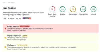
Socket is tracking a new trend where malicious actors are now exploiting the popularity of LLM research to spread malware through seemingly useful open source packages.

Security News
Research
Noxia, a new dark web bulletproof host, offers dirt cheap servers for Python, Node.js, Go, and Rust, enabling cybercriminals to distribute malware and execute supply chain attacks.