Security News
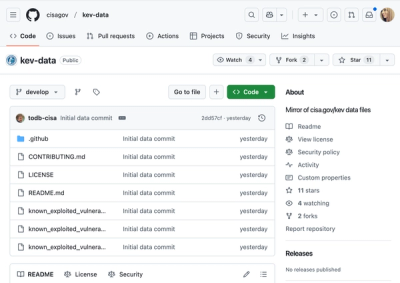
CISA Brings KEV Data to GitHub
CISA's KEV data is now on GitHub, offering easier access, API integration, commit history tracking, and automated updates for security teams and researchers.
@storybook/theming
Advanced tools
The @storybook/theming package is designed to help you customize the appearance of Storybook, an open-source tool for developing UI components in isolation. It allows you to create themes that can change the look and feel of Storybook's user interface to match your project's branding or style guidelines.
Creating custom themes
This feature allows you to define a custom theme for Storybook by specifying various properties such as base theme (light or dark), brand title, brand URL, brand image, and primary and secondary colors.
{
"base": "light",
"brandTitle": "My Custom Storybook",
"brandUrl": "https://mycompany.com",
"brandImage": "https://mycompany.com/logo.svg",
"colorPrimary": "#ff4785",
"colorSecondary": "#1EA7FD"
}Applying custom themes
This code sample demonstrates how to apply a built-in dark theme from the @storybook/theming package to your Storybook instance using the addParameters function.
import { themes } from '@storybook/theming';
import { addParameters } from '@storybook/react';

addParameters({
  options: {
    theme: themes.dark
  }
});
Extending existing themes
This feature allows you to extend an existing theme (in this case, the default light theme) and customize it further by overriding specific properties such as colors, background, border, typography, and more.
import { create } from '@storybook/theming';
import { themes } from '@storybook/theming';

export default create({
  base: 'light',
  brandTitle: 'Custom Storybook',
  ...themes.light,
  colorPrimary: 'hotpink',
  colorSecondary: 'deepskyblue',

  // UI
  appBg: 'white',
  appContentBg: 'silver',
  appBorderColor: 'grey',
  appBorderRadius: 4,

  // Typography
  fontBase: '"Open Sans", sans-serif',
  fontCode: 'monospace',

  // Text colors
  textColor: 'black',
  textInverseColor: 'rgba(255,255,255,0.9)',

  // Toolbar default and active colors
  barTextColor: 'silver',
  barSelectedColor: 'black',
  barBg: 'hotpink',

  // Form colors
  inputBg: 'white',
  inputBorder: 'silver',
  inputTextColor: 'black',
  inputBorderRadius: 4
});Material-UI is a popular React component library that follows Material Design guidelines. It includes a theming solution that allows you to customize the look and feel of your application. Unlike @storybook/theming, which is specific to Storybook, Material-UI's theming is meant for general React applications and provides a wider range of components to style.
Styled-components is a library for styling React applications using tagged template literals. It supports theming by allowing you to define a theme object and then use it throughout your application via a ThemeProvider. While @storybook/theming is focused on theming Storybook's UI, styled-components is a more general-purpose styling solution that can be used to theme entire React applications.
Ant Design (antd) is a design system for enterprise-level products. It includes a set of high-quality React components and a theming system that allows for customization of component styles. Ant Design's theming is more component-focused compared to @storybook/theming, which is tailored for customizing the Storybook interface.
FAQs
Core Storybook Components
The npm package @storybook/theming receives a total of 7,288,215 weekly downloads. As such, @storybook/theming popularity was classified as popular.
We found that @storybook/theming demonstrated a healthy version release cadence and project activity because the last version was released less than a year ago. It has 12 open source maintainers collaborating on the project.
Did you know?

Socket for GitHub automatically highlights issues in each pull request and monitors the health of all your open source dependencies. Discover the contents of your packages and block harmful activity before you install or update your dependencies.

Security News
CISA's KEV data is now on GitHub, offering easier access, API integration, commit history tracking, and automated updates for security teams and researchers.

Security News
Opengrep forks Semgrep to preserve open source SAST in response to controversial licensing changes.

Security News
Critics call the Node.js EOL CVE a misuse of the system, sparking debate over CVE standards and the growing noise in vulnerability databases.