Security News
Research
Data Theft Repackaged: A Case Study in Malicious Wrapper Packages on npm
The Socket Research Team breaks down a malicious wrapper package that uses obfuscation to harvest credentials and exfiltrate sensitive data.
@vcl/flex-layout
Advanced tools
deprecated - Use flex-grid instead.
A declarative layout system built on top of CSS Flexbox. Features in CSS Flexbox are exposed as classes that can be put on any element.
Based on that, a twelve-column grid is provided.
Flexbox based layout primitives that can solve almost all layout challenges.
The flex layout also features a layout grid which works just like a classical
float based grid. A grid row is built from a layout-grid-row containing
an arbitrary number of layout-grid-cells. The cells can be sized using
the column classed layout1 .. layout11 or the sizing from
the utils module.
The grid also supports nesting of rows.
Note that a layout-grid-row must be enclosed in a block container.
A special feature is a grid row which allows to wrap grid cells based on
their width maintaining the gutters. The total width of all cells can be
greater than 100%, they wrap at multiples of 100%.
The layout-wrapping-row modifier is used to enable this.
layout-horizontallayout-verticallayout-inlinelayout-reverselayout-wraplayout-wrap-reverselayout-flexlayout-autolayout-nonelayout1layout2layout3layout4layout5layout6layout7layout8layout9layout10layout11layout12layout-centerlayout-center-centerlayout-start-justifiedlayout-center-justifiedlayout-end-justifiedlayout-justifiedlayout-around-justifiedlayout-self-startlayout-self-centerlayout-self-endlayout-self-stretchlayout-grid-rowlayout-grid-celllayout-wrap-containerlayout-fixed-toplayout-fixed-rightlayout-fixed-bottomlayout-fixed-leftlayout-full-bleedlayout-invisiblelayout-hiddenlayout-relativelayout-fitlayout-grid-rowlayout-wrapping-row: Make the row a non-nestable one that can
accommodate cells of more than 100% width in total and wrap those accordingly.layouthorizontalverticalinlinereversewrapwrap-reverseflexautononeonetwothreefourfivesixseveneightnineteneleventwelvestart-justifiedcenter-justifiedend-justifiedjustifiedaround-justifiedself-startself-centerself-endself-stretch--flex-layout-half-gutter-width: The half width of the gutter between
grid cells.example.html on GH-pages.
FAQs
Flexbox based layout system
The npm package @vcl/flex-layout receives a total of 1 weekly downloads. As such, @vcl/flex-layout popularity was classified as not popular.
We found that @vcl/flex-layout demonstrated a not healthy version release cadence and project activity because the last version was released a year ago. It has 4 open source maintainers collaborating on the project.
Did you know?

Socket for GitHub automatically highlights issues in each pull request and monitors the health of all your open source dependencies. Discover the contents of your packages and block harmful activity before you install or update your dependencies.

Security News
Research
The Socket Research Team breaks down a malicious wrapper package that uses obfuscation to harvest credentials and exfiltrate sensitive data.

Research
Security News
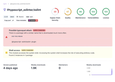
Attackers used a malicious npm package typosquatting a popular ESLint plugin to steal sensitive data, execute commands, and exploit developer systems.

Security News
The Ultralytics' PyPI Package was compromised four times in one weekend through GitHub Actions cache poisoning and failure to rotate previously compromised API tokens.