| dateRange | false | boolean | Date picker mode (date picker or date range picker). |
| inline | false | boolean | Normal mode or inline mode. If inline mode is used, set the input box type attribute to hidden and this option to true. Here is an example. |
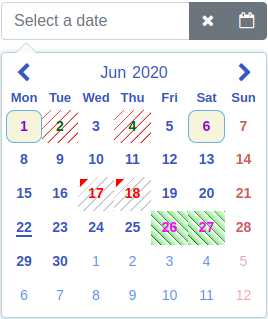
| dayLabels | {su: 'Sun', mo: 'Mon', tu: 'Tue', we: 'Wed', th: 'Thu', fr: 'Fri', sa: 'Sat'} | IMyDayLabels | Day labels visible on the selector. |
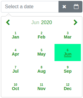
| monthLabels | { 1: 'Jan', 2: 'Feb', 3: 'Mar', 4: 'Apr', 5: 'May', 6: 'Jun', 7: 'Jul', 8: 'Aug', 9: 'Sep', 10: 'Oct', 11: 'Nov', 12: 'Dec' } | IMyMonthLabels | Month labels visible on the selector. |
| dateFormat | yyyy-mm-dd | string | Date format on the selection area and the callback. For example: d.m.yyyy, dd.mm.yyyy, yyyy-m-d, yyyy-mm-dd, d mmm yyyy, dd mmm yyyy, d## of mmm yyyy (d = Day not leading zero, dd = Day with leading zero, d## = Ordinal dates for example 3rd, m = Month not leading zero, mm = Month with leading zero, mmm = Month as a text, yyyy = Year four digit) |
| defaultView | date | DefaultView | Calendar opens to this view (date, month or year). |
| firstDayOfWeek | mo | string | First day of week on calendar. One of the following: mo, tu, we, th, fr, sa, su |
| sunHighlight | true | boolean | Sunday red colored on calendar. |
| satHighlight | false | boolean | Saturday red colored on calendar. |
| highlightDates | no default value | Array<IMyDate> | Dates red colored on calendar. Value of year or month can be zero. If it is zero it affects all years/months. For example: [{year: 2019, month: 11, day: 14}, {year: 2019, month: 1, day: 15}] |
| markCurrentDay | true | boolean | Is current day (today) marked (underline) on calendar. |
| markCurrentMonth | true | boolean | Is current month marked (underline) on calendar. Can be used if monthSelector = true. |
| markCurrentYear | true | boolean | Is current year marked (underline) on calendar. Can be used if yearSelector = true. |
| monthSelector | true | boolean | If true and if month label is selected opens a selector of months. |
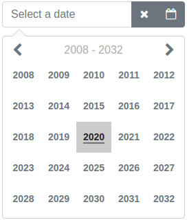
| yearSelector | true | boolean | If true and if year label is selected opens a selector of years. |
| disableHeaderButtons | true | boolean | Prevent to change the calendar view with header buttons if previous or next month are fully disabled by the disableUntil or the disableSince options. |
| showWeekNumbers | false | boolean | Are week numbers visible or not on calendar. Can be used if firstDayOfWeek = mo. |
| selectorHeight | 266px | string | Selector height. |
| selectorWidth | 266px | string | Selector width. |
| disableUntil | no default value | IMyDate | Disable dates backward starting from the given date. For example: {year: 2019, month: 6, day: 26}. To reset the existing disableUntil value set: {year: 0, month: 0, day: 0} |
| disableSince | no default value | IMyDate | Disable dates forward starting from the given date. For example: {year: 2019, month: 7, day: 22}. To reset the existing disableSince value set: {year: 0, month: 0, day: 0} |
| disableDates | no default value | Array<IMyDate>
or
Array<IMyDisabledDates> | Disable dates one by one. Array of disabled dates. For example: [{year: 2019, month: 11, day: 14}, {year: 2019, month: 1, day: 15}]. Or it is possible to disable dates by setting own style to td element. For example: [{dates: [{year: 2020, month: 5, day: 19}, {year: 2020, month: 5, day: 20}], styleClass: 'yoga'}]. Value of styleClass is name of CSS selector. The definition of the CSS selector have to be added to the stylesData option. For example it is possible add a CSS background-color to definition of this selector.
Value of year or month can be zero. If it is zero it affects all years/months. For example disable first day of every month: [{year: 0, month: 0, day: 1}]. To reset existing disableDates value set empty array to it. Here is an example. |
| disableDateRanges | no default value | Array<IMyDateRange> | Disable date ranges. For example: [{begin: {year: 2019, month: 11, day: 14}, end: {year: 2019, month: 11, day: 20}}]. To reset existing value of disableDateRanges set empty array to it. |
| disableWeekends | false | boolean | Disable weekends. (Saturday and Sunday). |
| disableWeekdays | no default value | Array< string > | Disable weekdays. Array of weekdays to disable. Weekdays are same strings as the firstDayOfWeek option. For example: ['tu', 'we'] which disables Tuesdays and Wednesdays. |
| enableDates | no default value | Array<IMyDate> | Enable single dates one by one if the date is disabled. For example if you disable the date range and want to enable some dates in range. Array of enabled days. For example: [{year: 2019, month: 11, day: 14}, {year: 2019, month: 1, day: 15}]. Value of year or month can be zero. If it is zero it affects all years/months. For example enable first day of every month: [{year: 0, month: 0, day: 1}]. To reset existing enableDates value set empty array to it. |
| markDates | no default value | Array<IMyMarkedDates> | Mark dates for different colors or styles. For example: [{dates: [{year: 2019, month: 11, day: 14}, {year: 2019, month: 12, day: 16}], color: '#004198', styleClass: 'karateDates'}, {dates: [{year: 2018, month: 10, day: 1}, {year: 2018, month: 11, day: 4}], color: 'green', styleClass: 'yogaDates'}]. The color property is optional. If it is given it adds a triangle to the upper left corner of the date. The styleClass is optional. If it is given it changes the style of the td element of the date. Value of the styleClass is a CSS selector name. The definition of the CSS selector have to be added to the stylesData option. For example it is possible add a CSS background-color to definition of this selector. Both color and styleClass can be used at the same time. Here is an example.
Value of year or month can be zero. If it is zero it affects all years/months. To reset existing value of markDates set empty array to it. |
| markWeekends | no default value | IMyMarkedDate | Mark weekends (Saturday and Sunday). For example: {marked: true, color: 'red'}. Value of color can be any CSS color code. To reset existing value of markWeekends set: {marked: false, color: ''} |
| alignSelectorRight | false | boolean | Align selector right. |
| openSelectorTopOfInput | false | boolean | Open selector top of input field. |
| closeSelectorOnDateSelect | true | boolean | Is selector closed or not on a date select. |
| closeSelectorOnDocumentClick | true | boolean | Is selector closed or not on a document click. |
| minYear | 1000 | number | Minimum allowed year in calendar. Cannot be less than 1000. |
| maxYear | 9999 | number | Maximum allowed year in calendar. Cannot be more than 9999. |
| showSelectorArrow | true | boolean | Is selector (calendar) arrow shown or not. |
| appendSelectorToBody | false | boolean | Is selector (calendar) appended to body element or not. |
| focusInputOnDateSelect | true | boolean | Is the input box focused after a date select. |
| moveFocusByArrowKeys | true | boolean | Is focus moved or not on the calendar by arrow keys. |
| dateRangeDatesDelimiter | " - " | string | The delimiter of dates in a date range. |
| inputFieldValidation | true | boolean | Input field validation enabled or not after blur event of input field. |
| showMonthNumber | true | boolean | Is month number shown or not on the month view. |
| todayTxt | empty string | string | Today footer text. This value comes also from locale Locales: If there is locale it is not necessary to add this property. Also the showFooterToday option have to be true in order to use this option. If you want to add only today date to the footer put empty string to the value of this option. |
| showFooterToday | false | boolean | Is today footer shown or not. |
| calendarAnimation | no default value | IMyCalendarAnimation | The type of open (in) and close (out) animation of calendar. One of the following (CalAnimation) value: None, Fade, ScaleTop, ScaleCenter, Rotate, FlipDiagonal or Own. Try animations here. Examples: 1 and 2. |
| viewChangeAnimation | true | boolean | Is view change animation enabled or not. |
| rtl | false | boolean | Is RTL enabled or not. Try RTL here. |
| stylesData | no default value | IMyStyles | Overridden styles of the datepicker. Here is an example on how to use this option. See also chapter below. |
| divHostElement | no default value | IMyDivHostElement | Div as a host element. In case of non-editable date field enable this option and put a angular-mydatepicker directive inside a div element. Placeholder text is an additional property of this option. Functionality is limited if this option is enabled. It is also possible to use input box and set it to disabled to archieve non-editable date field. |
| ariaLabelPrevMonth | Previous Month | string | Aria label text of previous month button. |
| ariaLabelNextMonth | Next Month | string | Aria label text of next month button. |


