What is daisyui?
DaisyUI is a plugin for Tailwind CSS that provides a set of pre-designed components and utilities to help developers quickly build modern and responsive user interfaces. It extends Tailwind CSS with additional classes and components, making it easier to create consistent and visually appealing designs.
What are daisyui's main functionalities?
Pre-designed Components
DaisyUI offers a variety of pre-designed components such as buttons, cards, modals, and more. These components come with default styles that can be easily customized using Tailwind CSS classes.
<button class="btn btn-primary">Primary Button</button>
Utility Classes
In addition to components, DaisyUI provides utility classes that extend Tailwind CSS. These utilities help in quickly applying common styles like padding, margin, background colors, and more.
<div class="bg-base-200 p-4 rounded-lg">Content goes here</div>
Theming
DaisyUI supports theming, allowing developers to switch between different themes easily. This is useful for creating dark mode or other custom themes for your application.
<html data-theme="dark"><body>...</body></html>
Responsive Design
DaisyUI components are designed to be responsive out of the box. This means they adapt to different screen sizes, making it easier to build mobile-friendly applications.
<div class="card lg:card-side bg-base-100 shadow-xl">...</div>
Other packages similar to daisyui
tailwindcss
Tailwind CSS is a utility-first CSS framework that provides low-level utility classes to build custom designs. While DaisyUI extends Tailwind CSS with pre-designed components, Tailwind CSS itself focuses on providing the building blocks for custom designs.
bootstrap
Bootstrap is a popular CSS framework that provides a set of pre-designed components and a grid system. Unlike DaisyUI, which is a plugin for Tailwind CSS, Bootstrap is a standalone framework with its own set of design principles and utilities.
material-ui
Material-UI is a React component library that implements Google's Material Design. It offers a wide range of pre-designed components and theming capabilities. While DaisyUI is built on top of Tailwind CSS, Material-UI is a standalone library specifically for React applications.
ant-design
Ant Design is a comprehensive design system and React UI library. It provides a wide range of high-quality components and design guidelines. Similar to DaisyUI, it aims to help developers build consistent and visually appealing user interfaces, but it is specifically tailored for React applications.

UI Components for Tailwind CSS
Themeable, Scalable and Designer-Friendly
[ See all components ]

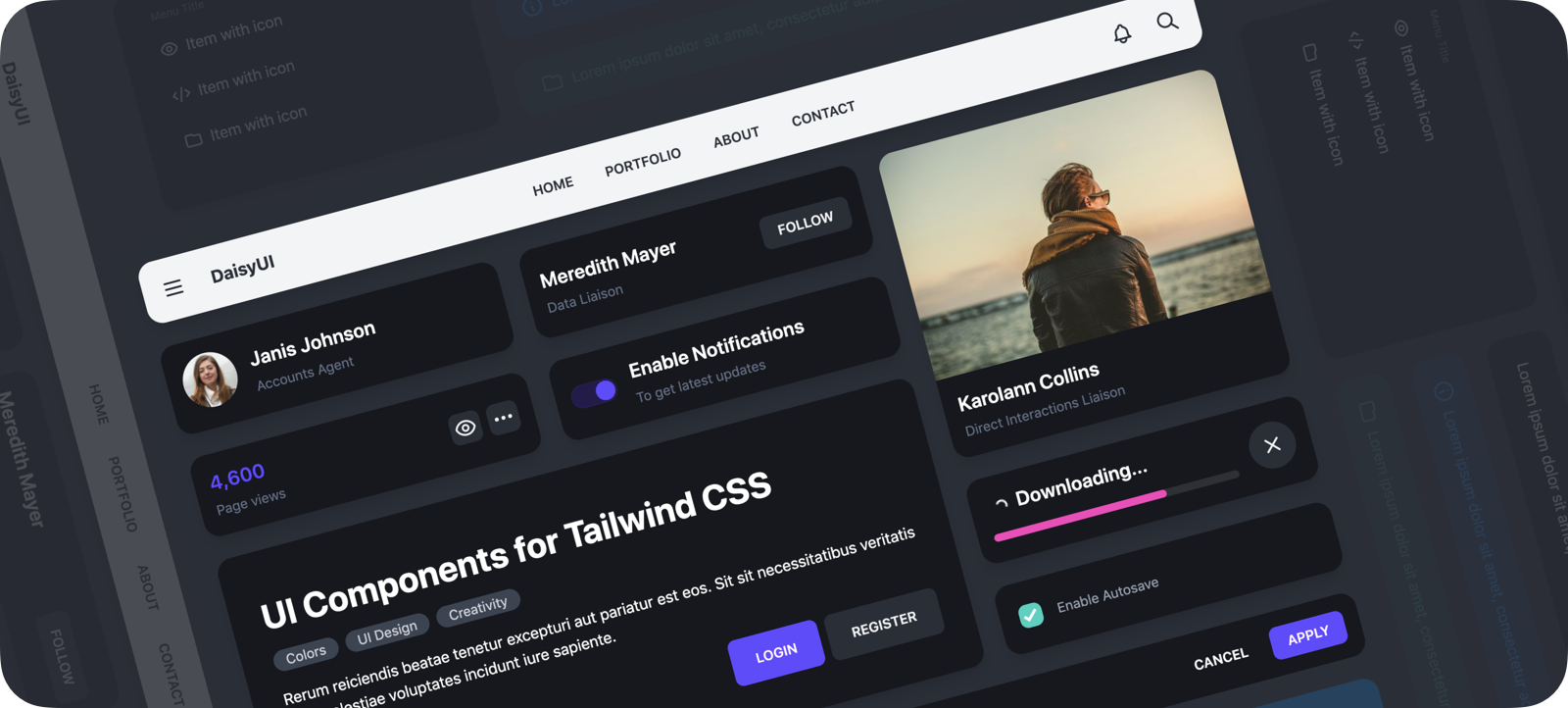
DaisyUI


It's like Tailwind CSS on steroids!
You have everything from Tailwind CSS, but you can also use component classes like btn, card, etc...
🔗 Links
🌼 Features
- Component classes: It adds component classes to Tailwind. Classes like
btn, card,... No need to deal with hundreds of utility classes. - Tailwind CSS plugin: DaisyUI is a Tailwind CSS plugin so you can simply add it to your
tailwind.config.js file. - Based on design system: DaisyUI applies design system concepts to Tailwind CSS. All components on your page are committed to a single design system.
- Customizable: You can customize the design of components with Tailwind utility classes and CSS variables.
- Semantic color names: Use color names like
primary, secondary, accent,... just like your design system defines. - RTL supported: Enable
rtl config for right to left layouts. - Themeable: Add multiple themes or change colors with a CSS variable. You can even set a theme for a specific section of your page.
- Designer-friendly: You can disable
styled config and only get the skeleton of components. No style, no colors. You can style everything using utility classes.
👩💻 Install now!
npm i daisyui
Then add DaisyUI to your tailwind.config.js
module.exports = {
plugins: [
require('daisyui'),
],
theme: {
extend: {
colors: require('daisyui/colors'),
},
},
}
Or use a CDN
Loading CSS files from CDN is not recommended for production. It's better to install Tailwind and DaisyUI as Nodejs dependencies so you can config/customize everything, and purge unused styles.
🎉 Use
Use component classes like btn, card, etc... to build your UI.
<a class="btn">Hello!</a>
<div class="shadow card">
  <div class="card-body">
    <h2 class="card-title">Card Title</h2>
    <p>Card text</p>
  </div>
</div>
👉 See all components
🎲 Try it online
📘 Documents + Examples
Read the documents for more info
[ daisyui.netlify.app ↗︎ ]
List of components
Please share


