Security News
Research
Data Theft Repackaged: A Case Study in Malicious Wrapper Packages on npm
The Socket Research Team breaks down a malicious wrapper package that uses obfuscation to harvest credentials and exfiltrate sensitive data.
inuit-responsive-widths
Advanced tools
Responsively controlled width classes for the inuitcss framework
The inuitcss widths-responsive module is an extension of the default widths
module.
Install using Bower:
$ bower install --save inuit-widths-responsive
Install using npm:
$ npm install --save inuit-widths-responsive
widths-responsive will inherit the same settings used for widths (i.e.
namespaces and fraction vs. spoken-word format).
widths-responsive loops through the breakpoints defined in
settings.responsive to generate prefixed breakpoint-based classes. If you are
using inuitcss’ default breakpoints, you will be given classes like
lap-and-up-1/4, or desk-one-half, etc.
FAQs
Responsively controlled width classes for the inuitcss framework
We found that inuit-responsive-widths demonstrated a not healthy version release cadence and project activity because the last version was released a year ago. It has 2 open source maintainers collaborating on the project.
Did you know?

Socket for GitHub automatically highlights issues in each pull request and monitors the health of all your open source dependencies. Discover the contents of your packages and block harmful activity before you install or update your dependencies.

Security News
Research
The Socket Research Team breaks down a malicious wrapper package that uses obfuscation to harvest credentials and exfiltrate sensitive data.

Research
Security News
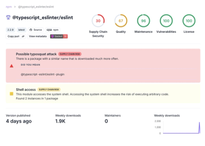
Attackers used a malicious npm package typosquatting a popular ESLint plugin to steal sensitive data, execute commands, and exploit developer systems.

Security News
The Ultralytics' PyPI Package was compromised four times in one weekend through GitHub Actions cache poisoning and failure to rotate previously compromised API tokens.