markdown-documentation-generator

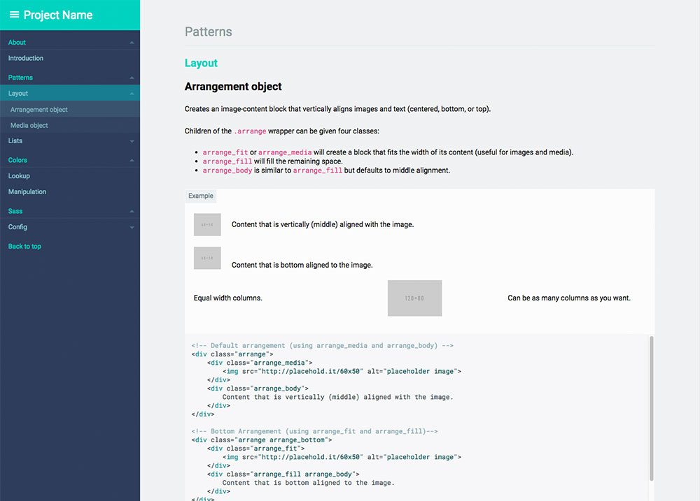
Screenshot
What is a living style guide?
To me, a style guide is a living document of [style] code, which details all the various elements and coded modules of your site or application. Beyond its use in consolidating the front-end code, it also documents the visual language, such as header styles and color palettes, used to create the site. This way, it’s a one-stop place for the entire team—from product owners and producers to designers and developers—to reference when discussing site changes and iterations. [...] - Susan Robertson/A list apart
The living part means that it uses your live css. If you change your css files, the style guide will change as well!
What this tool does, short version:
This tool will search all your style files (your .css, .scss _partial.scss, .less, .whatever) for comments and create an html file living style guide for your developers to use. It also has some additional hooks for creating sass/less documentation.
What this tool does, longer version:
By parsing your comments with markdown, the generator will convert that data to json, which is then run through a (customizable) handlebars template to create a static html file.
What you end up with is an html file that contains comments, rendered examples, and highlighted code, ready to be copied and distributed to your team.
Ultimately, the html file you end up with should inherit your site's css so your style guide is always in sync with your codebase. And since you are using markdown, your comment style is largely up to you and your team — they will be readable in and outside of your css.
All of this can be done via CLI or as part of a larger Node project, since the json, templates, and html are all publicly exposed. It's your data, so you can do with it whatever you please.
Install
Requires Node.js (if you're unsure if you have node install, run node -v in a console.)
Install with npm:
npm install -g markdown-documentation-generator
Usage
CLI usage
If you want to use the default settings, run:
cd /your/web/project
md_documentation
Your html file will be created under /your/web/project/styleguide/styleguide.html
To override default configuration and create a .styleguide config file in the current working directory, you may run:
md_documentation --init
Node module usage
Using the default settings:
var styleguide = require('markdown-documentation-generator');

styleguide.create();
Custom options can be passed via an options object (or read from a .styleguide config file)
var styleguide = require('markdown-documentation-generator');

var options = {...};

styleguide.create(options);
See the configuration & customization section below for more information about customization.
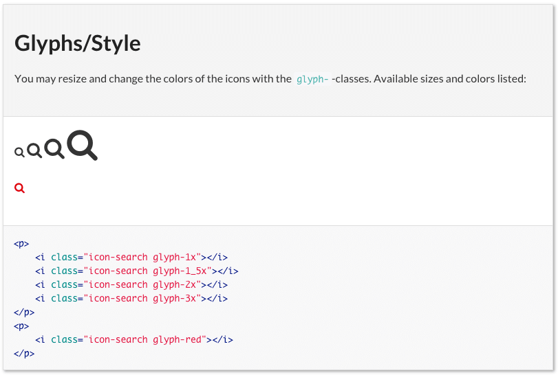
Comment your css/scss/less/whatever files. Use Markdown in the comments:
Example:
/* SG
# Glyphs/Style

You may resize and change the colors of the icons with the `glyph-`-classes. Available sizes and colors listed:

```html_example
<p>
  <i class="icon-search glyph-1x"></i>
  <i class="icon-search glyph-1_5x"></i>
  <i class="icon-search glyph-2x"></i>
  <i class="icon-search glyph-3x"></i>
</p>
```
*/

a [class^="icon-"],
a [class*=" icon-"] {
  text-decoration: none;
}

[class^="icon-"],
[class*=" icon-"] {
  &.glyph-1x { font-size: 1em; }
  &.glyph-1_5x { font-size: 1.5em; }
  &.glyph-2x { font-size: 2em; }
  &.glyph-3x { font-size: 3em; }
}

/* SG
```html_example
<p>
  <i class="icon-search glyph-red"></i>
</p>
```
**/

.glyph-red {
  color: $moh-red;
}
This will be rendered as:
cd to the web project (any folder containing css/scss/less files. The tool will search nested folders).- run
md_documentation to generate style guide. - wait a few seconds and a
styleguide.html is generated in styleguide/ (this is configurable, see Configuration).
Syntax
Best described by going through the example above line by line.
Line 1 (Demarcation)
/* is just an ordinary css comment. The SG means that this is a style guide comment. Only comments beginning with /* SG will be included in the style guide, all other comments are ignored. This demarcation is configurable.
Line 2 (Heading)
# Glyphs/Style
Every style guide comment must have a heading. # is the Markdown syntax for a heading (equivalent to h1). The name of this category will be Glyphs (which will be shown in the menu). The article will be Style (which will be shown in the menu when it's expanded). The heading (the part before the slash) is required, the slash and the article name are optional.
You may resize and change the colors of the icons with the `glyph-`-classes. Available sizes and colors listed:
The comment will be shown in the style guide. Describe your css rules! Feel free to use Markdown syntax. The comment is optional but be nice to your developers!
Line 6-11 (Code example)
```html_example
<p>
  <i class="icon-search glyph-1x"></i>
  <i class="icon-search glyph-1_5x"></i>
  <i class="icon-search glyph-2x"></i>
  <i class="icon-search glyph-3x"></i>
</p>
<p>
  <i class="icon-search glyph-red"></i>
</p>
```
This is where you write some HTML code to describe how to use your css rules. The HTML will be a) Rendered and used as an example, and b) Output with syntax highlighting. The HTML part is optional but most of the time you'll use it. Notice that the code is fenced in triple back ticks (and given a language marker of html_example) as per Markdown syntax.
*/
Closing the css comment.
Line 13-24
  a [class^="icon-"],
  a [class*=" icon-"] {
    text-decoration: none;
  }
  ...
Ordinary css! You could stop here and understand all you need to, but let's continue.
Line 24+
/* SG
```html_example
<p>
  <i class="icon-search glyph-red"></i>
</p>
```
*/

...
Additional comments about the previous article. This allows you to break your comments up whenever and they will always become a part of the previous comment (and added to the same article).
Markdown files
Sometimes it makes more sense to have some of your documentation in a markdown file. In order to get around the limitations of using /* */ inside markdown, it is necessary to instead use <sg> </sg> tags. Be sure to include "md":true in your fileExtensions setting if you intend on doing this.
Sections, Categories and Articles
All style guides are nested into three levels, with sections being the highest and articles being the lowest. Categories and articles are automatically generated based on the headings you create, but sections must be defined within your configuration.
With this in mind, it's worth thinking of sections as deep divisions in content (almost like their own pages). For instance, the two sections defined in the default configuration are "styles" and "development". A third possible section might be "editorial". For many, sections will be completely unnecessary.
Configuration & Customization
If you want to override the default configuration you may create a .styleguide file in your project folder (the same folder you run md_documentation in). Alternatively, you can pass custom options if you're invoking the module from within another Node application.
The easiest way to create a .styleguide file is to run md_documentation --init which will give you a boilerplate configuration file in the current working directory.
Options
sgComment 'SG'
The string you use to start your style guide comments. Can be anything, but it should be meaningful.
exampleIdentifier html_example
The language attribute you use to identify code examples that will be rendered in your style guide.
sortCategories true
Whether to automatically sort categories and articles alphabetically.
sections {'styles':'', 'development':'Dev:'}
The names of sections(keys) and their identifiers(values). The names will be output as-is, while the identifiers are searched for within the headings of articles and filtered out. For instance, using the settings listed above, a heading of # Dev:Buttons/Small would put this block into the "development" section(with the Article title being "Small", in the category of "Buttons").
Using '' as an identifier will make this the "default" section -- meaning all articles without an identifier will be put into that section (in this case, the "styles" section).
Section identifiers cannot contain a "/" character.
rootFolder './'
Directory to start looking for style guide commented files. All other paths will be relative to this (This path itself is relative to whatever directory the script is called from). Defaults to current working directory.
excludeDirs ['target', 'node_modules', '.git']
Directory names you want excluded from being scanned. Passed directly to Walk as a filter.
fileExtensions {scss:true, sass:true, less:true, md:true, css:false}
File extensions to include in the scan for style guide comments.
templateFile './node_modules/markdown-documentation-generator/template/template.hbs'
Path to a handlebars template to run your style guide data through.
themeFile './node_modules/markdown-documentation-generator/template/theme.css'
Path to a CSS file to give your style guide some extra style. This is registered as a partial and can be referenced via {{> theme}}.
htmlOutput './styleguide/styleguide.html'
Path to where you want to save your rendered style guide. Setting this to true will return the html as a String.
jsonOutput false
Path to where you want to save your style guide's json data. Setting this to any true will return the json as an Object.
handlebarsPartials {'jquery':'./node_modules/markdown-documentation-generator/template/jquery.js'}
Partial names(keys) and paths(values) to register to Handlebars before templating. jQuery is included as a default.
highlightStyle 'arduino-light'
Syntax highlighting style. Syntax highlighting relies on highlight.js. See available styles and their internal names.
highlightFolder './node_modules/highlight.js/styles/'
Folder to look for highlight styles in. Default is highlight.js folder which is installed as a dependency to this package.
customVariables {'pageTitle': 'Style Guide'}
Additional variables to make available to your templates (appended to your json). For instance, the default value can be accessed with {{customVariables/pageTitle}}.
markedOptions {'gfm': true}
Marked options to be passed when rendering your comments. Some options, like "breaks" and "renderer" will be overridden since they are essential to the way this application works.
Custom Themes
The final look and feel of the style guide is based on three different files:
To create your own template/theme, copy the template.html and theme.css to a folder of your choice. Then set the templateFile and themeFile in your .styleguide to the corresponding paths.
The Javascript object which you may use in your template file looks like this:
{
"sections": {
"section Name": {
"category": "Category Name",
"id": "category-name (HTML safe)"
"articles": [
{
"id": 'Article ID (HTML safe unique identifier)',
"category": 'Parent Category (from the "# Category/Heading" Markdown)',
"section": {
"name": "Parent Section",
"parentSection": true
},
"file": "File path where this article originated",
"heading": 'Article Heading (from the "# Category/Heading" Markdown)',
"code": ['HTML Code', ...],
"markup": ['Highlighted HTML Code', ...],
"comment": 'Markdown comment converted to HTML',
"priority": 'Article sorting value'
},
{...}
],
},
...
},
"menus": [
"section Name": [
{
"category": 'Category Name (one per unique "# Category")',
"id": 'Category ID (HTML-safe unique identifier)',
"headings": [
{
"id": 'Article ID (HTML-safe unique identifier)',
"name": 'Heading Name'
},
{...}
]
},
{...}
]
],
"customVariables":{...}
}
If you'd like to see your own JSON, set a path in the "jsonOutput" option in your .styleguide file.
Run with gulp/grunt
If you want to re-create the style guide automatically every time a stylesheet file is changed, you can run it with your favorite task runner. One way of running it with gulp would be using gulp-shell to execute the shell command md_documentation when a file is changed.
Sample gulp script:
var gulp  = require('gulp');
var shell = require('gulp-shell');
var watch = require('gulp-watch');

gulp.task('watch', function() {
  gulp.watch('path/to/watch/for/changes/**/*.scss', ['makeStyleguide']);
});

gulp.task('makeStyleguide',
  shell.task(
    ['md_documentation']
  )
);

gulp.task('default', ['watch']);


