Research
Security News
Quasar RAT Disguised as an npm Package for Detecting Vulnerabilities in Ethereum Smart Contracts
Socket researchers uncover a malicious npm package posing as a tool for detecting vulnerabilities in Etherium smart contracts.
msc-circle-progress
Advanced tools
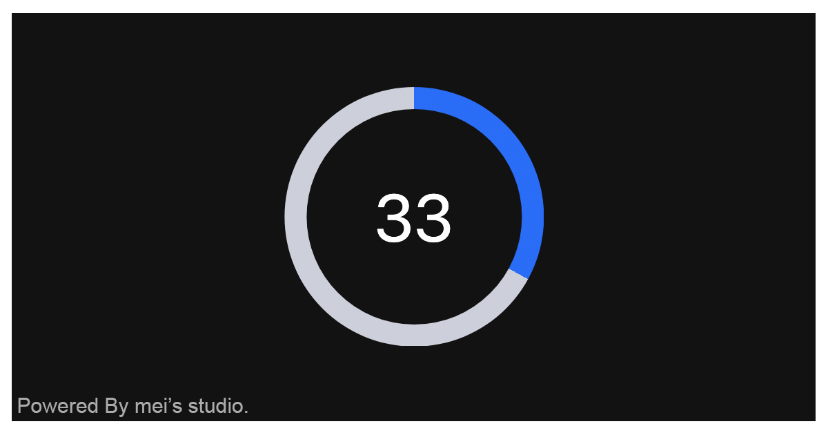
<msc-circle-progress /> provides progress with circle shape. Developers could use it to indicate upload、form complete status for users.
<msc-circle-progress /> provides progress with circle shape. Developers could use it to indicate upload、form complete status for users.

<msc-circle-progress /> is a web component. All we need to do is put the required script into your HTML document. Then follow <msc-circle-progress />'s html structure and everything will be all set.
<script
type="module"
src="https://your-domain/wc-msc-circle-progress.js">
</script>
Put <msc-circle-progress /> into HTML document. It will have different functions and looks with attribute mutation.
<msc-circle-progress>
  <script type="application/json">
    {
      "size": 16,
      "value": 33,
      "max": 100,
      "round": true
    }
  </script>
</msc-circle-progress>
Otherwise, developers could also choose remoteconfig to fetch config for <msc-circle-progress />.
<msc-circle-progress
  remoteconfig="https://your-domain/api-path"
>
</msc-circle-progress>
<msc-circle-progress /> could also use JavaScript to create DOM element. Here comes some examples.
<script type="module">
import { MscCircleProgress } from 'https://your-domain/wc-msc-circle-progress.js';

// use DOM api
const nodeA = document.createElement('msc-circle-progress');
document.body.appendChild(nodeA);
nodeA.value = 50;
nodeA.size = 10;

// new instance with Class
const nodeB = new MscCircleProgress();
document.body.appendChild(nodeB);
nodeB.value = 60;
nodeB.size = 20;

// new instance with Class & default config
const config = {
  size: 20,
  value: 0,
  max: 100
};
const nodeC = new MscCircleProgress(config);
document.body.appendChild(nodeC);
</script>
Developers could apply styles to decorate <msc-circle-progress />'s looking.
<style>
msc-circle-progress {
  --msc-circle-progress-font-size: 16px;
  --msc-circle-progress-font-color: #232a31;
  --msc-circle-progress-color: #0f69ff;
  --msc-circle-progress-placeholder-color: transparent;
}
</style>
Otherwise, apply pseudo class ::part(value) to direct style text element.
<style>
msc-circle-progress::part(value) {
  font-size: 40px;
  color: #fff;
  line-height: 1.5;
}
</style>
<msc-circle-progress /> supports some attributes to let it become more convenience & useful.
Set size for <msc-circle-progress />. It will change progress size. Default is 20 (not set).
<msc-circle-progress
  size="20"
>
  ...
</msc-circle-progress>
Set value for <msc-circle-progress />. Default is 0 (not set).
<msc-circle-progress
  value="0"
>
  ...
</msc-circle-progress>
Set max for <msc-circle-progress />. Default is 100 (not set).
<msc-circle-progress
  max="100"
>
  ...
</msc-circle-progress>
It will switch <msc-circle-progress /> bar as round once set. Default is true (not set).
<msc-circle-progress
  round
>
  ...
</msc-circle-progress>
| Property Name | Type | Description |
|---|---|---|
| size | Number | Getter / Setter for size. Default is 20. |
| value | Number | Getter / Setter for value. Default is 0. |
| max | Number | Getter / Setter for max. Default is 100. |
| round | Boolean | Getter / Setter for round. Default is true. |
| Method Signature | Description |
|---|---|
| refresh | Force refresh <msc-circle-progress />'s redering. Developers could call this method when <msc-circle-progress /> mutated. |
FAQs
<msc-circle-progress /> provides progress with circle shape. Developers could use it to indicate upload、form complete status for users.
The npm package msc-circle-progress receives a total of 20 weekly downloads. As such, msc-circle-progress popularity was classified as not popular.
We found that msc-circle-progress demonstrated a not healthy version release cadence and project activity because the last version was released a year ago. It has 1 open source maintainer collaborating on the project.
Did you know?

Socket for GitHub automatically highlights issues in each pull request and monitors the health of all your open source dependencies. Discover the contents of your packages and block harmful activity before you install or update your dependencies.

Research
Security News
Socket researchers uncover a malicious npm package posing as a tool for detecting vulnerabilities in Etherium smart contracts.

Security News
Research
A supply chain attack on Rspack's npm packages injected cryptomining malware, potentially impacting thousands of developers.

Research
Security News
Socket researchers discovered a malware campaign on npm delivering the Skuld infostealer via typosquatted packages, exposing sensitive data.