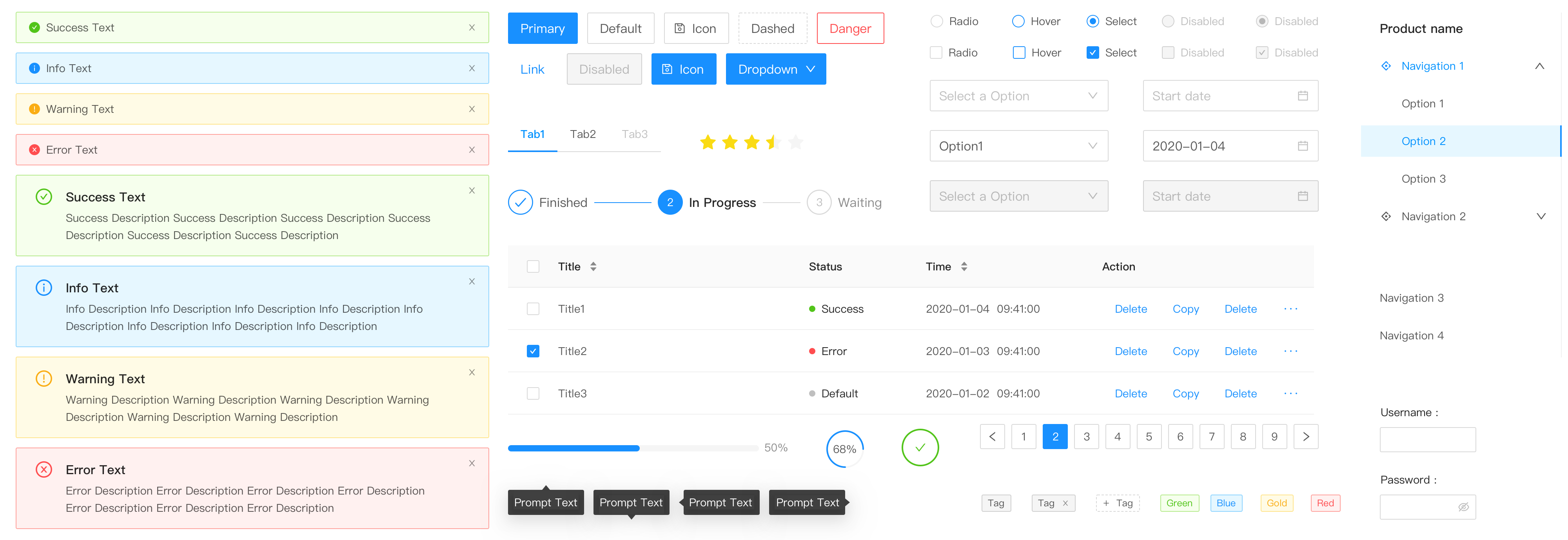
What is ng-zorro-antd?
ng-zorro-antd is a UI component library for Angular applications, based on the Ant Design system. It provides a wide range of high-quality, customizable components that follow the Ant Design guidelines, making it easier to build consistent and visually appealing user interfaces.
What are ng-zorro-antd's main functionalities?
Button
The Button component is used to trigger actions or events. It supports different types, sizes, and states.
<button nz-button nzType="primary">Primary Button</button>
Table
The Table component is used to display data in a tabular format. It supports features like sorting, pagination, and filtering.
<nz-table [nzData]="dataSet" [nzColumns]="columns"></nz-table>
Form
The Form component is used to create and manage forms. It supports validation, layout, and various input types.
<form nz-form [formGroup]="validateForm" (ngSubmit)="submitForm()"><nz-form-item><nz-form-label [nzSpan]="4" nzFor="userName">Username</nz-form-label><nz-form-control [nzSpan]="8"><input nz-input formControlName="userName" id="userName" /></nz-form-control></nz-form-item></form>
Modal
The Modal component is used to display content in a layer above the current page. It supports various configurations like title, footer, and actions.
<button nz-button (click)="isVisible = true">Show Modal</button><nz-modal [(nzVisible)]="isVisible" nzTitle="Modal Title" (nzOnCancel)="handleCancel()" (nzOnOk)="handleOk()"><p>Modal Content</p></nz-modal>
Notification
The Notification component is used to display messages to the user. It supports different types of notifications like success, error, and info.
this.notification.blank('Notification Title', 'This is the content of the notification.');
Other packages similar to ng-zorro-antd
primeng
PrimeNG is a collection of rich UI components for Angular. It offers a wide range of components similar to ng-zorro-antd, but with a different design philosophy and additional features like charts and drag-and-drop.
angular-material
Angular Material is a UI component library for Angular based on Google's Material Design. It provides a set of reusable, well-tested, and accessible UI components, but with a different design language compared to ng-zorro-antd.
ngx-bootstrap
ngx-bootstrap provides Bootstrap components powered by Angular. It offers a different set of components and styling compared to ng-zorro-antd, focusing on Bootstrap's design system.

NG-ZORRO

English | 简体中文
✨ Features
- An enterprise-class UI design system for Angular applications.
- 60+ high-quality Angular components out of the box.
- Written in TypeScript with predictable static types.
- The whole package of development and design resources and tools.
- Support OnPush mode, high performance.
- Powerful theme customization in every detail.
- Internationalization support for dozens of languages.
☀️ License
MIT

🖥 Environment Support

IE / Edge | 
Firefox | 
Chrome | 
Safari | 
Opera | 
Electron |
|---|
| Edge | last 2 versions | last 2 versions | last 2 versions | last 2 versions | last 2 versions |
🎨 Design Specification
ng-zorro-antd synchronizes design specification with Ant Design on a regular basis, you can check the log online.
📦 Installation
We recommend using @angular/cli to install. It not only makes development easier, but also allows you to take advantage of the rich ecosystem of angular packages and tooling.
$ ng new PROJECT_NAME
$ cd PROJECT_NAME
$ ng add ng-zorro-antd
More information about @angular/cli here.
You can also install ng-zorro-antd with npm or yarn
$ npm install ng-zorro-antd
🔨 Usage
Import the component modules you want to use into your app.module.ts file and feature modules.
import { NzButtonModule } from 'ng-zorro-antd/button';

@NgModule({
  imports: [ NzButtonModule ]
})
export class AppModule {
}
@angular/cli users won't have to worry about the things below but it's good to know.
And import style and SVG icon assets file link in angular.json.
{
  "assets": [
+   {
+     "glob": "**/*",
+     "input": "./node_modules/@ant-design/icons-angular/src/inline-svg/",
+     "output": "/assets/"
+   }
  ],
  "styles": [
+   "node_modules/ng-zorro-antd/ng-zorro-antd.min.css"
  ]
}
See Getting Started for more details.
🔗 Links
⌨️ Development
$ git clone git@github.com:NG-ZORRO/ng-zorro-antd.git
$ cd ng-zorro-antd
$ npm install
$ npm run start
Browser would open automatically.
🤝 Contributing

We welcome all contributions. Please read our CONTRIBUTING.md first. You can submit any ideas as pull requests or as GitHub issues.
If you're new to posting issues, we ask that you read How To Ask Questions The Smart Way (This guide does not provide actual support services for this project!), How to Ask a Question in Open Source Community and How to Report Bugs Effectively prior to posting. Well written bug reports help us help you!
Thanks to JetBrains for supporting us free open source licenses.

For questions on how to use ng-zorro-antd, please post questions to  using the
 ng-zorro-antd tag. If you're not finding what you need on stackoverflow, you can find us on  as well.
As always, we encourage experienced users to help those who are not familiar with ng-zorro-antd!
🎉 Users
We list some users here, if your company or product uses NG-ZORRO, let us know here!
Love ng-zorro-antd? Give our repo a star :star: :arrow_up:.


