Security News
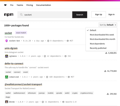
npm Updates Search Experience with New Objective Sorting Options
npm has a revamped search experience with new, more transparent sorting options—Relevance, Downloads, Dependents, and Publish Date.
ngx-bootstrap
Advanced tools
ngx-bootstrap is a popular Angular library that provides Bootstrap components powered by Angular. It allows developers to use Bootstrap's UI components in their Angular applications with ease, offering a wide range of features and customization options.
Alerts
The Alerts component allows you to display different types of alert messages such as success, info, warning, and danger. This is useful for providing feedback to users.
<alert type="success">Success Alert</alert>Modals
The Modals component allows you to create and manage modal dialogs. This is useful for displaying additional information or forms without navigating away from the current page.
<button type="button" class="btn btn-primary" (click)="openModal()">Open Modal</button>
<ng-template #template>
  <div class="modal-body">
    <p>Modal content goes here.</p>
  </div>
</ng-template>
Datepicker
The Datepicker component provides a user-friendly way to select dates. It supports various configurations and customizations to fit different use cases.
<input type="text" class="form-control" bsDatepicker>Tabs
The Tabs component allows you to create tabbed interfaces. This is useful for organizing content into separate sections that can be easily navigated by users.
<tabset>
  <tab heading="Tab 1">Content of Tab 1</tab>
  <tab heading="Tab 2">Content of Tab 2</tab>
</tabset>
Tooltips
The Tooltips component provides a way to display additional information when users hover over or focus on an element. This is useful for providing contextual help or explanations.
<button type="button" class="btn btn-secondary" tooltip="Tooltip text">Hover me</button>ng-bootstrap provides Bootstrap components for Angular without the need for jQuery. It offers a similar set of features to ngx-bootstrap but is designed to work seamlessly with Angular's reactive forms and other Angular-specific features.
PrimeNG is a comprehensive UI component library for Angular that includes a wide range of components such as data tables, charts, and form controls. It offers more components than ngx-bootstrap but may have a steeper learning curve.
Angular Material is the official Material Design component library for Angular. It provides a set of high-quality, reusable UI components based on Google's Material Design guidelines. It offers a different design aesthetic compared to Bootstrap.

Best way to quickly integrate Bootstrap 3 or Bootstrap 4 Components with Angular
ngx-bootstrap provides Bootstrap components powered by Angular, so you don't need to include original JS components.
Check our Getting started guide if it's your first project with Angular Bootstrap.
Bootstrap components for Angular applications, dozens of demos and API documentation could be found here: https://valor-software.com/ngx-bootstrap/.
ngx-bootstrap is an Open Source (MIT Licensed) project, it's an independent project with ongoing development made possible thanks to the support of our awesome backers. If you also would like to show support or simply give back to Open Source community, please consider becoming a backer sponsor of ngx-bootstrap on OpenCollective.
All donated funds are managed transparently on OpenCollective and will be used solely for compensating work and expenses for contributors. Valor Software employees and contractors are not eligible to use these funds.
What's there for you? Proper recognition and exposure of your name/logo/website on our page. Our main sponsors will be presented under this section! Be the first!
Use the Angular CLI ng add command for updating your Angular project.
ng add ngx-bootstrap
Install ngx-bootstrap from npm:
npm install ngx-bootstrap --save
Add wanted package to NgModule imports:
import { TooltipModule } from 'ngx-bootstrap/tooltip';

@NgModule({
  ...
  imports: [TooltipModule.forRoot(),...]
  ...
})
Add component to your page:
<button type="button" class="btn btn-primary"
        tooltip="Vivamus sagittis lacus vel augue laoreet rutrum faucibus.">
  Simple demo
</button>
You will need to add bootstrap css:
Bootstrap 3<!-- index.html -->
<link href="https://maxcdn.bootstrapcdn.com/bootstrap/3.3.7/css/bootstrap.min.css" rel="stylesheet">
Bootstrap 4<!--- index.html -->
<link href="https://maxcdn.bootstrapcdn.com/bootstrap/4.5.3/css/bootstrap.min.css" rel="stylesheet">
As you may know ngx-bootstrap support several bootstrap.css versions at the same time and has automatic tool to guess current used version of library, but if this guess fails you can specify version of bootstrap.css manually.
Sometimes, your project might contain some library that could interfere with the bootstrap framework, or you might have a customized version of bootstrap. The consequence is that the process of determining bootstrap version might be failed, which can break the UI. In that case, we can still set the bootstrap version manually in the bootstrapping component (i.e. AppComponent):
import { setTheme } from 'ngx-bootstrap/utils';

@Component({...})
export class AppComponent {
  constructor() {
    setTheme('bs3'); // or 'bs4'
    ...
  }
}
First time:
git clone https://github.com/valor-software/ngx-bootstrap.git
cd ngx-bootstrap
npm ci
npm run build
npm start
The only two dependencies are Angular and Bootstrap CSS. Here is the versions compatibility list:
| ngx-bootstrap | Angular | Bootstrap CSS |
|---|---|---|
| 6.0.0 | 9.x.x - 10.x.x | 3.x.x or 4.x.x |
| 5.6.x | 7.x.x - 9.1.0 | 3.x.x or 4.x.x |
| 5.0.0 - 5.6.0 | 7.x.x - 8.x.x | 3.x.x or 4.x.x |
| 4.x.x | 6.x.x - 7.x.x | 3.x.x or 4.x.x |
| 3.x.x | 6.x.x - 7.x.x | 3.x.x or 4.x.x |
| 2.x.x | 2.x.x - 4.x.x | 3.x.x or 4.x.x |
| 1.x.x | 2.x.x | 3.x.x or 4.x.x |
So if you are in trouble, here's where you can look for help.
The best place to ask questions is on StackOverflow (under the ngx-bootstrap tag)
You can also join our Slack channel and link your stackoverflow question there. But try to avoid asking generic help questions directly on Slack since they can easily get lost in the chat. You can also search among the existing GitHub issues.
If, and only if, none of the above helped, please open a new issue.
All contributions very welcome! And remember, contribution is not only PRs and code, but any help with docs or helping other developers to solve issues are very appreciated! Thanks in advance!
Please read our contribution guidelines.
Crossbrowser testing sponsored by Saucelabs
End-to-end testing sponsored by Cypress
7.1.2 (2021-09-24)
FAQs
Angular Bootstrap
The npm package ngx-bootstrap receives a total of 225,925 weekly downloads. As such, ngx-bootstrap popularity was classified as popular.
We found that ngx-bootstrap demonstrated a healthy version release cadence and project activity because the last version was released less than a year ago. It has 3 open source maintainers collaborating on the project.
Did you know?

Socket for GitHub automatically highlights issues in each pull request and monitors the health of all your open source dependencies. Discover the contents of your packages and block harmful activity before you install or update your dependencies.

Security News
npm has a revamped search experience with new, more transparent sorting options—Relevance, Downloads, Dependents, and Publish Date.

Security News
A supply chain attack has been detected in versions 1.95.6 and 1.95.7 of the popular @solana/web3.js library.

Research
Security News
A malicious npm package targets Solana developers, rerouting funds in 2% of transactions to a hardcoded address.