What is notistack?
notistack is a highly customizable notification library for React. It allows you to display snackbars (toasts) with ease and provides a variety of options for customization, including positioning, duration, and styling.
What are notistack's main functionalities?
Basic Snackbar
This code demonstrates how to display a basic snackbar using notistack. The `SnackbarProvider` component wraps the application, and the `useSnackbar` hook is used to trigger the snackbar.
import React from 'react';
import { SnackbarProvider, useSnackbar } from 'notistack';
function App() {
const { enqueueSnackbar } = useSnackbar();
const handleClick = () => {
enqueueSnackbar('This is a basic snackbar');
};
return (
<div>
<button onClick={handleClick}>Show Snackbar</button>
</div>
);
}
export default function IntegrationNotistack() {
return (
<SnackbarProvider maxSnack={3}>
<App />
</SnackbarProvider>
);
}
Custom Snackbar Variants
This code demonstrates how to display snackbars with different variants (success, error, warning, info) using notistack. The `enqueueSnackbar` function is called with a variant option to customize the type of snackbar.
import React from 'react';
import { SnackbarProvider, useSnackbar } from 'notistack';

function App() {
  const { enqueueSnackbar } = useSnackbar();

  const handleClickVariant = (variant) => () => {
    enqueueSnackbar('This is a ' + variant + ' snackbar', { variant });
  };

  return (
    <div>
      <button onClick={handleClickVariant('success')}>Show Success Snackbar</button>
      <button onClick={handleClickVariant('error')}>Show Error Snackbar</button>
      <button onClick={handleClickVariant('warning')}>Show Warning Snackbar</button>
      <button onClick={handleClickVariant('info')}>Show Info Snackbar</button>
    </div>
  );
}

export default function IntegrationNotistack() {
  return (
    <SnackbarProvider maxSnack={3}>
      <App />
    </SnackbarProvider>
  );
}
Custom Snackbar Styling
This code demonstrates how to apply custom styling to a snackbar using notistack. The `makeStyles` function from Material-UI is used to create custom styles, which are then applied to the snackbar via the `enqueueSnackbar` function.
import React from 'react';
import { SnackbarProvider, useSnackbar } from 'notistack';
import { makeStyles } from '@material-ui/core/styles';

const useStyles = makeStyles((theme) => ({
  customSnackbar: {
    backgroundColor: theme.palette.primary.main,
    color: theme.palette.primary.contrastText,
  },
}));

function App() {
  const classes = useStyles();
  const { enqueueSnackbar } = useSnackbar();

  const handleClick = () => {
    enqueueSnackbar('This is a custom styled snackbar', {
      classes: {
        root: classes.customSnackbar,
      },
    });
  };

  return (
    <div>
      <button onClick={handleClick}>Show Custom Styled Snackbar</button>
    </div>
  );
}

export default function IntegrationNotistack() {
  return (
    <SnackbarProvider maxSnack={3}>
      <App />
    </SnackbarProvider>
  );
}
Other packages similar to notistack
react-toastify
react-toastify is another popular library for displaying toast notifications in React applications. It offers a simple API and a variety of customization options. Compared to notistack, react-toastify is more focused on ease of use and quick setup, while notistack provides more advanced customization and control over the snackbars.
material-ui
Material-UI is a comprehensive library of React components that implement Google's Material Design. It includes a Snackbar component that can be used for notifications. While Material-UI's Snackbar is powerful and integrates well with other Material-UI components, notistack offers a more specialized and flexible solution for managing snackbars, including stacking and dismissing multiple notifications.
react-notifications-component
react-notifications-component is a library for creating customizable notifications in React. It supports various types of notifications and provides a range of customization options. Compared to notistack, react-notifications-component offers a broader range of notification types but may not provide the same level of integration and ease of use for snackbars specifically.
Notistack: Display notifications with call of a function.
Easy to use, customizable, smooth transitions, stack and queue them up!
| Stacking behaviour | Dismiss oldest when reached maxSnack (3 here) |
|---|
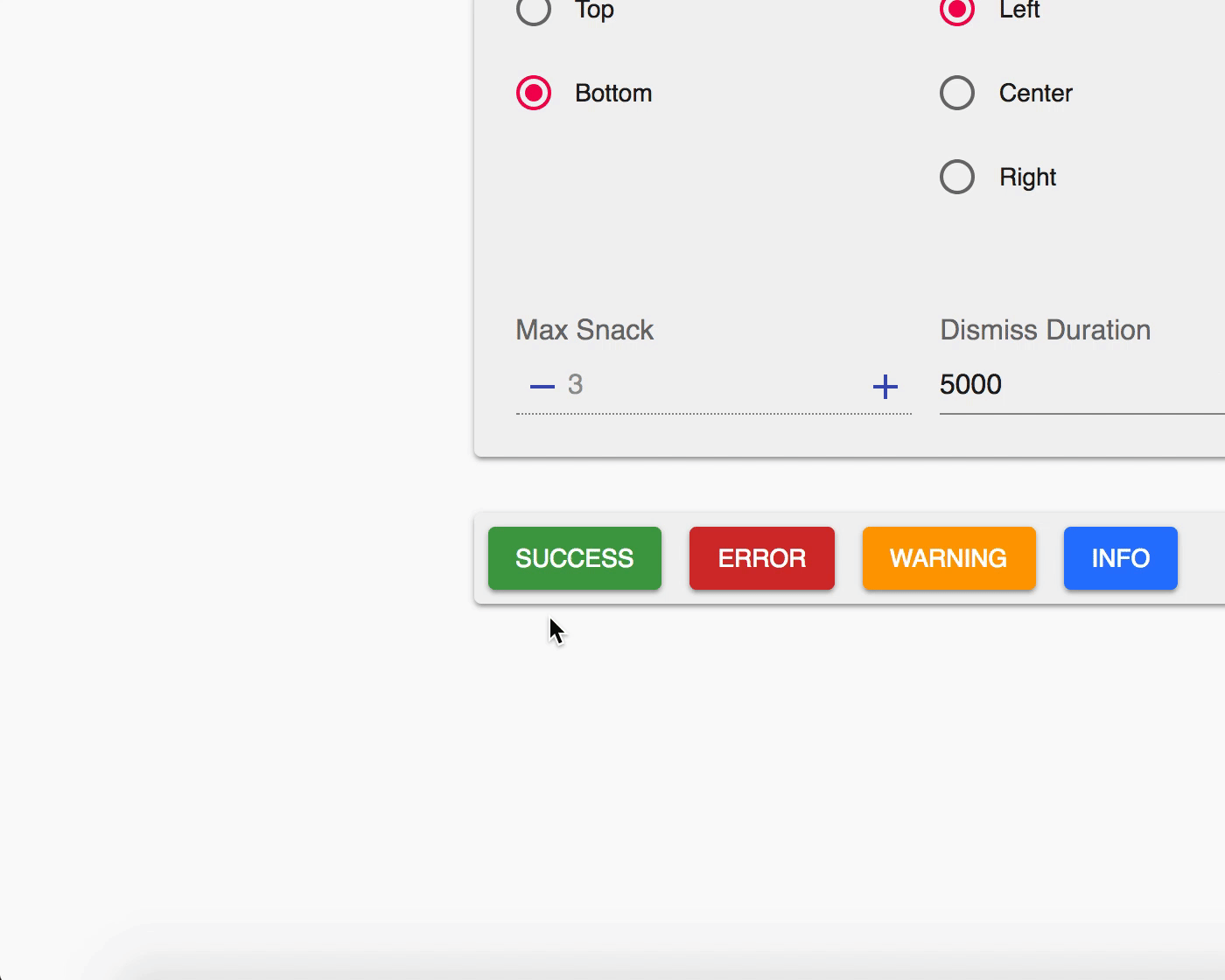 |  |
Table of Contents
Getting Started
Use your preferred package manager:
npm install notistack
yarn add notistack
Version guide
| Version | Notes |
|---|
v3.x.x | Latest stable release. Standalone (i.e. not dependent on material-ui) |
<= v2.0.8 | Requires Material-UI v5 as peer dependency. npm install notistack@2.0.8 |
<= 1.0.10 | Requires Material-UI <= v4 as peer dependency. npm install notistack@latest-mui-v4 |
How to use
Instantiate a SnackbarProvider component and start showing snackbars: (see docs for a full list of available props)
import { SnackbarProvider, enqueueSnackbar } from 'notistack';

const App = () => {
  return (
    <div>
      <SnackbarProvider />
      <button onClick={() => enqueueSnackbar('That was easy!')}>Show snackbar</button>
    </div>
  );
};
Alternatively, You can use useSnackbar hook to display Snackbars. Just remember to wrap your app inside of a SnackbarProvider to have access to the hook context:
import { SnackbarProvider, useSnackbar } from 'notistack';
<SnackbarProvider>
<App />
<MyButton />
</SnackbarProvider>
const MyButton = () => {
const { enqueueSnackbar, closeSnackbar } = useSnackbar();
return <Button onClick={() => enqueueSnackbar('I love hooks')}>Show snackbar</Button>;
};
Online demo
Visit the documentation website to see all the examples.
Or play with a minimal working example: codesandbox
Contribution
Open an issue and your problem will be solved.
Author - Contact
Hossein Dehnokhalaji


