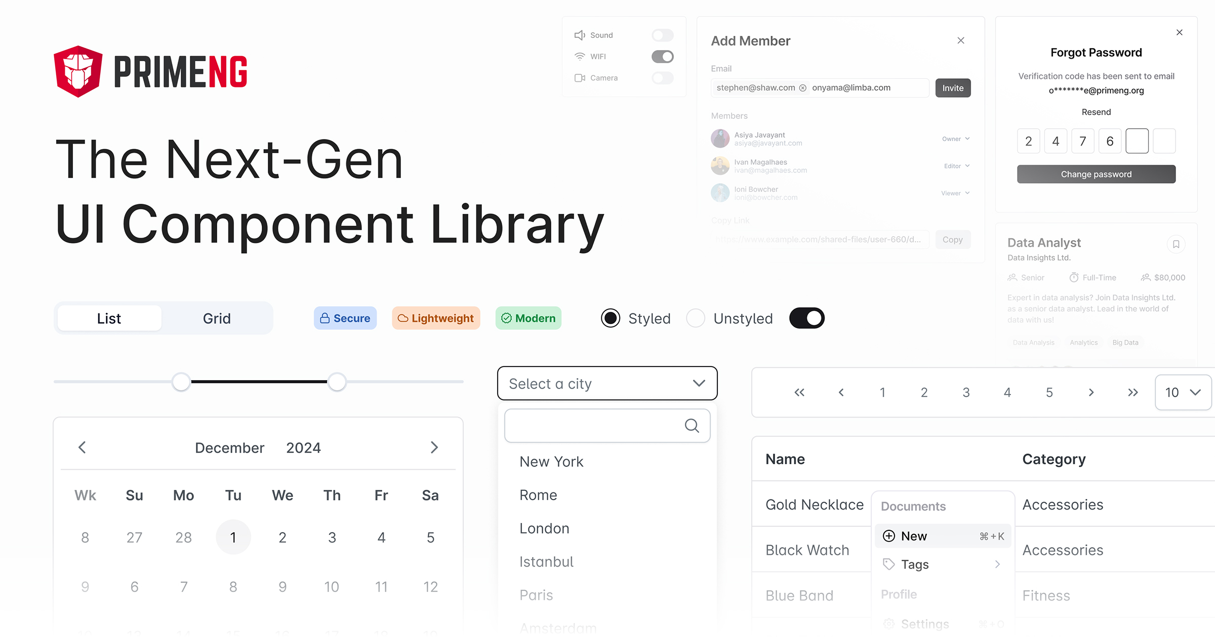
What is primeng?
PrimeNG is a comprehensive UI component library for Angular applications. It offers a wide range of components that are designed to be highly customizable and easy to integrate into Angular projects. PrimeNG covers various UI needs, from basic elements like buttons and forms to complex data tables and charts.
What are primeng's main functionalities?
DataTable
The DataTable component is used to display and manipulate tabular data. It supports features like sorting, pagination, and filtering.
{
"template": "<p-table [value]='cars'> <ng-template pTemplate='header'> <tr> <th>Vin</th> <th>Year</th> <th>Brand</th> <th>Color</th> </tr> </ng-template> <ng-template pTemplate='body' let-car> <tr> <td>{{car.vin}}</td> <td>{{car.year}}</td> <td>{{car.brand}}</td> <td>{{car.color}}</td> </tr> </ng-template> </p-table>",
"component": "import { Component } from '@angular/core'; @Component({ selector: 'app-root', templateUrl: './app.component.html' }) export class AppComponent { cars = [ { vin: 'a1653d4d', year: 1998, brand: 'VW', color: 'White' }, { vin: 'ddeb9b10', year: 1985, brand: 'Mercedes', color: 'Green' }, { vin: 'd8ebe413', year: 1995, brand: 'Jaguar', color: 'Silver' } ]; }"
}
Chart
The Chart component allows you to create various types of charts, such as pie, bar, and line charts, using the Chart.js library.
{
  "template": "<p-chart type='pie' [data]='data'></p-chart>",
  "component": "import { Component } from '@angular/core'; @Component({ selector: 'app-root', templateUrl: './app.component.html' }) export class AppComponent { data = { labels: ['A', 'B', 'C'], datasets: [ { data: [300, 50, 100], backgroundColor: ['#FF6384', '#36A2EB', '#FFCE56'], hoverBackgroundColor: ['#FF6384', '#36A2EB', '#FFCE56'] } ] }; }"
}
Dialog
The Dialog component is used to display modal dialogs. It supports features like custom headers, footers, and various animations.
{
  "template": "<p-dialog header='Title' [(visible)]='display'> <p>Content goes here...</p> </p-dialog> <button type='button' (click)='showDialog()'>Show</button>",
  "component": "import { Component } from '@angular/core'; @Component({ selector: 'app-root', templateUrl: './app.component.html' }) export class AppComponent { display: boolean = false; showDialog() { this.display = true; } }"
}
Other packages similar to primeng
ng-zorro-antd
NG-ZORRO is an Ant Design component library for Angular. It provides a wide range of high-quality components that are designed to be used in enterprise-level applications. Compared to PrimeNG, NG-ZORRO focuses more on providing a consistent design language and is based on the Ant Design system.
angular-material
Angular Material is the official Material Design component library for Angular. It offers a set of reusable UI components based on Google's Material Design guidelines. While PrimeNG provides a broader range of components, Angular Material focuses on delivering a consistent and modern look and feel.
clarity-angular
Clarity is a design system by VMware that includes a component library for Angular. It provides a set of well-designed, accessible, and customizable components. Clarity focuses on usability and accessibility, making it a good choice for enterprise applications. Compared to PrimeNG, Clarity has a more opinionated design system.


