What is rc-calendar?
The rc-calendar package is a React component library for creating and managing calendar functionalities. It provides a variety of features for date selection, date range selection, and custom calendar configurations.
What are rc-calendar's main functionalities?
Basic Date Picker
This feature allows you to render a basic date picker component. Users can select a single date from the calendar.
import React from 'react';
import Calendar from 'rc-calendar';
const BasicDatePicker = () => (
<Calendar />
);
export default BasicDatePicker;
Date Range Picker
This feature allows you to render a date range picker component. Users can select a range of dates from the calendar.
import React from 'react';
import Calendar from 'rc-calendar';
import RangeCalendar from 'rc-calendar/lib/RangeCalendar';

const DateRangePicker = () => (
  <RangeCalendar />
);

export default DateRangePicker;
Customizable Calendar
This feature allows you to customize the calendar component. For example, you can show week numbers and disable past dates.
import React from 'react';
import Calendar from 'rc-calendar';

const CustomCalendar = () => (
  <Calendar
    showWeekNumber={true}
    disabledDate={(current) => current && current < Date.now()}
  />
);

export default CustomCalendar;
Other packages similar to rc-calendar
react-datepicker
react-datepicker is a popular React component for date picking. It offers a wide range of features including date and time selection, date range selection, and custom date formats. Compared to rc-calendar, react-datepicker has a more modern design and additional customization options.
react-day-picker
react-day-picker is a flexible date picker component for React. It supports single date selection, date range selection, and custom modifiers for dates. It is highly customizable and offers a more lightweight solution compared to rc-calendar.
react-calendar
react-calendar is a simple and easy-to-use calendar component for React. It supports date selection, date range selection, and custom tile content. It is less feature-rich compared to rc-calendar but provides a straightforward and clean interface.
rc-calendar
calendar ui component for react, port from https://github.com/modulex/date-picker


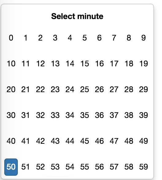
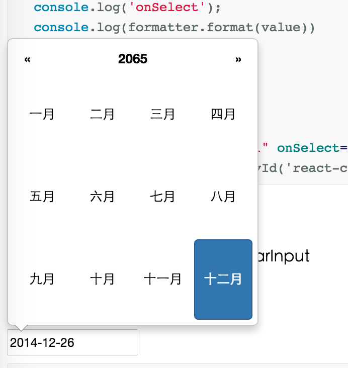
Screenshots


Feature
- support ie8,ie8+,chrome,firefox,safari
- support date, month, year, decade select panel
- support week number
- support en-us and zh-cn locale (ui and timeOffset)
- support aria and keyboard accessibility
Keyboard
- Previous month (PageUp)
- Next month (PageDown)
- tab into hour input: Last hour(Up), Next hour(Down)
- tab into hour input: Last minute(Up), Next minute(Down)
- tab into hour input: Last second(Up), Next second(Down)
- Last year (Control + left)
- Next year (Control + right)
install

Usage
import Calendar from 'rc-calendar';
import React from 'react';
React.render(<Calendar />, container);
Development
npm install
npm start
Example
http://localhost:8001/examples/
online example:
http://react-component.github.io/calendar/examples/index.html
API
Calendar props
| name | type | default | description |
|---|
| prefixCls | String | | prefixCls of this component |
| className | String | | additional css class of root dom node |
| style | Object | | additional style of root dom node |
| value | GregorianCalendar | | current value like input's value |
| defaultValue | GregorianCalendar | | defaultValue like input's defaultValue |
| orient | String[] | | affect the position of arrow. exp: ['left','top'] |
| locale | Object | import from 'rc-calendar/lib/locale/en-us' | calendar locale |
| disabledDate | Function(current:GregorianCalendar):Boolean | null | whether to disable select of current date |
| showWeekNumber | Boolean | false | whether to show week number of year |
| showToday | Boolean | true | whether to show today button |
| showTime | Boolean | true | whether to support time select |
| focused | Boolean | false | whether to focus on render |
| onSelect | Function(GregorianCalendar date) | function(){} | called when a date is selected from calendar |
| onBlur | Function() | function(){} | called when calendar loose focus |
Calendar.Picker props
| name | type | default | description |
|---|
| prefixCls | String | | prefixCls of this component |
| calendar | Calendar React Element | | |
| disabled | Boolean | | whether picker is disabled |
| adjustOrientOnCalendarOverflow | Boolean | true | whether adjust calendar orient if there is not enough space to show. better false if animation is 'slide-up' |
| animation | String | | index.css support 'slide-up' |
| transitionName | String | | css class for animation |
| renderCalendarToBody | Boolean | false | whether render picker's calendar to document.body |
| formatter | GregorianCalendarFormatter | | use to format/parse value to/from input |
| trigger | React.Element | | additional trigger appended to picker |
| value | GregorianCalendar | | current value like input's value |
| defaultValue | GregorianCalendar | | defaultValue like input's defaultValue |
| onChange | Function | | called when select a different value |
Test Case
http://localhost:8001/tests/runner.html?coverage
Coverage
http://localhost:8001/node_modules/rc-server/node_modules/node-jscover/lib/front-end/jscoverage.html?w=http://localhost:8001/tests/runner.html?coverage
License
rc-calendar is released under the MIT license.


