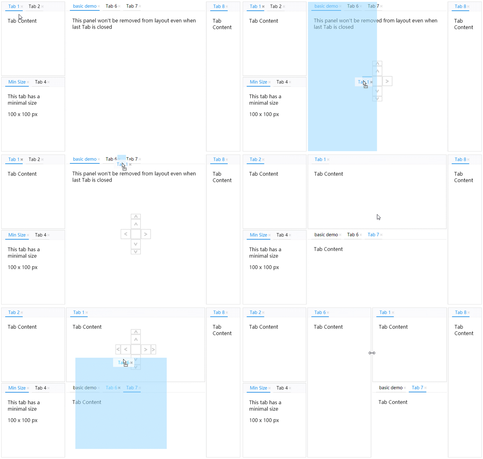
Dock Layout for React Component

Examples
https://ticlo.github.io/rc-dock/examples/
Usage

import DockLayout from 'rc-dock'
...
defaultLayout = {
dockbox: {
mode: 'horizontal',
children: [
{
tabs: [
{id: 'tab1', title: 'tab1', content: <div>Hello World</div>}
]
}
]
}
};
render() {
return <DockLayout defaultLayout={defaultLayout}/>
}
defaultLayout types
DefaultLayout
| Property | Type | Comments | Default |
|---|
| dockbox | BoxData | main dock box | required |
| floatbox | BoxData | main float box, children can only be PanelData | empty BoxData |
| groups | {[key]: TabGroup} | additional group information | {} |
BoxData
a box is the layout element that contains other boxes or panels
| Property | Type | Comments | Default |
|---|
| id | string | unique id | auto generated |
| size | number | size in dock group, used as width in h-box and used as height in v-box | 200 |
| mode | 'horizontal' | 'vertical' | 'float' | layout mode of the box | |
| children | (BoxData | PanelData)[] | children boxes or panels | required |
PanelData
a panel is a visiaul container with tabs button in the title bar
| Property | Type | Comments | Default |
|---|
| id | string | unique id | auto generated |
| size | number | size in dock group, used as width in h-box and used as height in v-box | 200 |
| group | string | name for the tab group | group of the first tab |
| tabs | TabData[] | children tabs | required |
| panelLock | PanelLock | addition information of a panel, this prevents the panel from being removed when there is no tab inside, a locked panel can not be moved to float layer either | |
| x | number | x position, only used in float mode | |
| y | number | y position, only used in float mode | |
| z | number | z index, only used in float mode | 0 |
| w | number | width, only used in float mode | |
| h | number | height, only used in float mode | |
TabData
| Property | Type | Comments | Default |
|---|
| id | string | unique id | required |
| title | string | ReactElement | tab title | required |
| content | ReactElement | (tab: TabData) => ReactElement | tab content | required |
| closable | bool | whether tab can be closed | false |
| cached | bool | cached tab will always reuse the react component thus allows the component to keep its internal state | false |
| cacheContext | React Context | cached tab is disconnected with parent react component, if react context is needed in the cached tab, the context type need to be specified here | |
| group | string | tabs with different tab group can not be put in same panel, more options for the group can be defined as TabGroup in DefaultLayout.groups | |


