| className | additional css class of root dom node | String | '' |
| prefixCls | prefix class | String | '' |
| animation | dropdown animation name. only support slide-up now | String | '' |
| transitionName | dropdown css animation name | String | '' |
| choiceTransitionName | css animation name for selected items at multiple mode | String | '' |
| dropdownMatchSelectWidth | whether dropdown's with is same with select. Default set min-width same as input | bool | true |
| dropdownClassName | additional className applied to dropdown | String | - |
| dropdownStyle | additional style applied to dropdown | Object | {} |
| onDropdownVisibleChange | control dropdown visible | function | () => { return true; } |
| notFoundContent | specify content to show when no result matches. | String | 'Not Found' |
| showSearch | whether show search input in single mode | bool | true |
| allowClear | whether allowClear | bool | false |
| maxTagTextLength | max tag text length to show | number | - |
| maxTagCount | max tag count to show | number | - |
| maxCount | Limit the maximum number of items that can be selected in multiple mode | number | - |
| maxTagPlaceholder | placeholder for omitted values | ReactNode/function(omittedValues) | - |
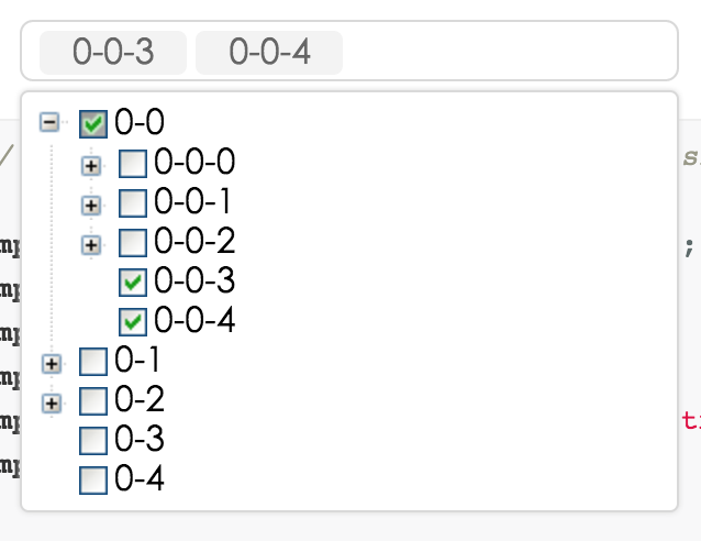
| multiple | whether multiple select (true when enable treeCheckable) | bool | false |
| disabled | whether disabled select | bool | false |
| searchValue | work with onSearch to make search value controlled. | string | '' |
| defaultValue | initial selected treeNode(s) | same as value type | - |
| value | current selected treeNode(s). | normal: String/Array. labelInValue: {value:String,label:React.Node}/Array<{value,label}>. treeCheckStrictly(halfChecked default false): {value:String,label:React.Node, halfChecked}/Array<{value,label,halfChecked}>. | - |
| labelInValue | whether to embed label in value, see above value type | Bool | false |
| onChange | called when select treeNode or input value change | function(value, label(null), extra) | - |
| onSelect | called when select treeNode | function(value, node, extra) | - |
| onSearch | called when input changed | function | - |
| onTreeExpand | called when tree node expand | function(expandedKeys) | - |
| onPopupScroll | called when popup scroll | function(event) | - |
| showCheckedStrategy | TreeSelect.SHOW_ALL: show all checked treeNodes (Include parent treeNode). TreeSelect.SHOW_PARENT: show checked treeNodes (Just show parent treeNode). Default just show child. | enum{TreeSelect.SHOW_ALL, TreeSelect.SHOW_PARENT, TreeSelect.SHOW_CHILD } | TreeSelect.SHOW_CHILD |
| treeIcon | show tree icon | bool | false |
| treeLine | show tree line | bool | false |
| treeDefaultExpandAll | default expand all treeNode | bool | false |
| treeDefaultExpandedKeys | default expanded treeNode keys | Array | - |
| treeExpandedKeys | set tree expanded keys | Array | - |
| treeExpandAction | Tree open logic, optional: false | click | doubleClick, same as expandAction of rc-tree | string | boolean | click |
| treeCheckable | whether tree show checkbox (select callback will not fire) | bool | false |
| treeCheckStrictly | check node precisely, parent and children nodes are not associated | bool | false |
| filterTreeNode | whether filter treeNodes by input value. default filter by treeNode's treeNodeFilterProp prop's value | bool/Function(inputValue:string, treeNode:TreeNode) | Function |
| treeNodeFilterProp | which prop value of treeNode will be used for filter if filterTreeNode return true | String | 'value' |
| treeNodeLabelProp | which prop value of treeNode will render as content of select | String | 'title' |
| treeData | treeNodes data Array, if set it then you need not to construct children TreeNode. (value should be unique across the whole array) | array<{value,label,children, [disabled,selectable]}> | [] |
| treeDataSimpleMode | enable simple mode of treeData.(treeData should be like this: [{id:1, pId:0, value:'1', label:"test1",...},...], pId is parent node's id) | bool/object{id:'id', pId:'pId', rootPId:null} | false |
| treeTitleRender | Custom render nodes | (nodeData: OptionType) => ReactNode | |
| loadData | load data asynchronously | function(node) | - |
| getPopupContainer | container which popup select menu rendered into | function(trigger:Node):Node | function(){return document.body;} |
| autoClearSearchValue | auto clear search input value when multiple select is selected/deselected | boolean | true |
| suffixIcon | specify the select arrow icon | ReactNode | (props: TreeProps) => ReactNode | - |
| clearIcon | specify the clear icon | ReactNode | (props: TreeProps) => ReactNode | - |
| removeIcon | specify the remove icon | ReactNode | (props: TreeProps) => ReactNode | - |
| switcherIcon | specify the switcher icon | ReactNode | (props: TreeProps) => ReactNode | - |
| virtual | Disable virtual when false | false | - |


