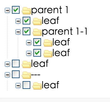
What is rc-tree?
The rc-tree npm package is a React component for displaying tree views. It provides flexible and efficient tree components with customizable nodes, drag-and-drop functionality, checkable nodes, and event handling for various actions like select, check, load data asynchronously, and more. It's suitable for implementing features like file systems, nested menus, or any hierarchical data representation.
What are rc-tree's main functionalities?
Basic Tree Structure
This feature allows the creation of a basic tree structure with nested nodes. The `treeData` prop defines the hierarchical structure of the tree.
import Tree from 'rc-tree';
const treeData = [{
title: 'parent 1',
key: '0-0',
children: [{
title: 'child 1-1',
key: '0-0-1',
children: [{
title: 'leaf',
key: '0-0-1-1'
}]
}, {
title: 'child 1-2',
key: '0-0-2',
children: [{
title: 'leaf',
key: '0-0-2-1'
}]
}]
}];
<Tree treeData={treeData} />
Drag-and-Drop
Enables drag-and-drop functionality within the tree, allowing users to reorder nodes by dragging them. Event handlers like `onDragEnter` and `onDrop` can be used to manage the drag-and-drop process.
import Tree from 'rc-tree';

<Tree
  treeData={treeData}
  draggable
  onDragEnter={info => console.log('enter:', info)}
  onDrop={info => console.log('drop:', info)}
/>
Checkable Nodes
This feature adds checkboxes to tree nodes, making them selectable. The `onCheck` event handler is triggered when checkboxes are checked or unchecked, allowing for custom handling of these events.
import Tree from 'rc-tree';

<Tree
  checkable
  onCheck={checkedKeys => console.log('onCheck', checkedKeys)}
  treeData={treeData}
/>
Async Data Loading
Supports loading data asynchronously for nodes. This is useful for loading child nodes on demand, for example, when a node is expanded. The `loadData` function is called to fetch child nodes asynchronously.
import Tree from 'rc-tree';

const loadData = treeNode =>
  new Promise(resolve => {
    setTimeout(() => {
      resolve();
    }, 1000);
  });

<Tree loadData={loadData} treeData={treeData} />
Other packages similar to rc-tree
react-sortable-tree
A package that provides a higher-order component for creating sortable drag-and-drop trees. It offers similar drag-and-drop capabilities but focuses more on the sorting aspect within the tree structure, compared to rc-tree's broader feature set.
antd
While not exclusively a tree component library, Ant Design (antd) includes a Tree component with features similar to rc-tree, such as drag-and-drop, checkable nodes, and async data loading. Ant Design's Tree component is styled according to the Ant Design system, providing a consistent look and feel for applications using Ant Design.
rc-tree
tree ui component for react


Screenshots

Feature
- support ie8,ie8+,chrome,firefox,safari
Example
http://localhost:8018/examples/
online example: http://react-component.github.io/tree/examples/
install

Usage
see examples
API
Tree props
| name | description | type | default |
|---|
| className | additional css class of root dom node | String | '' |
| prefixCls | prefix class | String | '' |
| showLine | whether show line | bool | true |
| showIcon | whether show icon | bool | true |
| multiple | whether multiple select | bool | false |
| checkable | whether support checked | bool/React Node | false |
| defaultExpandAll | expand all treeNodes | bool | false |
| defaultExpandedKeys | expand specific treeNodes | String[] | false |
| checkedKeys | Controlled checked treeNodes(After setting, defaultCheckedKeys will not work) | String[] | [] |
| defaultCheckedKeys | default checked treeNodes | String[] | [] |
| selectedKeys | Controlled selected treeNodes(After setting, defaultSelectedKeys will not work) | String[] | [] |
| defaultSelectedKeys | default selected treeNodes | String[] | [] |
| onCheck | click the treeNode/checkbox to fire | function(e:{checked:bool,node,checkedKeys,event,allCheckedNodes}) | - |
| onSelect | click the treeNode to fire | function(e:{selected:bool,node,selectedKeys,event}) | - |
| onDataLoaded | load data asynchronously and the return value should be a promise | function(node) | - |
| onRightClick | select current treeNode and show customized contextmenu | function({event,node}) | - |
| onMouseEnter | call when mouse enter a treeNode | function({event,node}) | - |
| onMouseLeave | call when mouse leave a treeNode | function({event,node}) | - |
| draggable | whether can drag treeNode. (drag events are not supported in Internet Explorer 8 and earlier versions or Safari 5.1 and earlier versions.) | bool | false |
| onTreeDragStart | it execs when fire the tree's dragstart event | function({event,node}) | - |
| onTreeDragEnter | it execs when fire the tree's dragenter event | function({event,node,expandedKeys}) | - |
| onTreeDragOver | it execs when fire the tree's dragover event | function({event,node}) | - |
| onTreeDragLeave | it execs when fire the tree's dragleave event | function({event,node}) | - |
| onTreeDrop | it execs when fire the tree's drop event | function({event,node,dragNode,dragNodesKeys}) | - |
TreeNode props
| name | description | type | default |
|---|
| className | additional class to treeNode | String | '' |
| disabled | whether disabled the treeNode | bool | false |
| title | tree/subTree's title | String | '---' |
| key | it's used with tree props's defaultExpandedKeys/defaultCheckedKeys/defaultSelectedKeys | String | treeNode's position |
| isLeaf | whether it's leaf node | bool | false |
Development
npm install
npm start
Test Case
http://localhost:8018/tests/runner.html?coverage
Coverage
http://localhost:8018/node_modules/rc-server/node_modules/node-jscover/lib/front-end/jscoverage.html?w=http://localhost:8018/tests/runner.html?coverage
License
rc-tree is released under the MIT license.
other tree view


