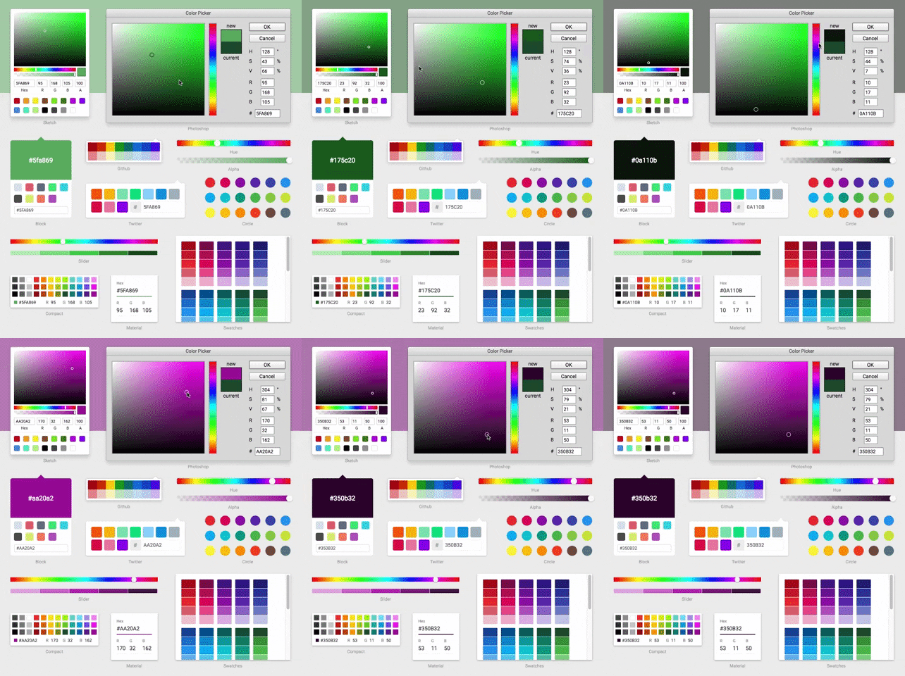
What is react-color?
The react-color npm package is a collection of color pickers for React applications. It provides a variety of UI components that allow users to select and manipulate colors in a user-friendly way. It supports different color models (RGB, HSL, etc.) and offers customizable styles and interfaces.
What are react-color's main functionalities?
Color Picker Components
react-color provides various color picker components like SketchPicker, which can be easily integrated into a React application to allow users to pick colors.
import { SketchPicker } from 'react-color';
function App() {
const [color, setColor] = useState('#fff');
const handleChangeComplete = (color) => {
setColor(color.hex);
};
return (
<SketchPicker
color={color}
onChangeComplete={handleChangeComplete}
/>
);
}
Customizable Styles
The components provided by react-color can be styled and customized to fit the design of the application. Users can adjust dimensions, colors, and more.
import { PhotoshopPicker } from 'react-color';

function App() {
  const [color, setColor] = useState('#fff');

  const styles = reactCSS({
    'default': {
      picker: {
        width: '300px',
        height: '400px',
      },
    },
  });

  return (
    <div style={ styles.picker }>
      <PhotoshopPicker
        color={color}
        onChangeComplete={(color) => setColor(color.hex)}
      />
    </div>
  );
}
Color Representation
react-color supports different color representations such as HEX, RGB, and HSL. Users can work with the color model that best suits their needs.
import { CompactPicker } from 'react-color';

function App() {
  const [color, setColor] = useState({ r: 255, g: 0, b: 0, a: 1 });

  return (
    <CompactPicker
      color={color}
      onChangeComplete={(color) => setColor(color.rgb)}
    />
  );
}
Other packages similar to react-color
react-colorful
react-colorful is a modern, lightweight, and dependency-free color picker for React. It is similar to react-color but focuses on performance and size, offering a smaller bundle size and faster parsing.
coloreact
coloreact is another React color picker component that provides a simple and flexible interface for color selection. It is less feature-rich compared to react-color but offers a minimalistic approach for developers who need a straightforward solution.
rc-color-picker
rc-color-picker is a React color picker component that is part of the rc-components family. It offers a different set of UI components and customization options compared to react-color, catering to developers who are already using other rc-components in their projects.


-
13 Different Pickers - Sketch, Photoshop, Chrome and many more
-
Make Your Own - Use the building block components to make your own
Demo

Live Demo
Installation & Usage
npm install react-color --save
Include the Component
import React from 'react'
import { SketchPicker } from 'react-color'

class Component extends React.Component {

  render() {
    return <SketchPicker />
  }
}
You can import AlphaPicker BlockPicker ChromePicker CirclePicker CompactPicker GithubPicker HuePicker MaterialPicker PhotoshopPicker SketchPicker SliderPicker SwatchesPicker TwitterPicker respectively.
100% inline styles via ReactCSS


