react-jsonschema-form

A simple React component capable of building HTML forms out of a JSON schema and using Bootstrap semantics by default.
A live playground is hosted on gh-pages.

Table of Contents
Installation
Requires React 0.14+.
As a npm-based project dependency
$ npm install react-jsonschema-form --save
Note: While the library renders Bootstrap HTML semantics, you have to build/load the Bootstrap styles on your own.
As a script served from a CDN
<script src="https://npmcdn.com/react-jsonschema-form/dist/react-jsonschema-form.js"></script>
Source maps are available at this url.
Note: The CDN version does not embed react nor react-dom.
You'll also need to alias the default export property to use the Form component:
const Form = JSONSchemaForm.default;
Usage
import React, { Component } from "react";
import { render } from "react-dom";

import Form from "react-jsonschema-form";

const schema = {
  title: "Todo",
  type: "object",
  required: ["title"],
  properties: {
    title: {type: "string", title: "Title", default: "A new task"},
    done: {type: "boolean", title: "Done?", default: false}
  }
};

const formData = {
  title: "First task",
  done: true
};

const log = (type) => console.log.bind(console, type);

render((
  <Form schema={schema}
        formData={formData}
        onChange={log("changed")}
        onSubmit={log("submitted")}
        onError={log("errors")} />
), document.getElementById("app"));
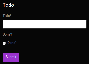
That should give something like this (if you took care of loading the standard Bootstrap stylesheet):

Form event handlers
Form submission
You can pass a function as the onSubmit prop of your Form component to listen to when the form is submitted and its data are valid. It will be passed a result object having a formData attribute, which is the valid form data you're usually after:
const onSubmit = ({formData}) => console.log("yay I'm valid!");

<Form schema={schema} onSubmit={onSubmit} />;
To react to when submitted form data are invalid, pass an onError handler, which is passed the list of encoutered errors:
const onError = (errors) => console.log("I have", errors.length, "errors to fix");

<Form schema={schema} onError={onError} />;
Form data changes
If you plan on being notified everytime the form data are updated, you can pass an onChange handler, which will receive the same args as onSubmit any time a value is updated in the form.
Form customization
The uiSchema object
JSONSchema is limited for describing how a given data type should be rendered as a form input component, that's why this lib introduces the concept of UI schema.
A UI schema is basically an object literal providing information on how the form should be rendered, while the JSON schema tells what.
The uiSchema object follows the tree structure of the form field hierarchy, and for each allows to define how it should be rendered:
const schema = {
  type: "object",
  properties: {
    foo: {
      type: "object",
      properties: {
        bar: {type: "string"}
      }
    }
  }
}

const uiSchema = {
  foo: {
    bar: {
      "ui:widget": "textarea"
    }
  }
}

render(<Form schema={schema} uiSchema={formData} />,
       document.getElementById("app"));
Alternative widgets
The uiSchema ui:widget property tells the form which UI widget should be used to render a certain field:
Example:
const uiSchema = {
done: {
"ui:widget": "radio"
}
};
render((
<Form schema={schema}
uiSchema={uiSchema}
formData={formData} />
), document.getElementById("app"));
Here's a list of supported alternative widgets for different JSONSchema data types:
For boolean fields
radio: a radio button group with true and false as selectable values;select: a select box with true and false as options;- by default, a checkbox is used
Note: To set the labels for a boolean field, instead of using true and false you can set enumNames in your schema. Note that enumNames belongs in your schema, not the uiSchema, and the order is always [true, false].
For string fields
textarea: a textarea element is used;password: an input[type=password] element is used;- by default, a regular
input[type=text] element is used.
The built-in string field also supports the JSONSchema format property, and will render an appropriate widget by default for the following formats:
date-time: Six select elements are used to select the year, the month, the day, the hour, the minute and the second;email: An input[type=email] element is used;uri: An input[type=url] element is used;- More formats could be supported in a near future, feel free to help us going faster!
For number and integer fields
updown: an input[type=number] updown selector;range: an input[type=range] slider;- by default, a regular
input[type=text] element is used.
Note: for numbers, min, max and step input attributes values will be handled according to JSONSchema's minimum, maximium and multipleOf values when they're defined.
Hidden widgets
It's possible to use an hidden widget for a given field by setting the ui:widget uiSchema directive to hidden for this field:
const schema = {
  type: "object",
  properties: {
    foo: {type: "boolean"}
  }
};

const uiSchema = {
  foo: {"ui:widget": "hidden"}
};
Notes
- Hiding widgets is only supported for
boolean, string, number and integer schema types; - An hidden widget takes its value from the
formData prop.
Object fields ordering
The uiSchema object spec also allows you to define in which order a given object field properties should be rendered using the ui:order property:
const schema = {
  type: "object",
  properties: {
    foo: {type: "string"},
    bar: {type: "string"}
  }
};

const uiSchema = {
  "ui:order": ["bar", "foo"]
};

render((
  <Form schema={schema} uiSchema={uiSchema} />
), document.getElementById("app"));
Custom CSS class names
The uiSchema object accepts a classNames property for each field of the schema:
const uiSchema = {
  title: {
    classNames: "task-title foo-bar"
  }
};
Will result in:
<div class="field field-string task-title foo-bar" >
  <label>
    <span>Title*</span>
    <input value="My task" required="" type="text">
  </label>
</div>
Custom labels for enum fields
This library supports the enumNames property for enum fields, which allows defining custom labels for each option of an enum:
const schema = {
  type: "number",
  enum: [1, 2, 3],
  enumNames: ["one", "two", "three"]
};
This will be rendered using a select box that way:
<select>
  <option value="1">one</option>
  <option value="2">two</option>
  <option value="3">three</option>
</select>
Note that string representations of numbers will be cast back and reflected as actual numbers into form state.
Multiple choices list
The default behavior for array fields is a list of text inputs with add/remove buttons. If you want a multiple choices list, you have to provide an enum list to the items property of the array field and set uniqueItems property to true.
See the "Arrays" section of the demo app and this issue for more information.
Autogenerated widget ids
By default, the lib will generate ids unique to the form for all rendered widgets. But if you plan on using multiple instances of the Form component in a same page, it's wise to declare a root prefix for these, using the ui:rootFieldId uiSchema directive:
const uiSchema = {
  "ui:rootFieldId": "myform"
};
So all widgets will have an id prefixed with myform.
Form action buttons
You can provide custom buttons to your form via the Form component's children. A default submit button will be rendered if you don't provide children to the Form component.
render(
  <Form schema={schema}>
    <div>
      <button type="submit">Submit</button>
      <button>Cancel</button>
    </div>
  </Form>);
Warning: there should be a button or an input with type="submit" to trigger the form submission (and then the form validation).
Help texts
Sometimes it's convenient to add some text next to a field to guide the end user filling it; this is the purpose of the ui:help uiSchema directive:
const schema = {type: "string"};
const uiSchema = {
  "ui:widget": "password",
  "ui:help": "Hint: Make it strong!"
};

Help texts work for any kind of field at any level, and will always be rendered immediately below the field component widget(s), but after contextualized errors, if any.
Advanced customization
The API allows to specify your own custom widgets and fields components:
- A widget represents a HTML tag for the user to enter data, eg.
input, select, etc. - A field usually wraps one or more widgets and most often handles internal field state; think of a field as a form row, including the labels.
Custom widget components
You can provide your own custom widgets to a uiSchema for the following json data types:
stringnumberintegerboolean
const schema = {
  type: "string"
};

const uiSchema = {
  "ui:widget": (props) => {
    return (
      <input type="text"
        className="custom"
        value={props.value}
        required={props.required}
        onChange={(event) => props.onChange(event.target.value)} />
    );
  }
};

render(<Form schema={schema} uiSchema={uiSchema} />);
Alternatively, you can register them all at once by passing the widgets prop to the Form component, and reference their identifier from the uiSchema:
const MyCustomWidget = (props) => {
  return (
    <input type="text"
      className="custom"
      value={props.value}
      required={props.required}
      onChange={(event) => props.onChange(event.target.value)} />
  );
};

const widgets = {
  myCustomWidget: MyCustomWidget
};

const uiSchema = {
  "ui:widget": "myCustomWidget"
}

render(<Form
  schema={schema}
  uiSchema={uiSchema}
  widgets={widgets} />);
This is useful if you expose the uiSchema as pure JSON, which can't carry functions.
The following props are passed to the widget component:
schema: The JSONSchema subschema object for this field;value: The current value for this field;required: The required status of this field;onChange: The value change event handler; call it with the new value everytime it changes;placeholder: The placeholder value, if any;options: The list of options for enum fields;
Custom field components
You can provide your own field components to a uiSchema for basically any json schema data type, by specifying a ui:field property.
For example, let's create and register a dumb geo component handling a latitude and a longitude:
const schema = {
type: "object",
required: ["lat", "lon"],
properties: {
lat: {type: "number"},
lon: {type: "number"}
}
};
class GeoPosition extends React.Component {
constructor(props) {
super(props);
this.state = {...props.formData};
}
onChange(name) {
return (event) => {
this.setState({
[name]: parseFloat(event.target.value)
}, () => this.props.onChange(this.state));
};
}
render() {
const {lat, lon} = this.state;
return (
<div>
<input type="number" value={lat} onChange={this.onChange("lat")} />
<input type="number" value={lon} onChange={this.onChange("lon")} />
</div>
);
}
}
const uiSchema = {"ui:field": "geo"};
const fields = {geo: GeoPosition};
render(<Form
schema={schema}
uiSchema={uiSchema}
fields={fields} />);
Note: Registered fields can be reused accross the entire schema.
Field props
A field component will always be passed the following props:
schema: The JSON schema for this field;uiSchema: The uiSchema for this field;idSchema: The tree of unique ids for every child field;formData: The data for this field;errorSchema: The tree of errors for this field and its children;registry: A registry object (read next).
The registry object
The registry is an object containing the registered custom fields and widgets as well as root schema definitions.
The registry is passed down the component tree, so you can access it from your custom field and SchemaField components.
Custom SchemaField
Warning: This is a powerful feature as you can override the whole form behavior and easily mess it up. Handle with care.
You can provide your own implementation of the SchemaField base React component for rendering any JSONSchema field type, including objects and arrays. This is useful when you want to augment a given field type with supplementary powers.
To proceed so, pass a fields object having a SchemaField property to your Form component; here's a rather silly example wrapping the standard SchemaField lib component:
import SchemaField from "react-jsonschema-form/lib/components/fields/SchemaField";

const CustomSchemaField = function(props) {
  return (
    <div id="custom">
      <p>Yeah, I'm pretty dumb.</p>
      <SchemaField {...props} />
    </div>
  );
};

const fields = {
  SchemaField: CustomSchemaField
};

render((
  <Form schema={schema}
        uiSchema={uiSchema}
        formData={formData}
        fields={fields} />
), document.getElementById("app"));
If you're curious how this could ever be useful, have a look at the Kinto formbuilder repository to see how it's used to provide editing capabilities to any form field.
Props passed to a custom SchemaField are the same as the ones passed to a custom field.
Custom titles
You can provide your own implementation of the TitleField base React component for rendering any title. This is useful when you want to augment how titles are handled.
Simply pass a fields object having a TitleField property to your Form component:
const CustomTitleField = ({title}) => <div id="custom">{title}</div>;

const fields = {
  TitleField: CustomTitleField
};

render((
  <Form schema={schema}
        uiSchema={uiSchema}
        formData={formData}
        fields={fields} />
), document.getElementById("app"));
Live form data validation
By default, form data are only validated when the form is submitted or when a new formData prop is passed to the Form component.
You can enable live form data validation by passing a liveValidate prop to the Form component, and set it to true. Then, everytime a value changes within the form data tree (eg. the user entering a character in a field), a validation operation is performed, and the validation results are reflected into the form state.
Be warned that this is an expensive strategy, with possibly strong impact on performances.
Styling your forms
This library renders form fields and widgets leveraging the Bootstrap semantics. That means your forms will be beautiful by default if you're loading its stylesheet in your page.
You're not necessarily forced to use Bootstrap; while it uses its semantics, it also provides a bunch of other class names so you can bring new styles or override default ones quite easily in your own personalized stylesheet. That's just HTML after all :)
If you're okay with using styles from the Bootstrap ecosystem though, then the good news is that you have access to many themes for it, which are compatible with our generated forms!
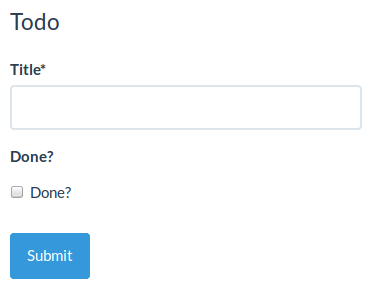
Here are some examples from the playground, using some of the Bootswatch free themes:

Last, if you really really want to override the semantics generated by the lib, you can always create and use your own custom widget, field and/or schema field components.
Schema definitions and references
This library partially supports inline schema definition dereferencing, which is Barbarian for avoiding to copy and paste commonly used field schemas:
{
  "definitions": {
    "address": {
      "type": "object",
      "properties": {
        "street_address": { "type": "string" },
        "city":           { "type": "string" },
        "state":          { "type": "string" }
      },
      "required": ["street_address", "city", "state"]
    }
  },
  "type": "object",
  "properties": {
    "billing_address": { "$ref": "#/definitions/address" },
    "shipping_address": { "$ref": "#/definitions/address" }
  }
}
(Sample schema courtesy of the Space Telescope Science Institute)
Note that it only supports local definition referencing, we do not plan on fetching foreign schemas over HTTP anytime soon. Basically, you can only reference a definition from the very schema object defining it.
JSON Schema supporting status
This component follows JSON Schema specs. Due to the limitation of form widgets, there are some exceptions as follows:
additionalItems keyword for arrays
This keyword works when items is an array. additionalItems: true is not supported because there's no widget to represent an item of any type. In this case it will be treated as no additional items allowed. additionalItems being a valid schema is supported.
Troubleshooting
Build error wrt missing "buffertools" module
Build error: Cannot find module 'buffertools' from .../node_modules/react-jsonschema-form/node_modules/deeper
This is an issue in the way deeper handles the optional buffertools dependency (by using try/catch around a require('buffertools')).
If you use webpack you can do the following to ignore this import:
module.exports = {
entry: "app",
output: { ... },
plugins: [
new webpack.IgnorePlugin(/^(buffertools)$/),
...
]
}
If you are using browserify instead, do the following:
var bundler = browserify({ ... yourconfig ... }).ignore('buffertools')
Contributing
Development server
$ npm start
A live development server showcasing components with hot reload enabled is available at localhost:8080.
If you want the development server to listen on another host or port, you can use the RJSF_DEV_SERVER env variable:
$ RJSF_DEV_SERVER=0.0.0.0:8000 npm start
Tests
$ npm test
TDD
$ npm run tdd
License
Apache 2


