react-native-calendar-picker


This is a Calendar Picker Component for React Native

To use the calendar you just need to:
npm install --save react-native-calendar-picker
Note: react-native-calendar-picker v5 is a complete re-write of the calendar. This calendar is now written using ES6 syntax. I kept most of the same functionalities and added support for date ranges.
If you need the old code I saved it on a branch v4
Prerequisites
CalendarPicker requires Moment JS >=2.0. Date props may be anything parseable by Moment: Javascript Date, Moment date, or ISO8601 datetime string.
npm install --save moment
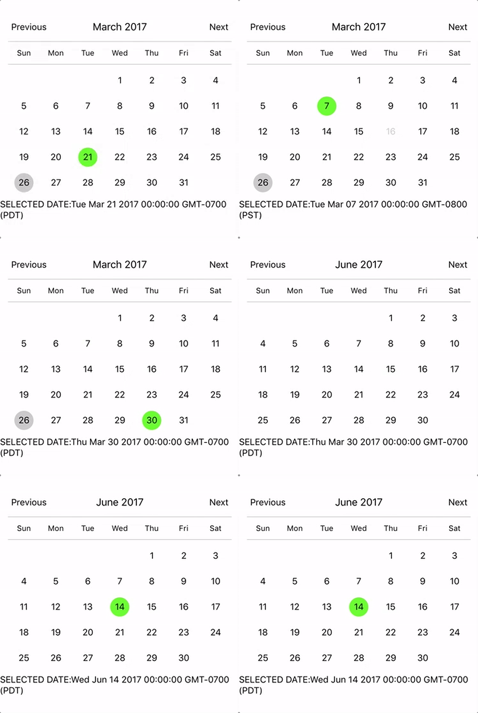
Example
import React, { Component } from 'react';
import {
  StyleSheet,
  Text,
  View
} from 'react-native';
import CalendarPicker from 'react-native-calendar-picker';

export default class App extends Component {
  constructor(props) {
    super(props);
    this.state = {
      selectedStartDate: null,
    };
    this.onDateChange = this.onDateChange.bind(this);
  }

  onDateChange(date) {
    this.setState({
      selectedStartDate: date,
    });
  }
  render() {
    const { selectedStartDate } = this.state;
    const startDate = selectedStartDate ? selectedStartDate.toString() : '';
    return (
      <View style={styles.container}>
        <CalendarPicker
          onDateChange={this.onDateChange}
        />

        <View>
          <Text>SELECTED DATE:{ startDate }</Text>
        </View>
      </View>
    );
  }
}

const styles = StyleSheet.create({
  container: {
    flex: 1,
    backgroundColor: '#FFFFFF',
    marginTop: 100,
  },
});
CalendarPicker Props
| Prop | Type | Description |
|---|
weekdays | Array | Optional. List of week days. Eg. ['Mon', 'Tue', ...] Must be 7 days |
months | Array | Optional. List of months names. Eg. ['Jan', 'Feb', ...] Must be 12 months |
startFromMonday | Boolean | Optional. Default first day of week will be Sunday. You can set start of week from Monday by setting this to true. Default is false |
showDayStragglers | Boolean | Optional. Populate previous & next month days in empty slots. Default is false |
allowRangeSelection | Boolean | Optional. Allow to select date ranges. Default is false |
allowBackwardRangeSelect | Boolean | Optional. Allow selecting range in reverse. Default is false |
previousTitle | String | Optional. Title of button for previous month. Default is Previous |
nextTitle | String | Optional. Title of button for next month. Default is Next |
previousTitleStyle | TextStyle | Optional. Text styling for Previous text. |
nextTitleStyle | TextStyle | Optional. Text styling for Next text. |
previousComponent | Object | Optional. Component to use in Previous button. Overrides previousTitle & previousTitleStyle. |
nextComponent | Object | Optional. Component to use in Next button. Overrides nextTitle & nextTitleStyle. |
selectedDayColor | String | Optional. Color for selected day |
selectedDayStyle | ViewStyle | Optional. Style for selected day. May override selectedDayColor. |
selectedDayTextColor | String | Optional. Text color for selected day |
selectedRangeStartStyle | ViewStyle | Optional. Style for range selected start day. |
selectedRangeEndStyle | ViewStyle | Optional. Style for range selected end day. |
selectedRangeStyle | ViewStyle | Optional. Style for all days in range selection. |
disabledDates | Array or Function | Optional. Specifies dates that cannot be selected. Array of Dates, or a function that returns true for a given Moment date (apologies for the inverted logic). |
disabledDatesTextStyle | TextStyle | Optional. Text styling for disabled dates. |
selectedStartDate | Date | Optional. Specifies a selected Start Date. |
selectedEndDate | Date | Optional. Specifies a selected End Date. |
minRangeDuration | Number or Array | Optional. Specifies a minimum range duration when using allowRangeSelection. Can either pass a number to be used for all dates or an Array of objects if the minimum range duration depends on the date {date: Moment-parsable date, minDuration: Number} |
maxRangeDuration | Number or Array | Optional. Specifies a maximum range duration when using allowRangeSelection. Can either pass a number to be used for all dates or an Array of objects if the maximum range duration depends on the date {date: Moment-parsable date, maxDuration: Number} |
todayBackgroundColor | String | Optional. Background color for today. Default is #cccccc |
todayTextStyle | TextStyle | Optional. Text styling for today. |
textStyle | TextStyle | Optional. Style overall text. Change fontFamily, color, etc. |
customDatesStyles | Array | Optional. Style individual date(s). Array of objects {date: Moment-parseable date, containerStyle: ViewStyle, style: ViewStyle, textStyle: TextStyle} |
customDatesStylesPriority | String | Optional. Precedence of customDates or dayOfWeek styles. Default dayOfWeek |
scaleFactor | Number | Optional. Default (375) scales to window width |
minDate | Date | Optional. Specifies minimum date to be selected |
maxDate | Date | Optional. Specifies maximum date to be selected |
initialDate | Date | Optional. Date that calendar opens to. Defaults to today. |
width | Number | Optional. Width of CalendarPicker's container. Defaults to Dimensions width. |
height | Number | Optional. Height of CalendarPicker's container. Defaults to Dimensions height. |
swipeConfig | Object | Optional. Config passed to Swiper. |
enableSwipe | Boolean | Optional. Whether to enable swiping. Default is true |
enableDateChange | Boolean | Optional. Whether to enable pressing on day. Default is true |
restrictMonthNavigation | Boolean | Optional. Whether to disable Previous month button if it is before minDate or Next month button if it is after MaxDate. Default is false |
onDateChange | Function | Optional. Callback when a date is selected. Returns Moment date as first param; START_DATE or END_DATE as second param. |
onMonthChange | Function | Optional. Callback when Previous / Next month is pressed. Returns Moment date as first parameter. |
onSwipe | Function | Optional. Callback when swipe event is triggered. Returns swipe direction as first parameter. |
dayShape | String | Optional. Shape of the Day component. Default is circle. Available options are circle and square. |
headingLevel | Number | Optional. Sets the aria-level for the calendar title heading when on Web. Default is 1. |
selectMonthTitle | String | Optional. Title of month selector view. Default is Select Month. |
selectYearTitle | String | Optional. Title of year selector view. Default is Select Year. |
dayLabelsWrapper | ViewStyle | Optional. Style for weekdays wrapper. E.g If you want to remove top and bottom divider line. |
dayOfWeekStyles | TextStyle | Optional. Style for changing color and style for any day of the week. E.g If you want all Sundays in RED color, and Mondays in BLUE color, etc. You need to pass JSON object of styles. 0 for Sunday and 6 for Saturday, but if startFromMonday=true, then 0 for Monday and 6 for Sunday. See example below. |
monthYearHeaderWrapperStyle | ViewStyle | Optional. Style for header MonthYear title wrapper. E.g If you want to change the order of year and month. |
Styles
Some styles will overwrite some won't. For instance:
- If you provide textStyle with fontFamily and color, out of ranges dates will not apply your color, just fontFamily.
Order of precedence:
- defaultColor => textStyle => selectedDayColor
- defaultTodayBackgroundColor => todayBackgroundColor
- defaultBackgroundColor => selectedDayColor
- defaultTextStyles => textStyle => selectedDayTextColor
More Examples
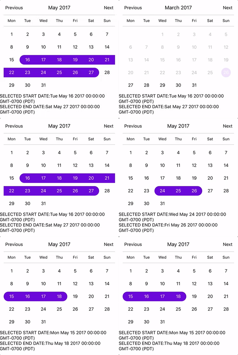
Start from Monday, allowRangeSelection, Min and Max Dates and Styles Changes Example

import React, { Component } from 'react';
import {
StyleSheet,
Text,
View
} from 'react-native';
import CalendarPicker from 'react-native-calendar-picker';
export default class App extends Component {
constructor(props) {
super(props);
this.state = {
selectedStartDate: null,
selectedEndDate: null,
};
this.onDateChange = this.onDateChange.bind(this);
}
onDateChange(date, type) {
if (type === 'END_DATE') {
this.setState({
selectedEndDate: date,
});
} else {
this.setState({
selectedStartDate: date,
selectedEndDate: null,
});
}
}
render() {
const { selectedStartDate, selectedEndDate } = this.state;
const minDate = new Date();
const maxDate = new Date(2017, 6, 3);
const startDate = selectedStartDate ? selectedStartDate.toString() : '';
const endDate = selectedEndDate ? selectedEndDate.toString() : '';
return (
<View style={styles.container}>
<CalendarPicker
startFromMonday={true}
allowRangeSelection={true}
minDate={minDate}
maxDate={maxDate}
todayBackgroundColor="#f2e6ff"
selectedDayColor="#7300e6"
selectedDayTextColor="#FFFFFF"
onDateChange={this.onDateChange}
/>
<View>
<Text>SELECTED START DATE:{ startDate }</Text>
<Text>SELECTED END DATE:{ endDate }</Text>
</View>
</View>
);
}
}
const styles = StyleSheet.create({
container: {
flex: 1,
backgroundColor: '#FFFFFF',
marginTop: 100,
},
});
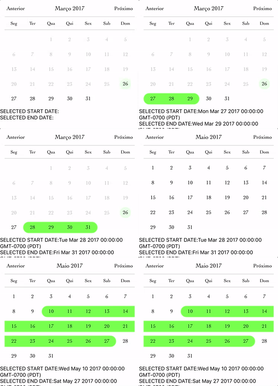
Complex Example, Changing Fonts and Colors, Language and etc...

import React, { Component } from 'react';
import {
StyleSheet,
Text,
View
} from 'react-native';
import CalendarPicker from 'react-native-calendar-picker';
export default class App extends Component {
constructor(props) {
super(props);
this.state = {
selectedStartDate: null,
selectedEndDate: null,
};
this.onDateChange = this.onDateChange.bind(this);
}
onDateChange(date, type) {
if (type === 'END_DATE') {
this.setState({
selectedEndDate: date,
});
} else {
this.setState({
selectedStartDate: date,
selectedEndDate: null,
});
}
}
render() {
const { selectedStartDate, selectedEndDate } = this.state;
const minDate = new Date();
const maxDate = new Date(2017, 6, 3);
const startDate = selectedStartDate ? selectedStartDate.toString() : '';
const endDate = selectedEndDate ? selectedEndDate.toString() : '';
return (
<View style={styles.container}>
<CalendarPicker
startFromMonday={true}
allowRangeSelection={true}
minDate={minDate}
maxDate={maxDate}
weekdays={['Seg', 'Ter', 'Qua', 'Qui', 'Sex', 'Sab', 'Dom']}
months={['Janeiro', 'Fevereiro', 'Março', 'Abril', 'Maio', 'Junho', 'Julho', 'Agosto', 'Setembro', 'Outubro', 'Novembro', 'Dezembro']}
previousTitle="Anterior"
nextTitle="Próximo"
todayBackgroundColor="#e6ffe6"
selectedDayColor="#66ff33"
selectedDayTextColor="#000000"
scaleFactor={375}
textStyle={{
fontFamily: 'Cochin',
color: '#000000',
}}
onDateChange={this.onDateChange}
/>
<View>
<Text>SELECTED START DATE:{ startDate }</Text>
<Text>SELECTED END DATE:{ endDate }</Text>
</View>
</View>
);
}
}
const styles = StyleSheet.create({
container: {
flex: 1,
backgroundColor: '#FFFFFF',
marginTop: 100,
},
});
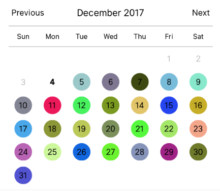
Custom styling individual dates

let today = moment();
let day = today.clone().startOf('month');
let customDatesStyles = [];
while(day.add(1, 'day').isSame(today, 'month')) {
customDatesStyles.push({
date: day.clone(),
style: {backgroundColor: '#'+('#00000'+(Math.random()*(1<<24)|0).toString(16)).slice(-6)},
textStyle: {color: 'black'},
containerStyle: [],
});
}
render() {
return (
<CalendarPicker
todayTextStyle={{fontWeight: 'bold'}}
todayBackgroundColor={'transparent'}
customDatesStyles={customDatesStyles}
minDate={today}
/>
);
}
Styling individual weekdays
<CalendarPicker
      textStyle={styles.calendarTextStyle}
      weekdays={CALENDAR_WEEK_DAYS}
      allowRangeSelection
      previousTitle="<"
      previousTitleStyle={{color: '#fff'}}
      nextTitle=">"
      nextTitleStyle={{color: '#f00'}}
      dayLabelsWrapper={{
        borderBottomWidth: 0,
        borderTopWidth: 0,
      }}
      dayOfWeekStyles={{
        0: {
          color: '#00f',
          fontSize: 22,
          fontWeight: 'bold',
          backgroundColor: '#ff0',
        },
        5: {
          color: '#000',
          fontSize: 22,
        },
      }}
    />
Methods
These internal methods may be accessed through a ref to the CalendarPicker.
| Name | Params | Description |
|---|
handleOnPressDay | day (Integer) | Programmatically select date. day is a number that is the day of the current month. Moment example for today's day of month: moment().date() |
handleOnPressNext | | Programmatically advance to next month. |
handleOnPressPrevious | | Programmatically advance to previous month. |
resetSelections | | Clear date selections. Useful for resetting date range selection when user has picked a start date but not an end date. |
TypeScript
Definitions are available at https://www.npmjs.com/package/@types/react-native-calendar-picker courtesy of automatensalat.
npm install --save @types/react-native-calendar-picker
Suggestions?
Open Issues. Submit PRs.
Special Thanks
I would like to call out some contributors who have been helping with this project
Sample Application
The sample app is an Expo project created with create-react-native-app.
cd example
npm run cp
npm install
npm start
Development
The source files are copied from the project root directory into example/node_modules using npm run cp. If a source file is modified, it must be copied over again with npm run cp.


