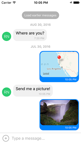
Gifted Chat


The most complete chat UI for React Native (formerly known as Gifted Messenger).


Features
- Fully customizable components
- Composer actions (to attach photos, etc.)
- Load earlier messages
- Copy messages to clipboard
- Touchable links using react-native-parsed-text
- Avatar as user's initials
- Localized dates
- Multiline TextInput
- InputToolbar avoiding keyboard
- Redux support
- System message
Dependency
- Use version
0.2.x for RN >= 0.44.0 - Use version
0.1.x for RN >= 0.40.0 - Use version
0.0.10 for RN < 0.40.0
Installation
- Using npm:
npm install react-native-gifted-chat --save - Using Yarn:
yarn add react-native-gifted-chat
Example
import { GiftedChat } from 'react-native-gifted-chat';

class Example extends React.Component {

  state = {
    messages: [],
  };

  componentWillMount() {
    this.setState({
      messages: [
        {
          _id: 1,
          text: 'Hello developer',
          createdAt: new Date(),
          user: {
            _id: 2,
            name: 'React Native',
            avatar: 'https://facebook.github.io/react/img/logo_og.png',
          },
        },
      ],
    });
  }

  onSend(messages = []) {
    this.setState((previousState) => ({
      messages: GiftedChat.append(previousState.messages, messages),
    }));
  }

  render() {
    return (
      <GiftedChat
        messages={this.state.messages}
        onSend={(messages) => this.onSend(messages)}
        user={{
          _id: 1,
        }}
      />
    );
  }

}
Advanced example
See example/App.js for a working demo!
Message object
e.g. Chat Message
{
_id: 1,
text: 'My message',
createdAt: new Date(Date.UTC(2016, 5, 11, 17, 20, 0)),
user: {
_id: 2,
name: 'React Native',
avatar: 'https://facebook.github.io/react/img/logo_og.png',
},
image: 'https://facebook.github.io/react/img/logo_og.png',
}
e.g. System Message
{
_id: 1,
text: 'This is a system message',
createdAt: new Date(Date.UTC(2016, 5, 11, 17, 20, 0)),
system: true,
}
Props
-
messages (Array) - Messages to display
-
text (String) - Input text; default is undefined, but if specified, it will override GiftedChat's internal state (e.g. for redux; see notes below)
-
placeholder (String) - Placeholder when text is empty; default is 'Type a message...'
-
messageIdGenerator (Function) - Generate an id for new messages. Defaults to UUID v4, generated by uuid
-
user (Object) - User sending the messages: { _id, name, avatar }
-
onSend (Function) - Callback when sending a message
-
locale (String) - Locale to localize the dates
-
timeFormat (String) - Format to use for rendering times; default is 'LT'
-
dateFormat (String) - Format to use for rendering dates; default is 'll'
-
isAnimated (Bool) - Animates the view when the keyboard appears
-
loadEarlier (Bool) - Enables the "Load earlier messages" button
-
onLoadEarlier (Function) - Callback when loading earlier messages
-
isLoadingEarlier (Bool) - Display an ActivityIndicator when loading earlier messages
-
renderLoading (Function) - Render a loading view when initializing
-
renderLoadEarlier (Function) - Custom "Load earlier messages" button
-
renderAvatar (Function) - Custom message avatar; set to null to not render any avatar for the message
-
showUserAvatar (Bool) - Whether to render an avatar for the current user; default is false, only show avatars for other users
-
onPressAvatar (Function(user)) - Callback when a message avatar is tapped
-
renderAvatarOnTop (Bool) - Render the message avatar at the top of consecutive messages, rather than the bottom; default is false
-
renderBubble (Function) - Custom message bubble
-
renderSystemMessage (Function) - Custom system message
-
onLongPress (Function(context, message)) - Callback when a message bubble is long-pressed; default is to show an ActionSheet with "Copy Text" (see example using showActionSheetWithOptions())
-
renderMessage (Function) - Custom message container
-
renderMessageText (Function) - Custom message text
-
renderMessageImage (Function) - Custom message image
-
imageProps (Object) - Extra props to be passed to the <Image> component created by the default renderMessageImage
-
lightboxProps (Object) - Extra props to be passed to the MessageImage's Lightbox
-
renderCustomView (Function) - Custom view inside the bubble
-
renderDay (Function) - Custom day above a message
-
renderTime (Function) - Custom time inside a message
-
renderFooter (Function) - Custom footer component on the ListView, e.g. 'User is typing...'; see example/App.js for an example
-
renderChatFooter (Function) - Custom component to render below the MessageContainer (separate from the ListView)
-
renderInputToolbar (Function) - Custom message composer container
-
renderComposer (Function) - Custom text input message composer
-
renderActions (Function) - Custom action button on the left of the message composer
-
renderSend (Function) - Custom send button; you can pass children to the original Send component quite easily, for example to use a custom icon (example)
-
renderAccessory (Function) - Custom second line of actions below the message composer
-
onPressActionButton (Function) - Callback when the Action button is pressed (if set, the default actionSheet will not be used)
-
bottomOffset (Integer) - Distance of the chat from the bottom of the screen (e.g. useful if you display a tab bar)
-
minInputToolbarHeight (Integer) - Minimum height of the input toolbar; default is 44
-
listViewProps (Object) - Extra props to be passed to the messages <ListView>; some props can't be overridden, see the code in MessageContainer.render() for details
-
textInputProps (Object) - Extra props to be passed to the <TextInput>
-
keyboardShouldPersistTaps (Enum) - Determines whether the keyboard should stay visible after a tap; see <ScrollView> docs
-
onInputTextChanged (Function) - Callback when the input text changes
-
maxInputLength (Integer) - Max message composer TextInput length
-
parsePatterns (Function) - Custom parse patterns for react-native-parsed-text used to linkify message content (like URLs and phone numbers), e.g.:
<GiftedChat
  parsePatterns={(linkStyle) => [
    { type: 'phone', style: linkStyle, onPress: this.onPressPhoneNumber },
    { pattern: /#(\w+)/, style: { ...linkStyle, styles.hashtag }, onPress: this.onPressHashtag },
  ]}
/>
Imperative methods
focusTextInput() - Open the keyboard and focus the text input box
The messages prop should work out-of-the-box with Redux. In most cases this is all you need.
If you decide to specify a text prop, GiftedChat will no longer manage its own internal text state and will defer entirely to your prop.
This is great for using a tool like Redux, but there's one extra step you'll need to take:
simply implement onInputTextChanged to receive typing events and reset events (e.g. to clear the text onSend):
<GiftedChat
text={customText}
onInputTextChanged={(text) => this.setCustomText(text)}
/>
Notes for Android
If you are using Create React Native App / Expo, no Android specific installation steps are required -- you can skip this section. Otherwise we recommend modifying your project configuration as follows.
-
Make sure you have android:windowSoftInputMode="adjustResize" in your AndroidManifest.xml:
<activity
  android:name=".MainActivity"
  android:label="@string/app_name"
  android:windowSoftInputMode="adjustResize"
  android:configChanges="keyboard|keyboardHidden|orientation|screenSize">
-
If you plan to use GiftedChat inside a Modal, see #200.
Notes for local development
You can use wml to keep the example app in sync
with any changes you make to the library during development. Steps:
- Install it:
npm install -g wml - Configure it:
wml add . example/node_modules/react-native-gifted-chat from the root directory cd examplenpm startwml start in another terminal window (doesn't matter where)
Note that it's important for wml start to come after npm start, or you'll get Can't find entry file index.js errors.
If you have any issues, you can clear your watches using watchman watch-del-all and try again.
License
Author
Feel free to ask me questions on Twitter @FaridSafi!


