Security News
Research
Data Theft Repackaged: A Case Study in Malicious Wrapper Packages on npm
The Socket Research Team breaks down a malicious wrapper package that uses obfuscation to harvest credentials and exfiltrate sensitive data.
react-native-indicator
Advanced tools
A useful indicator component for React Native


Make sure that you are in your React Native project directory and run:
$ npm install react-native-indicator --save
It works, have fun!
Following the Art module instruction to configure.
Import react-native-indicator as a JavaScript module:
import {CirclesLoader, PulseLoader, TextLoader, DotsLoader, ...} from 'react-native-indicator';
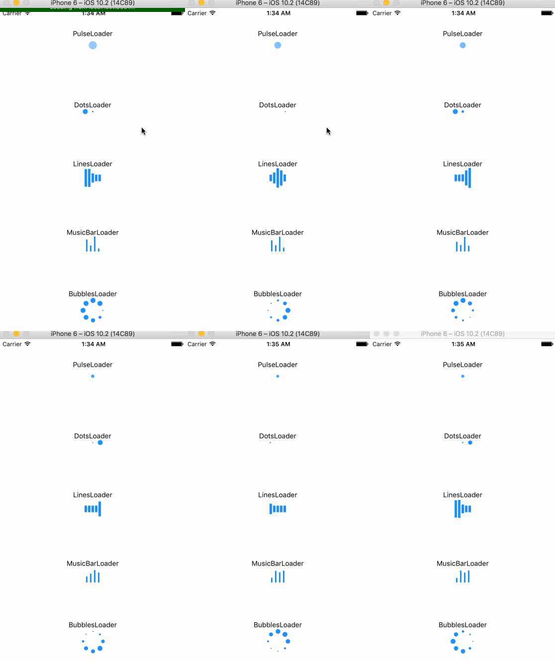
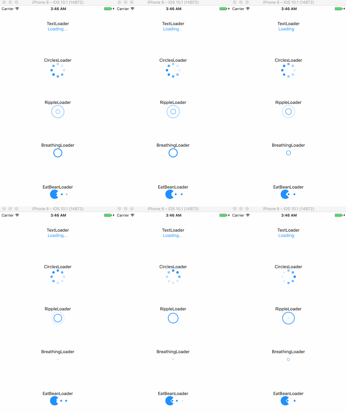
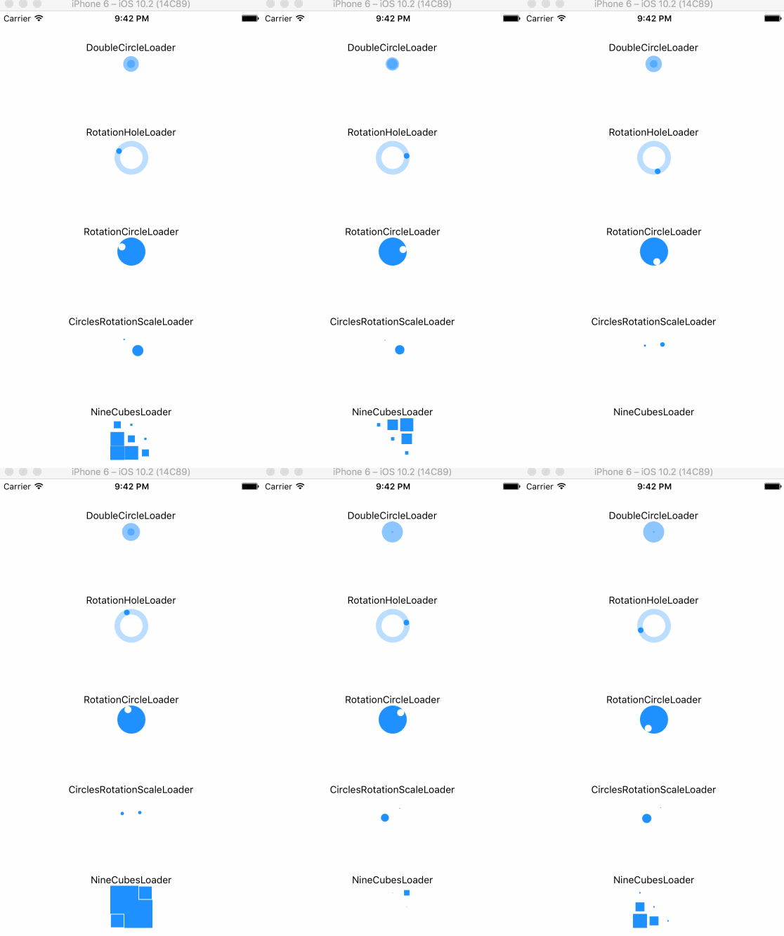
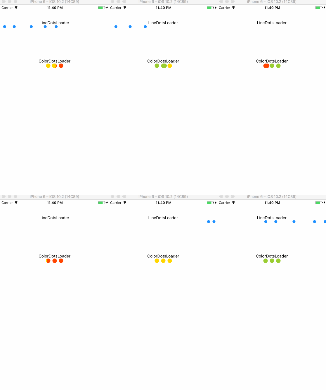
Here is currently available types:
render(){
    return(
        <View>
            <CirclesLoader />
            <TextLoader text="Loading" />
        </View>
    );
}
| prop | type | default | description |
|---|---|---|---|
| size | number | 30 | circle's size |
| color | string | '#1e90ff' | indicator's color |
| frequency | number | 1000 | scale's frequency |
| prop | type | default | description |
|---|---|---|---|
| size | number | 10 | dot's size |
| color | string | '#1e90ff' | indicator's color |
| betweenSpace | number | 5 | distance between two dots |
| prop | type | default | description |
|---|---|---|---|
| text | string | 'Loading' | contents |
| textStyle | style | inherited | text's style |
| prop | type | default | description |
|---|---|---|---|
| size | number | 40 | circle's size |
| color | string | '#1e90ff' | indicator's color |
| dotRadius | number | 10 | each dot's size |
| prop | type | default | description |
|---|---|---|---|
| size | number | 40 | circle's size |
| color | string | '#1e90ff' | indicator's color |
| dotRadius | number | 8 | each dot's size |
| prop | type | default | description |
|---|---|---|---|
| size | number | 10 | circle's size |
| color | string | '#1e90ff' | indicator's color |
| strokeWidth | number | 3 | outline width |
| frequency | number | 800 | scale's frequency |
| prop | type | default | description |
|---|---|---|---|
| size | number | 10 | circle's size |
| color | string | '#1e90ff' | indicator's color |
| strokeWidth | number | 3 | outline width |
| prop | type | default | description |
|---|---|---|---|
| color | string | '#1e90ff' | indicator's color |
| barWidth | number | 5 | each bar's width |
| barHeight | number | 40 | each bar's height |
| barNumber | number | 5 | the number of bar |
| betweenSpace | number | 2 | distance between two bars |
| prop | type | default | description |
|---|---|---|---|
| color | string | '#1e90ff' | indicator's color |
| barWidth | number | 3 | each bar's width |
| barHeight | number | 30 | each bar's height |
| betweenSpace | number | 5 | distance between two bars |
| prop | type | default | description |
|---|---|---|---|
| color | string | '#1e90ff' | indicator's color |
| size | number | 30 | indicator's size |
| prop | type | default | description |
|---|---|---|---|
| size | number | 30 | circle's size |
| color | string | '#1e90ff' | indicator's color |
| prop | type | default | description |
|---|---|---|---|
| size | number | 30 | indicator's size |
| color | string | '#1e90ff' | indicator's color |
| rotationSpeed | number | 800 | rotation speed |
| prop | type | default | description |
|---|---|---|---|
| size | number | 40 | indicator's size |
| color | string | '#1e90ff' | indicator's color |
| rotationSpeed | number | 800 | rotation speed |
| strokeWidth | number | 8 | circle outline's width |
| prop | type | default | description |
|---|---|---|---|
| size | number | 50 | indicator's size |
| color | string | '#1e90ff' | indicator's color |
| prop | type | default | description |
|---|---|---|---|
| size | number | 20 | each cube's size |
| color | string | '#1e90ff' | indicator's color |
warning: this indicator will occupy a whole horizontal space automatically, which means you don't need to set any center props. Just keeping the direction of its parent View is vertical.
| prop | type | default | description |
|---|---|---|---|
| size | number | 10 | dot's size |
| color | string | '#1e90ff' | indicator's color |
| dotsNumber | number | 5 | the number of dots |
| betweenSpace | number | 5 | distance between two dots |
| prop | type | default | description |
|---|---|---|---|
| size | number | 15 | each cube's size |
| betweenSpace | number | 7 | distance between two dots |
| color1 | string | '#ff4500'(red) | 1st color |
| color2 | string | '#ffd700'(yellow) | 2nd color |
| color3 | string | '#9acd32'(green) | 3rd color |
| prop | type | default | description |
|---|---|---|---|
| size | number | 10 | dot's size |
| color | string | '#1e90ff' | indicator's color |
| betweenSpace | number | 5 | distance between two dots |
| speed | number | 200 | change speed |
MIT
FAQs
React Native Indicator Component
The npm package react-native-indicator receives a total of 254 weekly downloads. As such, react-native-indicator popularity was classified as not popular.
We found that react-native-indicator demonstrated a not healthy version release cadence and project activity because the last version was released a year ago. It has 1 open source maintainer collaborating on the project.
Did you know?

Socket for GitHub automatically highlights issues in each pull request and monitors the health of all your open source dependencies. Discover the contents of your packages and block harmful activity before you install or update your dependencies.

Security News
Research
The Socket Research Team breaks down a malicious wrapper package that uses obfuscation to harvest credentials and exfiltrate sensitive data.

Research
Security News
Attackers used a malicious npm package typosquatting a popular ESLint plugin to steal sensitive data, execute commands, and exploit developer systems.

Security News
The Ultralytics' PyPI Package was compromised four times in one weekend through GitHub Actions cache poisoning and failure to rotate previously compromised API tokens.