react-native-raw-bottom-sheet
Hooray! The new version 3 has been released.
Please pay close attention if you are upgrading the RBSheet from version 2 to version 3.
- Functional Components: Starting from v3.0.0, RBSheet has been completely rewritten using Functional Components. This improves performance and aligns with modern React practices.
- Prop Removal & Renaming: Several props have been removed and renamed for improved clarity and maintainability. Please refer to the updated documentation for a complete list of available props and their intended behavior.


- Super Lightweight Component
- Add Your Own Component To Bottom Sheet
- Customize Whatever You Like
- Support Drag Down Gesture
- Support All Orientations
- Support Both Android And iOS
- Smooth Animation
- Zero Configuration
- Zero dependency
- Millions of Downloads
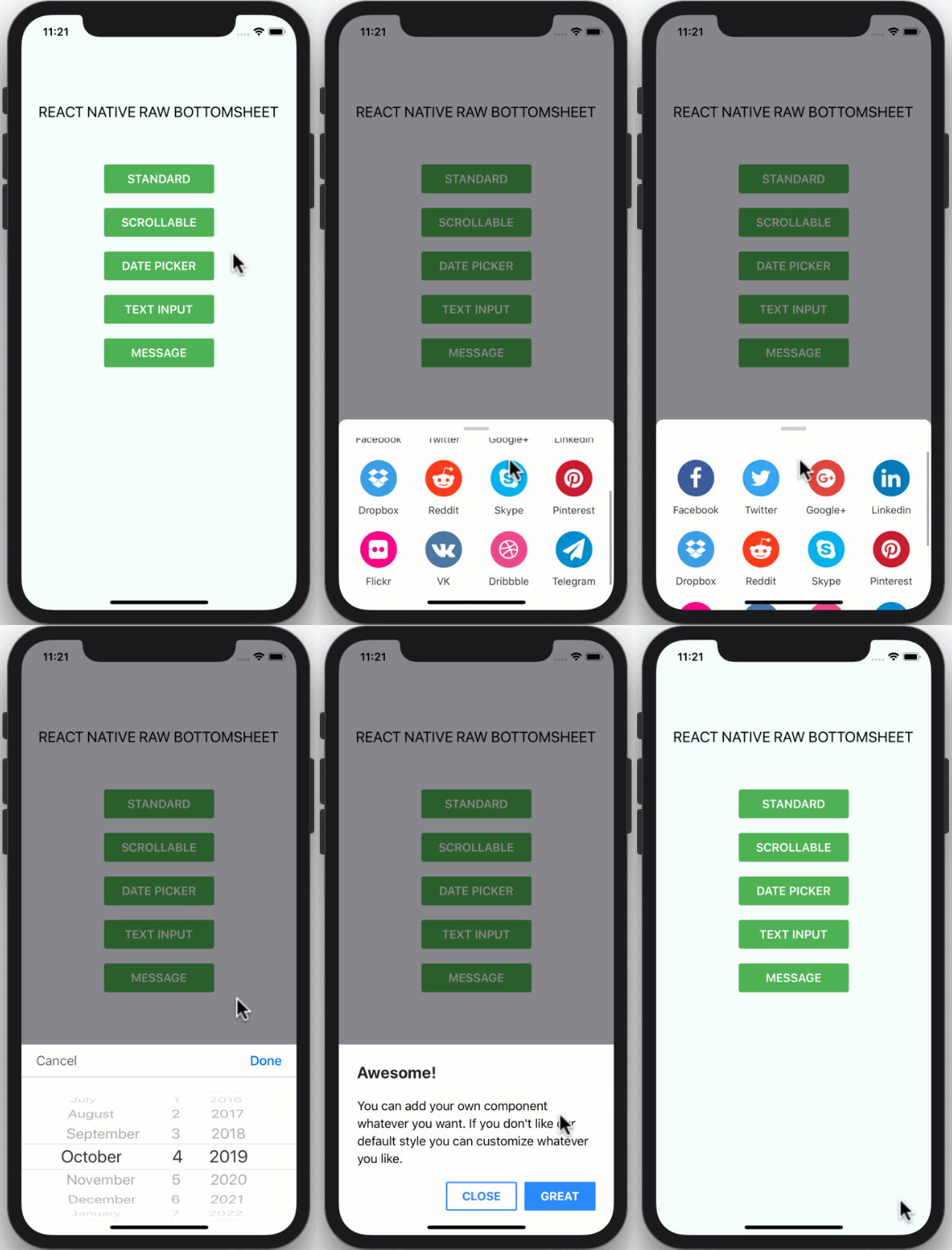
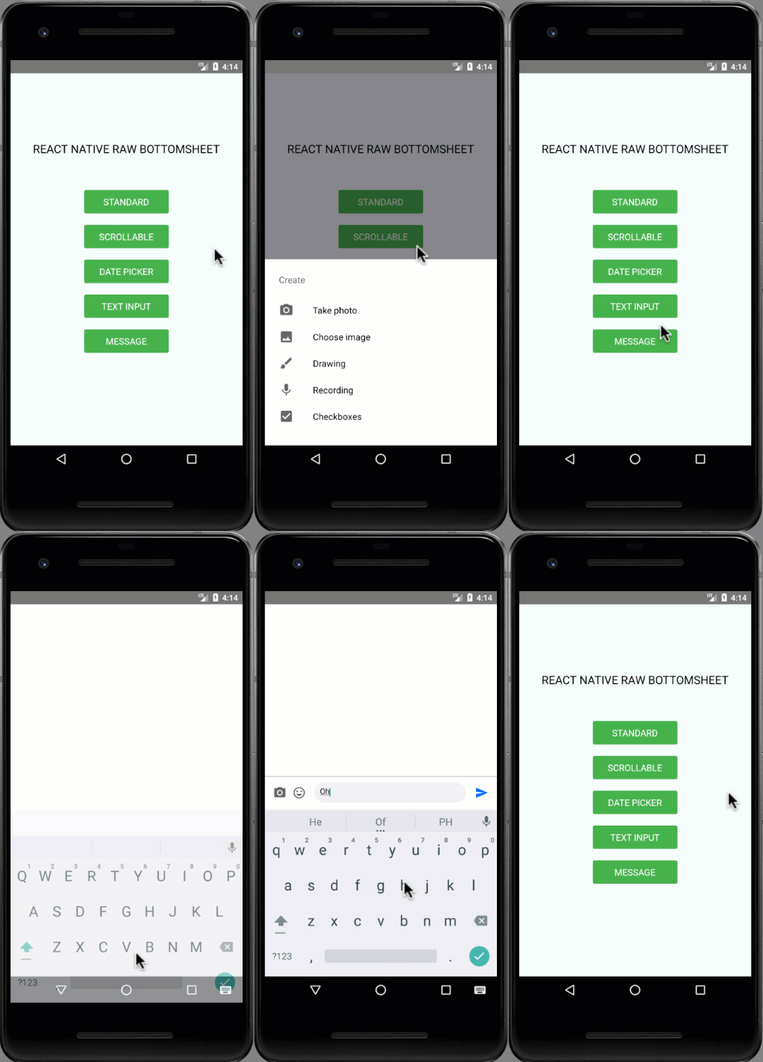
| Showcase iOS | Showcase Android |
|---|
 |  |
Installation
npm i react-native-raw-bottom-sheet --save
or
yarn add react-native-raw-bottom-sheet
Example
Please check the example folder to explore more example codes.
Single Bottom Sheet
import React, {useRef} from 'react';
import {View, Button} from 'react-native';
import RBSheet from 'react-native-raw-bottom-sheet';

export default function Example() {
  const refRBSheet = useRef();

  return (
    <View style={{flex: 1}}>
      <Button
        title="OPEN BOTTOM SHEET"
        onPress={() => refRBSheet.current.open()}
      />
      <RBSheet
        ref={refRBSheet}
        useNativeDriver={true}
        customStyles={{
          wrapper: {
            backgroundColor: 'transparent',
          },
          draggableIcon: {
            backgroundColor: '#000',
          },
        }}
        customModalProps={{
          animationType: 'slide',
          statusBarTranslucent: true,
        }}
        customAvoidingViewProps={{
          enabled: false,
        }}>
        <YourOwnComponent />
      </RBSheet>
    </View>
  );
}
Multiple Bottom Sheet
const refRBSheet = useRef([]);

const renderItem = ({item, index}) => {
  return (
    <View>
      <TouchableOpacity
        style={styles.button}
        onPress={() => refRBSheet.current[index].open()}>
        <Text style={styles.buttonText}>ITEM {item + 1}</Text>
      </TouchableOpacity>

      <RBSheet ref={ref => (refRBSheet.current[index] = ref)}>
        <View style={styles.bottomSheetContainer}>
          <Text style={styles.bottomSheetText}>I AM ITEM {item + 1}</Text>
        </View>
      </RBSheet>
    </View>
  );
};
Props
| Props | Type | Description | Default |
|---|
| height | number | The height of bottom sheet | 260 |
| openDuration | number | Duration of the animation when opening bottom sheet | 300 (ms) |
| closeDuration | number | Duration of the animation when closing bottom sheet | 200 (ms) |
| closeOnPressMask | boolean | Press the outside area (mask) to close bottom sheet | true |
| closeOnPressBack | boolean | Press hardware back android to close bottom sheet (Android only) | false |
| draggable | boolean | Enable the drag-down gesture to close the bottom sheet | false |
| dragOnContent | boolean | The draggable is only worked on the draggable icon. Set this to true
if you want to drag on the content as well (doesn't work with ScrollView) | false |
| useNativeDriver | boolean | Use the native driver to run smoother animation | false |
| customStyles | object | Add custom styles to bottom sheet | {} |
| customModalProps | object | Add custom props to modal | {} |
| customAvoidingViewProps | object | Add custom props to KeyboardAvoidingView | {} |
| onOpen | function | Callback function that will be called after the bottom sheet has been opened | null |
| onClose | function | Callback function that will be called after the bottom sheet has been closed | null |
Available Custom Style
customStyles: {
wrapper: {...},
container: {...},
draggableIcon: {...}
}
Methods
| Method Name | Description | Usage |
|---|
| open | Open the bottom sheet | refRBSheet.current.open() |
| close | Close the bottom sheet | refRBSheet.current.close() |
CONTRIBUTING
I'm really glad you're reading this, because we need volunteer developers to help bring this project to life.
How to contribute:
- Clone this repository
- Open project, then run
yarn to install devDependencies - Add your magic code for contribution
- Test your code
- Navigate to
example folder - Run
yarn & yarn start to run the example project - Test your code in
example/App.js
- Update
README.md to update documentation (Optional) - Write unit testing in
__tests__ folder (Optional) - Update
index.d.ts to update typing (Optional) - Make a pull request, Genius!
License
This project is licensed under the MIT License - see the LICENSE.md file for details.
Author
Made with ❤️ by NY Samnang.


