Research
Security News
Quasar RAT Disguised as an npm Package for Detecting Vulnerabilities in Ethereum Smart Contracts
Socket researchers uncover a malicious npm package posing as a tool for detecting vulnerabilities in Etherium smart contracts.
react-native-slider-picker
Advanced tools
A lean, custom React Native input component to select a single value on a scale from 0 to a maximum value of your choice.
npm install react-native-slider-picker
React Native Slider Picker's sole dependency is react-native-css-vh-vw, which is used for height and width dimensions.
Props:
Note: All props are optional and have default values.
Functional Props:
| Name | Type | Description | Default | Notes |
|---|---|---|---|---|
| callback | Function | Called on change. | () => {} | |
| convertToNumericInputOnScreenReader | Boolean | Determines if the component should be converted to a numeric typed <TextInput> component. | true | |
| defaultValue | Number | Default value for slider on load. | 5 | If valued passed is greater than maxValue, the value will be set to that of maxValue. |
| errorToleranceMargin | Number | Margin of error for user to move drag off of the cursor along the Y Axis of the screen/component. If user drags beyond this amount of units in either vertical direction the PanResponder event will not update position of cursor. | 50 | Is checked to ensure a Number type is passed that is greater than 0. |
| maxValue | Number | The maximum value/high end of range for the Slider. | 10 | |
| slideBeginCallback | Function | Callback function to be executed when Slider's touch event begins. | () => {} | Called in onPanResponderGrant property of panResponder |
General Style Props:
| Name | Type | Description | Default | Notes |
|---|---|---|---|---|
fillColor | String | Sets fill color of inner slider. | "dodgerblue" | Can pass valid React Native color keywords, hexidecimal, rgb(), or rgba() values. |
heightPercentage | Number | Percentage of device's viewport to set as component's height. | 1 | Value passed to vh() |
maxLabel | String | Label for the maximum value. | Empty <View> component. | Empty <View> has a flex : 1 value. |
midLabel | String | Label for the medium value. | Empty <View> component. | Empty <View> has a flex : 1 value. |
minLabel | String | Label for the minimum value. | Empty <View> component. | Empty <View> has a flex : 1 value. |
showFill | Boolean | Boolean value to determine whether or not the slider inner shows a fill or if it is transparent. | true | |
showNumberScale | Boolean | Boolean value to determine whether or not to display scale of numbers for the Slider's range. | false | |
showSeparatorScale | Boolean | Boolean value to determine whether or not to display lines dividing the slider into different sections. | false | |
widthPercentage | Number | Percentage of device's viewport to set as component's width. | 85 | Value passed to vw() |
Specific Style Props:
| Name | Type | Description | Default | Notes |
|---|---|---|---|---|
buttonBackgroundColor | String | Sets background color of Slider's button. | "white" | Can pass valid React Native color keywords, hexidecimal, rgb(), or rgba() values. |
buttonBorderColor | String | Sets border color of Slider's button. | "dimgrey" | Can pass valid React Native color keywords, hexidecimal, rgb(), or rgba() values. |
buttonBorderWidth | Number | Sets border width of Slider's button. | 1 | |
buttonDimensionsPercentage | Number | Sets height and width of Slider's button as percentage of viewport width. | 1 | |
labelFontColor | String | Sets font color of labels if they are displayed. | "dimgrey" | Can pass valid React Native color keywords, hexidecimal, rgb(), or rgba() values. |
labelFontSize | Number | Sets font size of labels if they are displayed. | 28 | |
labelFontWeight | String | Sets font weight of labels if they are displayed. | "normal" | |
scaleNumberFontColor | String | Sets font color of scale numbers if they are displayed. | "dimgrey" | Can pass valid React Native color keywords, hexidecimal, rgb(), or rgba() values. |
scaleNumberFontSize | Number | Sets font size of scale numbers if they are displayed. | 24 | |
scaleNumberFontWeight | String | Sets font weight of scale numbers if they are displayed. | "normal" | |
sliderInnerBackgroundColor | String | Sets background color of inner slider View. | "white" | Can pass valid React Native color keywords, hexidecimal, rgb(), or rgba() values. |
sliderInnerBorderStyles | Object | An object of StyleSheet properties to set border-related styles of sliderInner View component. | { borderWidth: vw(1) / 2, borderColor: '#d9dce4', borderBottomColor: '#f1f4f5', borderRadius: 50 } | If passed, the object is filtered to remove any key/value properties that are not for component's border. |
Style Override Props:
| Name | Type | Description | Default | Notes |
|---|---|---|---|---|
buttonStylesOverride | Object | If passed, overrides all styling for the slider's button. | null | |
labelStylesOverride | Object | If passed, overrides all styling for the slider's label text. | null | |
numberStylesOverride | Object | If passed, overrides all styling for the slider's number scale text. | null | |
selectionFillStylesOverride | Object | If passed, overrides all styling for the slider's inner fill indicating current value. | null | |
separatorStylesOverride | Object | If passed, overrides all styling for the separator lines for the slider. | null | |
sliderInnerStylesOverride | Object | If passed, overrides all styling for the slider's inner container. | null |
Accessibility/Screen Reader Numeric Input Conversion Props:
| Name | Type | Description | Default | Notes |
|---|---|---|---|---|
| accessibilityLabel | String | Passed to accessibilityLabel prop on numeric TextInput if screen reader is enabled and convertToNumberInputOnScreenReader is true | '' | |
| accessibilityHint | String | Passed to accessibilityHint prop on numeric TextInput if screen reader is enabled and convertToNumericInputOnScreenReader is true. | '' | |
| convertToNumericInputOnScreenReader | Boolean | Determines if the component should be converted to a numeric typed TextInput component. | true | |
| numericInputContainerStyles | Object | StyleSheet rules passed to the <View> component that wraps <TextInput> in numeric input for screen readers. | { width: vw(25), flexDirection: 'row',backgroundColor: '#f1f4f5', borderBottomColor: "#889cb2", borderBottomWidth: vh(1) / 3, marginHorizontal: vw(5), marginVertical: vh(2), padding: vw(4), borderTopLeftRadius: 10, borderTopRightRadius: 10, ... Platform.isPad ? ({ marginTop: vh(4)}) : null } | |
| numericInputTextInputStyles | Object | StyleSheet rules passed to the <TextInput> component in numeric input for screen readers. | { flex: 1, fontSize: Math.ceil(vw(3) * 1.3), ... Platform.select({ ios: { marginTop: vw(2) }, android: { paddingBottom: 0, paddingTop: 5 }}) } |
Basic, bare-bones usage:
import { SliderPicker } from 'react-native-slider-picker';

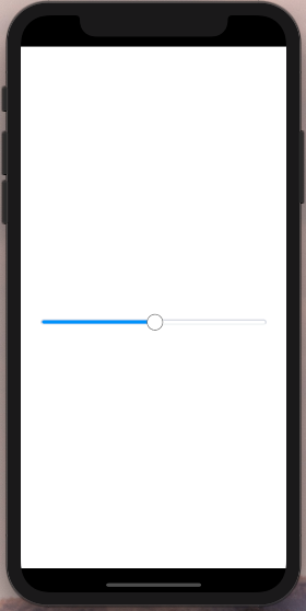
<SliderPicker />
Output:

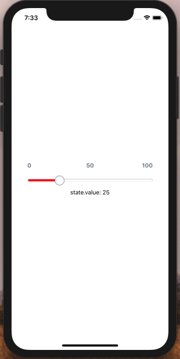
Usage with many props:
import { SliderPicker } from 'react-native-slider-picker';

export class Demo extends React.Component {
  constructor(props) {
    super(props);

    this.state = { value: 25 };
  }

  render() {
    return (
      <View style={styles.container}>

        <SliderPicker
          minLabel={'0'}
          midLabel={'50'}
          maxLabel={'100'}
          maxValue={100}
          callback={position => {
            this.setState({ value: position });
          }}
          defaultValue={this.state.value}
          labelFontColor={"#6c7682"}
          labelFontWeight={'600'}
          showFill={true}
          fillColor={'red'}
          labelFontWeight={'bold'}
          showNumberScale={true}
          showSeparatorScale={true}
          buttonBackgroundColor={'#fff'}
          buttonBorderColor={"#6c7682"}
          buttonBorderWidth={1}
          scaleNumberFontWeight={'300'}
          buttonDimensionsPercentage={6}
          heightPercentage={1}
          widthPercentage={80}
        />

        <Text>state.value: {this.state.value}</Text>
      </View>
    );
  }
}
Output:

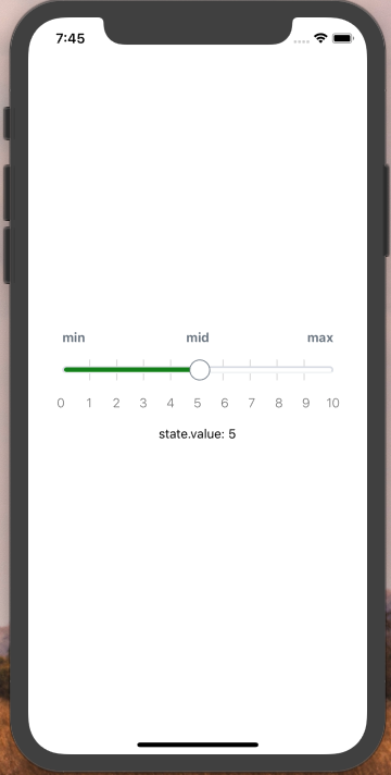
Usage with scale
import { SliderPicker } from 'react-native-slider-picker';

export class Demo extends React.Component {
  constructor(props) {
    super(props);

    this.state = { value: 5 };
  }

  render() {
    return (
      <View style={styles.container}>

        <SliderPicker
          minLabel={'min'}
          midLabel={'mid'}
          maxLabel={'max'}
          maxValue={10}
          callback={position => {
            this.setState({ value: position });
          }}
          defaultValue={this.state.value}
          labelFontColor={"#6c7682"}
          labelFontWeight={'600'}
          showFill={true}
          fillColor={'green'}
          labelFontWeight={'bold'}
          showNumberScale={true}
          showSeparatorScale={true}
          buttonBackgroundColor={'#fff'}
          buttonBorderColor={"#6c7682"}
          buttonBorderWidth={1}
          scaleNumberFontWeight={'300'}
          buttonDimensionsPercentage={6}
          heightPercentage={1}
          widthPercentage={80}
        />

        <Text>state.value: {this.state.value}</Text>
      </View>
    );
  }
}
Output:

FAQs
Custom range slide picker for React Native.
We found that react-native-slider-picker demonstrated a not healthy version release cadence and project activity because the last version was released a year ago. It has 1 open source maintainer collaborating on the project.
Did you know?

Socket for GitHub automatically highlights issues in each pull request and monitors the health of all your open source dependencies. Discover the contents of your packages and block harmful activity before you install or update your dependencies.

Research
Security News
Socket researchers uncover a malicious npm package posing as a tool for detecting vulnerabilities in Etherium smart contracts.

Security News
Research
A supply chain attack on Rspack's npm packages injected cryptomining malware, potentially impacting thousands of developers.

Research
Security News
Socket researchers discovered a malware campaign on npm delivering the Skuld infostealer via typosquatted packages, exposing sensitive data.