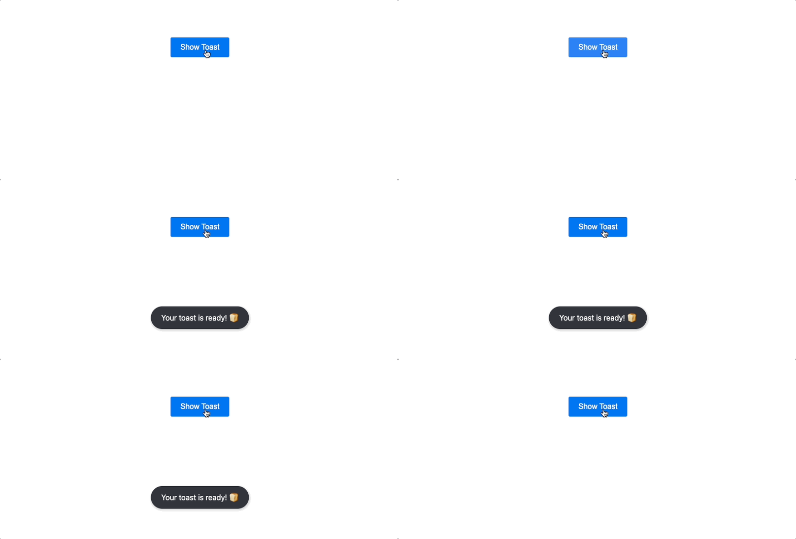
React Simple Toasts 🍞
React Simple Toasts is a lightweight, user-friendly toast message library for React applications.


Table of Contents
Installation
To install the package via npm, run:
npm install react-simple-toasts
Usage
To utilize React Simple Toasts, invoke the toast function with a message to display:
import toast from 'react-simple-toasts';

function MyComponent() {
  return <button onClick={() => toast('Hello, world!')}>Display Toast</button>;
}
By default, the toast message is displayed for 3 seconds. Modify the duration by providing a second argument to the toast function:
toast('Hello, world!', 5000);
Adjust the appearance and behavior of the toast message by supplying an options object to the toast function:
toast('Hello, world!', {
  duration: 5000,
  position: 'top-right',
  clickable: true,
  clickClosable: true,
  className: 'custom-toast',
  render: (message) => <CustomToast message={message} />,
  onClick: (event) => console.log('Toast clicked!'),
});
Live Demo
Experience React Simple Toasts in action with our live demo.
API
toast(message, options)
Displays a toast message with the specified message and options.
Main Parameters
| Parameter | Type | Description |
|---|
message | string, ReactNode | The message to display in the toast. |
options | object | An optional object containing options for the toast. |
Options Object Properties
| Property | Type | Description |
|---|
duration | number | The duration (in milliseconds) for which the toast message will be displayed. Default is 3000. |
className | string | A string of classes to apply to the toast container. |
clickable | boolean | A boolean value that determines whether the toast message is clickable. Default is false. |
clickClosable | boolean | A boolean value that determines whether the toast message can be closed by clicking on it. Default is false. |
position | string | A string that sets the position of the toast message. Available options are 'bottom-left', 'bottom-center', 'bottom-right', 'top-left', 'top-center', 'top-right', and 'center'. Default is 'bottom-center'. |
maxVisibleToasts | number | The maximum number of toast messages that can be displayed simultaneously. Default is null, which allows an unlimited number of toasts. |
render | function | A function that returns a ReactNode to render as the toast message. The function takes a message argument, which is the message to display in the toast. Default is null. |
onClick | function | A function to be called when the toast message is clicked. This function takes an event argument, which is the click event. Must be used with clickable: true. |
onClose | function | A function to be called when the toast message is closed and the closing animation is finished. |
onCloseStart | function | A function to be called when the toast message starts closing, right before the closing animation begins. |
Toast Return Object
When the toast function is called, it returns an object with a single method, close(), allowing you to manually close the toast message currently being displayed.
| Method | Description | Version |
|---|
close() | Closes the currently displayed toast message. | 3.3.0 |
updateDuration(newDuration: number) | Updates the duration of the currently displayed toast message. | 3.5.0 |
update(message: ReactNode, duration?: number) | Updates the message and duration of the currently displayed toast message. | 3.5.0 |
You can invoke this method at any time to close the toast message before its duration has elapsed. For instance, you might call it in response to a user interaction, such as a button click.
const myToast = toast('Hello, world!');
<button onClick={() => myToast.close()}>Close Toast Message</button>;
createToast(options)
Available from version 3.6.0.
The createToast function creates and returns a new toast function instance based on the given options. This allows you to create and manage multiple pre-configured toast instances with various options.
The options object contains the following properties:
| Parameter | Type | Description |
|---|
duration | number | The duration (in milliseconds) for which the toast message will be displayed. Default is 3000. |
className | string | A string of classes to apply to the toast container. |
clickClosable | boolean | A boolean value that determines whether the toast message can be closed by clicking on it. Default is false. |
position | string | A string that sets the position of the toast message. Available options are 'bottom-left', 'bottom-center', 'bottom-right', 'top-left', 'top-center', 'top-right', and 'center'. Default is 'bottom-center'. |
maxVisibleToasts | number | The maximum number of toast messages that can be displayed simultaneously. Default is null, which allows an unlimited number of toasts. |
render | function | A function that returns a ReactNode to render as the toast message. The function takes a message argument, which is the message to display in the toast. Default is null. |
createToast is similar to toastConfig, which sets global default options, but it allows you to create and use toast instances with different configurations for more flexibility. This enables you to apply different options to each toast instance.
import { createToast } from 'react-simple-toasts';

const customToast = createToast({
  duration: 5000,
  className: 'custom-toast',
  clickClosable: true,
  position: 'bottom-right',
  maxVisibleToasts: 3,
  render: (message) => <b className="my-toast">{message}</b>,
});

function MyComponent() {
  return (
    <button onClick={() => customToast('Hello, world!')}>
      Display Custom Toast
    </button>
  );
}
toastConfig(options)
Sets default options for all toast messages.
The options object contains the following properties:
| Parameter | Type | Description |
|---|
duration | number | The duration (in milliseconds) for which the toast message will be displayed. Default is 3000. |
className | string | A string of classes to apply to the toast container. |
clickClosable | boolean | A boolean value that determines whether the toast message can be closed by clicking on it. Default is false. |
position | string | A string that sets the position of the toast message. Available options are 'bottom-left', 'bottom-center', 'bottom-right', 'top-left', 'top-center', 'top-right', and 'center'. Default is 'bottom-center'. |
maxVisibleToasts | number | The maximum number of toast messages that can be displayed simultaneously. Default is null, which allows an unlimited number of toasts. |
render | function | A function that returns a ReactNode to render as the toast message. The function takes a message argument, which is the message to display in the toast. Default is null. |
toastConfig is used to set global default options, which will be applied to all toast instances used throughout your app. However, if you need to create toast instances with different configurations, it is recommended to use createToast instead.
import { toastConfig } from 'react-simple-toasts';
toastConfig({
duration: 5000,
className: 'custom-toast',
clickClosable: true,
position: 'bottom-right',
maxVisibleToasts: 3,
render: (message) => <b className="my-toast">{message}</b>,
});
clearToasts()
Removes all currently displayed toast messages.
This function provides a convenient way to remove all active toast messages at once. It can be useful in situations where you need to clear all toasts, such as when a user logs out or navigates away from a page.
import { clearToasts } from 'react-simple-toasts';

function ClearAllToastsButton() {
  return (
    <button onClick={() => clearToasts()}>Clear All Toast Messages</button>
  );
}
Contributing
Contributions are always welcome! If you want to contribute to this project.
License
This project is licensed under the MIT License.


