Security News
Research
Data Theft Repackaged: A Case Study in Malicious Wrapper Packages on npm
The Socket Research Team breaks down a malicious wrapper package that uses obfuscation to harvest credentials and exfiltrate sensitive data.
react-tailwindcss-datepicker
Advanced tools

A modern date range picker component for React using Tailwind 3 and dayjs. Alternative to Litepie Datepicker which uses Vuejs.
Go to full documentation
⚠️ React Tailwindcss Datepicker uses Tailwind CSS 3 (with the @tailwindcss/forms plugin) & Dayjs under the hood to work.
$ npm install react-tailwindcss-datepicker
$ yarn add react-tailwindcss-datepicker
Make sure you have installed the peer dependencies as well with the below versions.
"dayjs": "^1.11.6",
"react": "^18.2.0"
Add the datepicker to your tailwind configuration using this code
// in your tailwind.config.js
module.exports = {
    // ...
    content: ["./src/**/*.{js,jsx,ts,tsx}", "./node_modules/react-tailwindcss-datepicker/dist/index.esm.js"],
    // ...
}
Then use react-tailwindcss-select in your app:
import React, {useState} from "react";
import Datepicker from "react-tailwindcss-datepicker";

const App = () => {
    const [value, setValue] = useState({
        startDate: new Date(),
        endDate: new Date().setMonth(11)
    });

    const handleValueChange = (newValue) => {
        console.log("newValue:", newValue);
        setValue(newValue);
    }

    return (
        <div>
            <Datepicker
                value={value}
                onChange={handleValueChange}
            />
        </div>
    );
};

export default App;
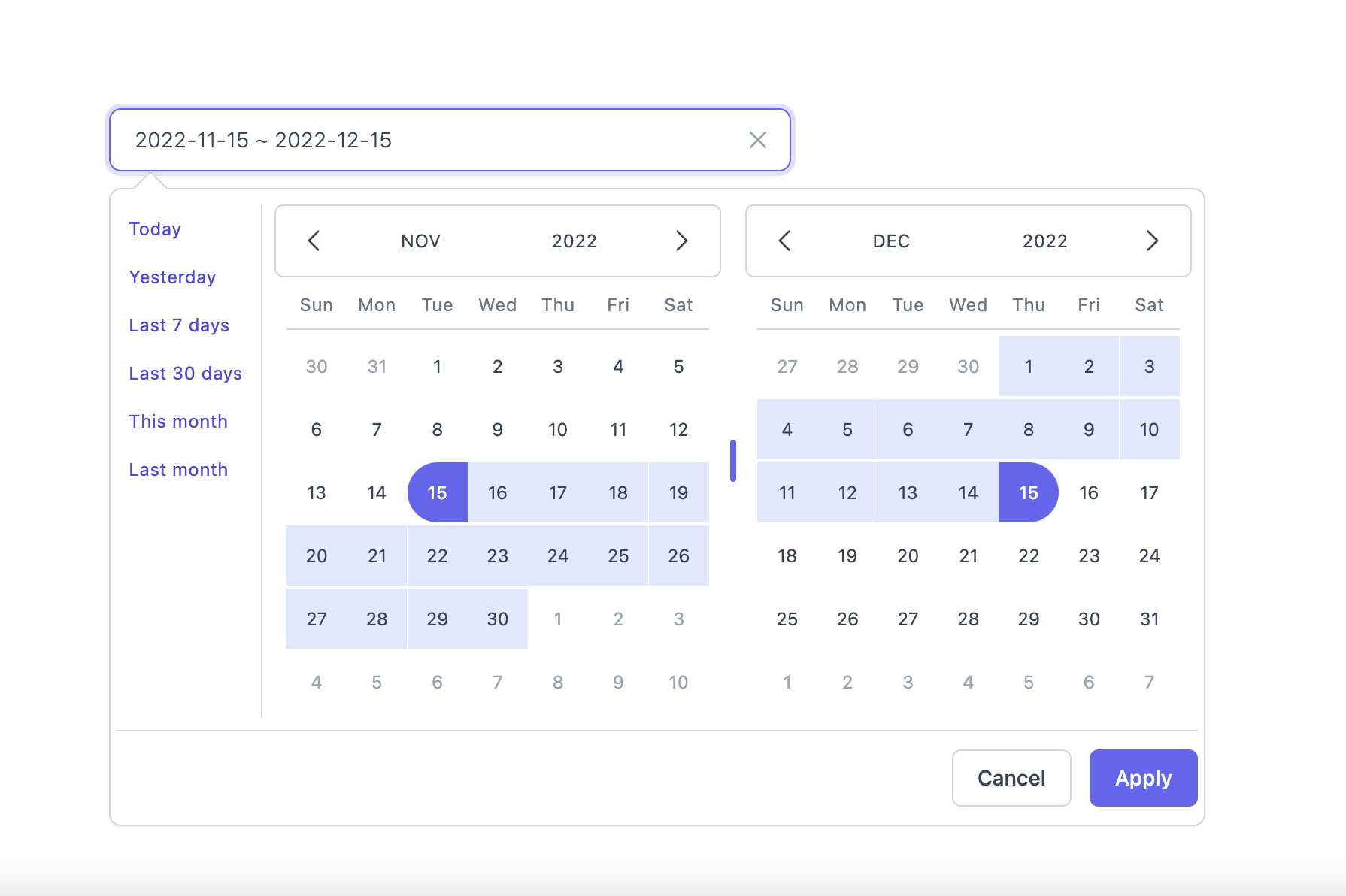
Light Mode

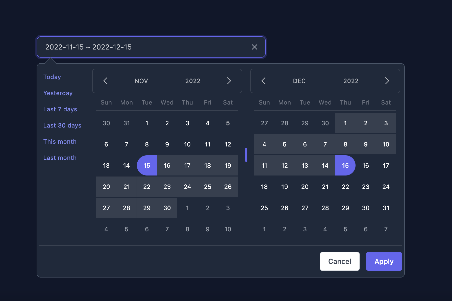
Dark Mode

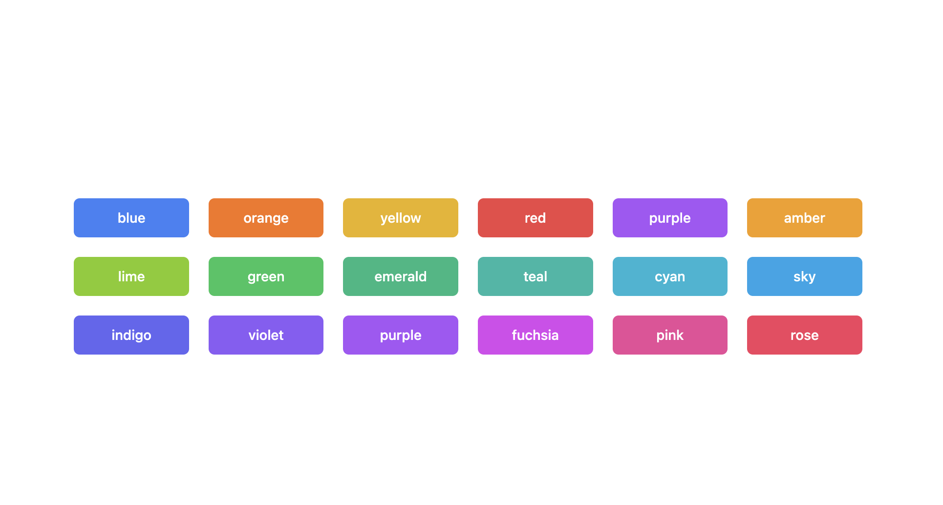
Supported themes

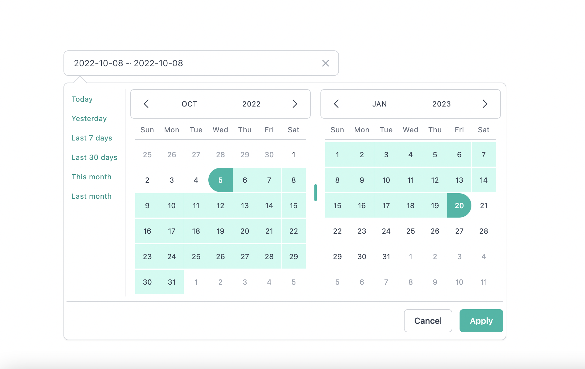
Teal themes example

You can find the demo at here
Info
👉 To discover the other possibilities offered by this library, you can consult the full documentation.
Got ideas on how to make this better? Open an issue!
I thank you in advance for your contribution to this project.
MIT Licensed. Copyright (c) Lewhe Onesine 2022.
FAQs
A modern React Datepicker using Tailwind CSS 3
The npm package react-tailwindcss-datepicker receives a total of 36,508 weekly downloads. As such, react-tailwindcss-datepicker popularity was classified as popular.
We found that react-tailwindcss-datepicker demonstrated a healthy version release cadence and project activity because the last version was released less than a year ago. It has 1 open source maintainer collaborating on the project.
Did you know?

Socket for GitHub automatically highlights issues in each pull request and monitors the health of all your open source dependencies. Discover the contents of your packages and block harmful activity before you install or update your dependencies.

Security News
Research
The Socket Research Team breaks down a malicious wrapper package that uses obfuscation to harvest credentials and exfiltrate sensitive data.

Research
Security News
Attackers used a malicious npm package typosquatting a popular ESLint plugin to steal sensitive data, execute commands, and exploit developer systems.

Security News
The Ultralytics' PyPI Package was compromised four times in one weekend through GitHub Actions cache poisoning and failure to rotate previously compromised API tokens.