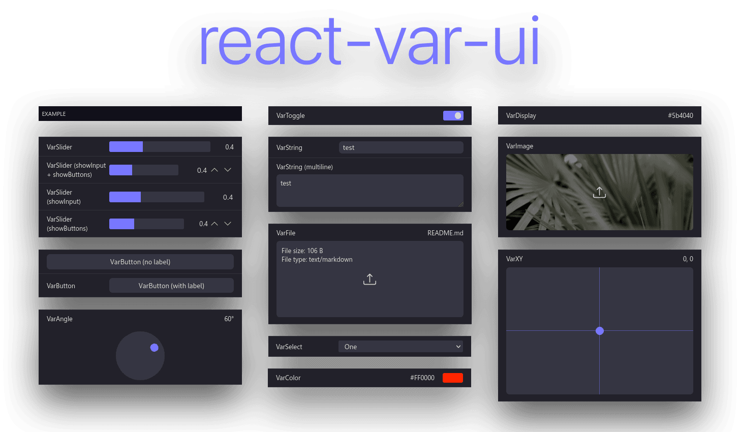
react-var-ui
Simple React settings library.


React component library for variable setting and preview, inspired by iOS settings, react-dat-gui and dat.gui.
While some code from react-dat-gui was used, this library functions in a completely different way. The codebase uses modern React code practices such as hooks and functional components. Instead of iterating over the children array, react-var-ui uses a Context. Creation of custom components is also easier.
Installation
Install react-var-ui with either npm or yarn:
yarn add react-var-ui
# or
npm install react-var-ui
Then include the CSS with:
@import 'react-var-ui/dist/index.css';
or:
import 'react-var-ui/dist/index.css';
Example usage
const [values, setValues] = React.useState({
  toggle: true,
  color: '#FF0000',
  select: 1,
  slider: 0.4
});

return (
  <VarUI updateValues={setValues} values={values}>
    <VarCategory label="Example">
      <VarColor path="color" label="Color" />
      <VarToggle path="toggle" label="Toggle" />
      <VarSelect
        path="select"
        label="Select"
        options={[
          { key: 0, label: 'Zero' },
          { key: 1, label: 'One' }
        ]}
      />
      <VarSlider
        label="VarSlider"
        path="slider"
        min={0.2}
        max={0.8}
        step={0.1}
      />
    </VarCategory>
  </VarUI>
);
Theme customization
The colors can be customized as such (provided are default values):
.react-var-ui {
  --react-var-ui-foreground-color: #ddd;
  --react-var-ui-background-color: #11111a;
  --react-var-ui-accent-color: #4444ff;
  --react-var-ui-input-background-color: #66666a;
  --react-var-ui-label-background-normal-color: #22222a;
  --react-var-ui-label-background-hover-color: #33333a;
  --react-var-ui-label-border-color: #33333a;
}


