What is reactjs-popup?
reactjs-popup is a simple and flexible React component for creating various types of popups, including tooltips, modals, and dropdowns. It is designed to be easy to use and customize, making it a popular choice for adding interactive elements to React applications.
What are reactjs-popup's main functionalities?
Modal Popup
This feature allows you to create a modal popup that can be triggered by a button. The modal can contain any content, and it includes a close button to dismiss the popup.
```jsx
import React from 'react';
import Popup from 'reactjs-popup';
import 'reactjs-popup/dist/index.css';
const ModalExample = () => (
<Popup trigger={<button> Open Modal </button>} modal>
{close => (
<div>
<button onClick={close}>×</button>
<div> Modal Content </div>
</div>
)}
</Popup>
);
export default ModalExample;
```
Tooltip Popup
This feature allows you to create a tooltip popup that appears when you hover over a trigger element. The tooltip can be positioned relative to the trigger element.
```jsx
import React from 'react';
import Popup from 'reactjs-popup';
import 'reactjs-popup/dist/index.css';

const TooltipExample = () => (
  <Popup trigger={<button> Hover me </button>} position="right center">
    <div> Tooltip Content </div>
  </Popup>
);

export default TooltipExample;
```
Dropdown Popup
This feature allows you to create a dropdown popup that appears when you click on a trigger element. The dropdown can contain any content and can be positioned relative to the trigger element.
```jsx
import React from 'react';
import Popup from 'reactjs-popup';
import 'reactjs-popup/dist/index.css';

const DropdownExample = () => (
  <Popup trigger={<button> Open Dropdown </button>} position="bottom left">
    <div> Dropdown Content </div>
  </Popup>
);

export default DropdownExample;
```
Other packages similar to reactjs-popup
react-modal
react-modal is a widely-used package for creating accessible modal dialogs in React. It provides more advanced features for managing modal states and accessibility compared to reactjs-popup, but it is primarily focused on modals rather than other types of popups.
react-tooltip
react-tooltip is a package specifically designed for creating tooltips in React applications. It offers more customization options and advanced features for tooltips compared to reactjs-popup, but it does not support other types of popups like modals or dropdowns.
react-dropdown
react-dropdown is a package focused on creating dropdown menus in React. It provides more specialized features for dropdowns, such as keyboard navigation and multi-select options, but it does not support other types of popups like modals or tooltips.


built with react Fragment : react 16 Tiny 3KB
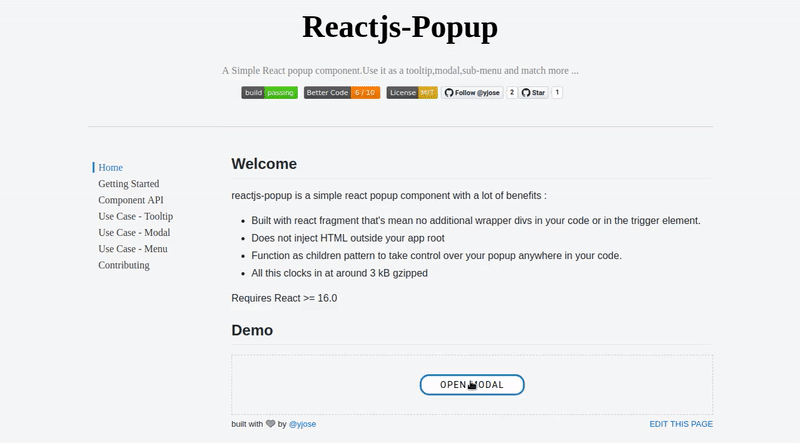
Welcome
Reactjs-popup is a simple react popup component with a lot of benefits :
- Built with react fragment that’s mean no additional wrapper Divs in your code or in the trigger element. 😮
- Does not inject HTML outside your app root. 📦
- Function as children pattern to take control over your popup anywhere in your code. 💪
- Modal, Tooltip, Menu : All in one 🏋️
- Full style customization 👌
- Easy to use. 🚀
- IE Support.🚀
- TypeScript Support 👌
- All these clocks in at around 3 kB zipped. ⚡️
Requires React >= 16.0
Reactjs-popup is being sponsored by the following tool; please help to support us by taking a look and signing up to a free trial

Demo
Live Demo
Installing / Getting started
This package is available in npm repository as reactjs-popup. It will work correctly with all popular bundlers.
npm install reactjs-popup --save
Using yarn
yarn add reactjs-popup -s
Include the Component
To start using reactjs popup you just need to import the component from the reactjs-popup package.
import React from "react";
import Popup from "reactjs-popup";

export default () => (
  <Popup trigger={<button> Trigger</button>} position="right center">
    <div>Popup content here !!</div>
  </Popup>
);
You can find more examples in the reactjs-popup home page
Contributing
Clone Repo
Fork and then clone the repo
git clone git@github.com:your-username/reactjs-popup.git
Start Developing
Install all npm scripts:
npm install
or
yarn install
we use a simple package called parcel-story it's a simple storybook alternative more info https://github.com/yjose/parcel-story
Run parcel-story :
yarn start
Run Test in watch mode
yarn test-watch
To make contributing simply you need to create a new story with documentation under stories/src directory ( you can copy/past any story to start with ).
In this story, you need to present the new features or the bug fix and don't forget to comment your code :) .
Make Changes. If you want to contribute check out the help wanted issues for things that need fixing.
Before submitting a pull request run npm run test to run the unit-tests and npm run eslint to check for linting errors in your changes.
Licensing
The code in this project is licensed under MIT license.
Show your support!

That's all, thank you for your attention, please the repo to show your support...
...we are all made of stars !
Maintainers


