Research
Security News
Quasar RAT Disguised as an npm Package for Detecting Vulnerabilities in Ethereum Smart Contracts
Socket researchers uncover a malicious npm package posing as a tool for detecting vulnerabilities in Etherium smart contracts.
sc-filtered-list
Advanced tools
A UI control to allow the user to quickly choose a single object from a list of many objects
sc-filtered-list is a UI control to allow the user to quickly choose a
single object from a list of many objects.

Get Node.js. And then in a console...
npm install
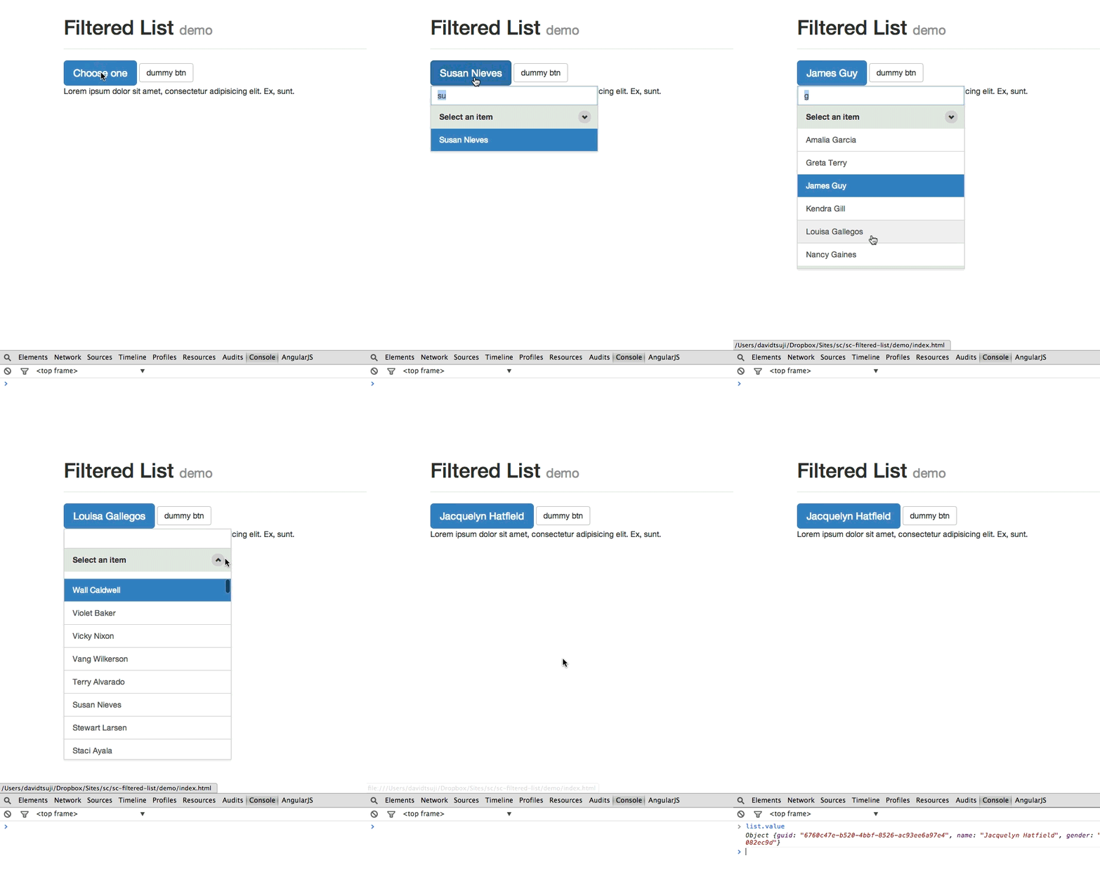
This control is attached to a button. When the button is clicked a list would appear inline to allow the user to either use the mouse or keyboard to choose an item. A text input is available to allow the list to be filtered.
The FilteredList can be instantiated using data- attributes directly in
the markup or manually by code.
Instantiate using data- attributes
Add data-sc-filtered-list to a <button>. Will instantiate on domready.
<button data-sc-filtered-list>
To get a reference to the instantiated object use the jQuery data method:
$('#myButton').data('scfilteredlist');
Instantiate using code
var filter = new FilteredList(document.querySelector('#myButton'));
Give options using the data- attribute.
<button data-sc-filtered-list data-sc-filtered-list-options='{"fuzzy": true}'>
The options object must be a properly formatted JSON string.
Give options using code.
var filter = new FilteredList(document.querySelector('#myButton'), {
  fuzzy: true
});
buttonLabel The button label (default: "Choose one")fuzzy The search type. If true "dvd" will match "david" (default: false)itemLabelKey The object key to use for the items label (default: "name")listTitle The title above the list (default: "Select an item")maxNumItems The maximum number of items in the list (default: 10)maxNumItemsVisible The maximum number of items visible (default: 7)width The width of the list (default: 300)sort The default sort ["", "asc", "desc"] (default: "desc")sortControlVisible If the sort control is visible (default: true)To change the defaults, use the global FilteredList variable.
FilteredList.defaults.maxNumItems = 10;
The FilteredList uses an event based system with methods on, off and
once.
myList.on('change', function(){});
Events
change When the user selects and item and the value has changedclose When the list closesdestroy When the FilteredList is destroyedfiltered When the search value changesitemFocus When an item in the list gains focusopen When the list openssort When the list is sortedredraw When the list redraws itselffetch When the list tries to fetch data based on the search termCSS is provided and is required however it is plain by design. There are 2 ways to make the list pretty.
The markup that is generated on instantiation is template driven. These templates can be changed if necessary.
FilteredList.templates.listWrapper
<div class='{{config.className}}-container'>{{!config.templates.listInput}}{{!config.templates.listHeader}}{{!config.templates.listItemWrapper}}</div>
FilteredList.templates.listInput
<div class='{{config.className}}-input-container'><input type='text' class='{{config.className}}-input form-control'></div>
FilteredList.templates.listHeader
<header class='{{config.className}}-header panel-heading'>{{!config.defaults.listTitle}}{{!config.templates.listSortToggle}}</header>
FilteredList.templates.listItemWrapper
<div class='{{config.className}}-items list-group'></div>
FilteredList.templates.listItem
<a href class='{{config.className}}-item list-group-item' data-cid='{{cid}}'>{{!key}}</a>
FilteredList.templates.listSortToggle
<button type='button' class='{{config.className}}-sort-toggle btn btn-default btn-xs' title='sort'></button>
Adds an array of objects/items in bulk
myList.data([{
  name: "david"
}, {
  name: "max"
}]);
myList.items.push({
  name: "david"
});
To get the value of the selected object/item use the value property.
myList.value;
Destroys the FilteredList and invalidates the object.
myList.destroy();
Any further calls to methods like
destroyordataetc will return nothing.
FAQs
A UI control to allow the user to quickly choose a single object from a list of many objects
The npm package sc-filtered-list receives a total of 1 weekly downloads. As such, sc-filtered-list popularity was classified as not popular.
We found that sc-filtered-list demonstrated a not healthy version release cadence and project activity because the last version was released a year ago. It has 1 open source maintainer collaborating on the project.
Did you know?

Socket for GitHub automatically highlights issues in each pull request and monitors the health of all your open source dependencies. Discover the contents of your packages and block harmful activity before you install or update your dependencies.

Research
Security News
Socket researchers uncover a malicious npm package posing as a tool for detecting vulnerabilities in Etherium smart contracts.

Security News
Research
A supply chain attack on Rspack's npm packages injected cryptomining malware, potentially impacting thousands of developers.

Research
Security News
Socket researchers discovered a malware campaign on npm delivering the Skuld infostealer via typosquatted packages, exposing sensitive data.