specialUi
你要的特效UI组件在这里!来看看有惊喜的!
Install
npm i special-ui
Usage
全局使用
import Vue from 'vue'
import specialUi from 'special-ui'
Vue.use(specialUi)
按需引入
import Vue from 'vue'
import {FlyLine} from 'special-ui'
Vue.use(FlyLine)
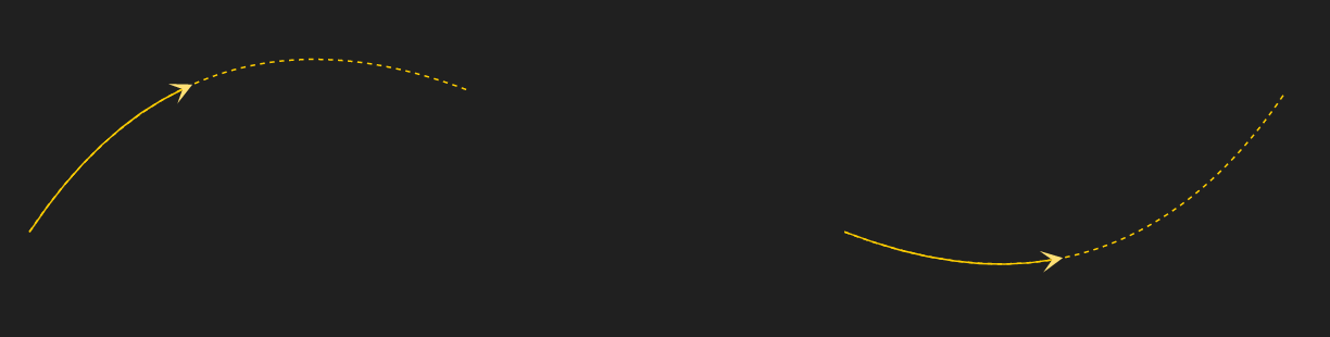
1. FlyLine 组件
一个2维的飞线组件
效果图
飞线使用
引入
import Vue from 'vue'
import {FlyLine} from 'special-ui'
Vue.use(FlyLine)
使用
lines = [
    {
        start: [329.3029054888133, 166.22157534665564],
        end: [800, 80],
    },
    {
        start: [829.3029054888133, 166.22157534665564],
        end: [1400, 80],
        arcRadis: -0.6
    }
]

config = {
    isDash: false
}
<fly-lIne :lines="lines" :config="config"></fly-lIne>
组件参数
config: 对象
| 属性 | 说明 | 默认值 |
|---|
| lineColor | 飞线颜色 | #FFCE00 |
| isDash | 是否是虚线 | true |
| dash | 虚线配置 | '3, 3' |
| isFly | 是否显示飞线动效 | true |
| flyLineColor | 飞线动效颜色 | #FFCE00 |
| isShowArrow | 是否显示箭头 | true |
lines: 数组
| 属性 | 说明 | 默认值 |
|---|
| start | 起点坐标 | 无 |
| end | 终点坐标 | 无 |
| arcRadis | 曲线系数 | 0.5 |
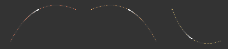
2. FlyLine2 组件
一个2维的飞线组件2
效果图
飞线使用
引入
import Vue from 'vue'
import {FlyLine2} from 'special-ui'
Vue.use(FlyLine2)
使用
<template>
<div class="container">
<fly-line2 :width="1820" :height="900" :dataset="data" :config="config"></fly-line2>
</div>
</template>
<script>
export default {
name: 'App',
data () {
return {
data: [
{
from: { x: 300, y: 300},
to: { x: 700, y: 100},
raduis: 0.5
},
{
from: { x: 1200, y: 300},
to: { x: 800, y: 100},
raduis: 0.5
},
{
from: { x: 1300, y: 100},
to: { x: 1600, y: 300},
raduis: -0.5
}
],
config: {
lineDash: [5, 4],
lineWidth: 1,
colors: ['#F9815C', '#F8AB60', '#EDCC72', '#E2F194', '#94E08A', '#4ECDA5'],
moveRadius: 3,
fillColor: '#fff',
shadowColor: '#fff',
shadowBlur: 2
}
}
}
}
</script>
<style>
.container {
height: 100%;
}
</style>
组件参数
| 属性 | 说明 | 默认值 |
|---|
| width | 画布宽度 | 0 |
| height | 画布高度 | 0 |
| dataset | 飞线数组 | [] |
| config | 飞线参数配置 | {} |
config: 数组
| 属性 | 说明 | 默认值 |
|---|
| markerRadius | marker点半径 | 3, 为0则没有圆点显示 |
| markerColor | marker颜色 | null, 不设置则和线条颜色一致 |
| lineWidth | 线条宽度 | 1 |
| lineDash | 虚线设置 | [], 为空数组则显示实线 |
| colors | 飞线颜色 | [] |
| moveRadius | 移动点半径 | 3 |
| fillColor | 移动点颜色 | '#fff' |
| shadowColor | 移动点阴影颜色 | '#fff' |
| shadowColor | 移动点阴影颜色 | '#fff' |
| shadowBlur | 移动点阴影大小 | 5 |
3. AirLoading 组件
一个无人机动画加载组件
效果图

无人机动画加载组件使用
引入
import Vue from 'vue'
import {AirLoading} from 'special-ui'
Vue.use(AirLoading)
使用
<air-loading :loading="loading"></air-loading>
组件参数
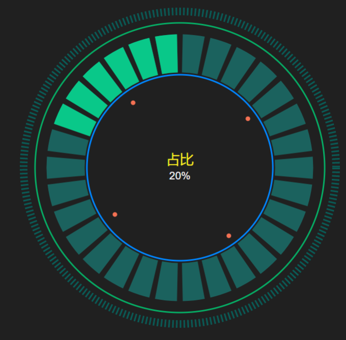
4. RingChart 组件
一个炫酷的环形占比组件
效果图
环形占比组件使用
引入
import Vue from 'vue'
import {RingChart} from 'special-ui'
Vue.use(RingChart)
使用
config = {
    ring: {
        outDash: {
            height: 10
        },
        progress: {
            num: 30
        }
    },
    text: {
        title: {
            color: '#fff222'
        }
    }
}
<ring-chart :r="500" :num="20" :total="100" :title="'占比'" :subTitle="'20%'" :config="config"/>
组件参数
| 属性 | 说明 | 默认值 |
|---|
| r | 半径(控制宽高) | 300 |
| total | 总数 | 0 |
| num | 占比数 | 0 |
| title | 内部大标题 | '' |
| subTitle | 内部小标题 | '' |
| config | 环形参数对象 | {} |
config对象参数说明:
| 属性 | 说明 | 默认值 |
|---|
| text | 文本对象 | {} |
| ring | 环形图对象 | {} |
text参数说明:
color: 标题颜色;
fontSize: 标题字体;
dx: 标题x偏移量(默认居中);
dy: 标题y偏移量(默认居中);
| 属性 | 说明 | 默认值 |
|---|
| title | 大标题 | { color: '#ffffff', fontSize: '18px', dx: 0, dy: -5) } |
| subTitle | 小标题 | { color: '#ffffff', fontSize: '14px', dx: 0, dy: 15 } |
ring参数说明:
outDash: 设置最外层虚线参数;
outRing:设置外层实线参数;
innerRing:设置内层实线参数;
progress:设置进度条参数;
anniCircle:设置内层动画参数;
| 属性 | 说明 | 默认值 |
|---|
| title | 大标题 | { color: '#ffffff', fontSize: '18px', dx: 0, dy: -5) } |
| subTitle | 小标题 | { color: '#ffffff', fontSize: '14px', dx: 0, dy: 15 } |
outDash参数说明:
| 属性 | 说明 | 默认值 |
|---|
| height | 高度 | 5 |
| dash | 虚线宽度及间隔 | '2, 3' |
| color | 颜色 | '2, 3' |
outRing|innerRing参数说明:
| 属性 | 说明 | 默认值 |
|---|
| height | 高度 | 5 |
| color | 颜色 | '2, 3' |
progress参数说明:
| 属性 | 说明 | 默认值 |
|---|
| color | 颜色 | 'rgba(18,253,240,0.30)' |
| activeColor | 高亮颜色 | '#09C889' |
| num | 扇形块数量 | 60 |
anniCircle参数说明:
| 属性 | 说明 | 默认值 |
|---|
| color | 颜色 | '#F47153' |
| radius | 半径 | 3 |
5. RingChart 组件
流程图组件
效果图
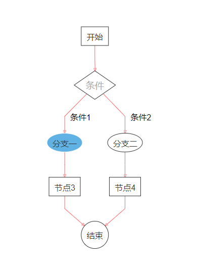
流程图组件使用
引入
import Vue from 'vue'
import {FlowChart} from 'special-ui'
Vue.use(FlowChart)
使用
<template>
<div class="container">
    <flow-chart :nodes="nodes" :edges="edges" :nodeStle="nodeStle" :eageStle="eageStle" :arrowheadStyle="arrowheadStyle" :direction="'TB'" @onSelect="selectNode"/>
</div>
</template>

<script>
export default {
    data () {
        return {
            nodeStle: 'stroke: #333; fill: #fff;',
            eageStle: 'stroke: #f66; stroke-width: 1px;',
            arrowheadStyle: 'stroke: #f66;',
            labelStyle: 'fill: #333; font-size: 14px',
            nodes: [],
            edges: []
        }
    },
    created() {
        this.init()
    },
    methods: {
        selectNode (d) {
            console.log(d)
        },
        init () {
            this.nodes = [
                {
                    id: 'e0',
                    value: {
                        label: '开始'
                    }
                },
                {
                    id: 'e1',
                    class: 'diamond',
                    labelStyle: 'fill: #aaa; font-size: 18px',
                    value: {
                        label: '条件',
                        shape: 'diamond'
                    }
                },
                {
                    id: 'e2',
                    style: 'stroke: #fff; fill: #61b2e4',
                    value: {
                        label: '分支一',
                        shape: 'ellipse'
                    }
                },
                {
                    id: 'e3',
                    value: {
                        label: '分支二',
                        shape: 'ellipse'
                    }
                },
                {
                    id: 'e4',
                    value: {
                        label: '节点3'
                    }
                },
                {
                    id: 'e5',
                    value: {
                        label: '节点4'
                    }
                },
                {
                    id: 'e6',
                    value: {
                        label: '结束',
                        shape: 'circle'
                    }
                }
            ]
            this.edges = [
                {
                    from: 'e0',
                    to: 'e1'
                },
                {
                    from: 'e1',
                    to: 'e2',
                    label: '条件1'
                },
                {
                    from: 'e1',
                    to: 'e3',
                    label: '条件2'
                },
                {
                    from: 'e2',
                    to: 'e4',
                },
                {
                    from: 'e3',
                    to: 'e5',
                },
                {
                    from: 'e4',
                    to: 'e6'
                },
                {
                    from: 'e5',
                    to: 'e6'
                }
            ]
        }
    }
}
</script>

<style lang="scss" scoped>
.container {
  height: 100%;
}
</style>
组件参数
| 属性 | 说明 | 默认值 |
|---|
| direction | 流程图方向 | LR (LR: 从左至右; RL: 从右至左; TB: 从上至下; BT: 从下至上) |
| nodes | 流程图节点 | [] |
| edges | 流程图连线 | [] |
| nodeStyle | 节点样式 | ' ', 遵循svg样式 |
| eageStyle | 连线样式 | ' ', 遵循svg样式 |
| arrowheadStyle | 连线箭头样式 | ' ', 遵循svg样式 |
| labelStyle | 文字样式 | ' ', 遵循svg样式 |
说明
可以在节点数组项中配置nodeStyle、labelStyle; 连线数组中配置eageStyle、arrowheadStyle、labelStyle;
配置了单项的样式后,优先级高于全局样式配置
事件
属性|说明
onSelect|节点点击事件
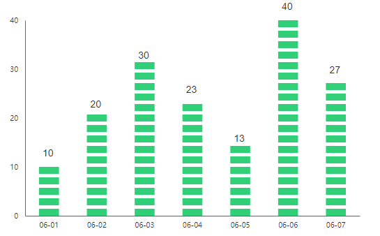
6. DashChart 组件
一个dash柱状图组件
效果图
DashChart组件使用
引入
import Vue from 'vue'
import {DashChart} from 'special-ui'
Vue.use(DashChart)
使用
<template>
<div class="container">
    <dash-chart :dataset="dataset" :xAxisArr="xAxisArr"/>
</div>
</template>

<script>
export default {
    data () {
        return {
            dataset: [10, 20, 30, 23, 13, 40, 27],
            xAxisArr: ['06-01', '06-02', '06-03', '06-04', '06-05', '06-06', '06-07']
        }
    },
}
</script>

<style lang="scss" scoped>
.container {
  height: 100%;
}
</style>
组件参数
| 属性 | 说明 | 默认值 |
|---|
| dataset | 统计数据数组 | [] |
| xAxisArr | x轴显示 | [0, 1, ...] |
| width | 画布宽度 | 600 |
| height | 画布高度 | 400 |
| color | 柱状图颜色 | '#31cf78' |
| dash | 柱状图高度和间隔 | [10, 5] |
| yAxisNum | y轴显示个数 | 5 |
| tickSizeInner | 坐标轴内刻度 | 0 |
| tickSizeOuter | 坐标轴外刻度 | 0 |
| axisColor | 坐标轴颜色 | '#666' |
| axisTextColor | 坐标轴文本颜色 | '#333' |
| padding | 内间距 | {top: 60, bottom: 60, left: 60, right: 60} |
| textStyle | 文本样式 | {fontSize: '14px',color: '#333333',dx: 5,dy: -15} |
textStyle属性说明:
fontSize: 字体大小
color: 字体颜色
dx: 文本偏移量x方向
dy: 文本偏移量y方向
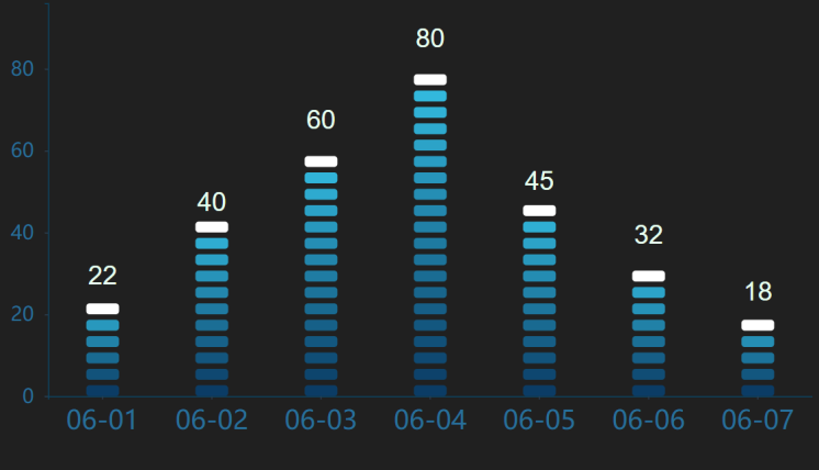
7. GradientDashChart 组件
一个渐变的dash柱状图组件
效果图
GradientDashChart组件使用
引入
import Vue from 'vue'
import {GradientDashChart} from 'special-ui'
Vue.use(GradientDashChart)
使用
<template>
<div class="container">
    <gradient-dash-chart
        :direction="'y'"
        :dataset="dataset"
        :axisArr="axisArr"
        :width="770"
        :height="400"
        :axisNum="config.axisNum"
        :tickSizeInner="config.tickSizeInner"
        :axisColor="config.axisColor"
        :xAxisTextSize="config.xAxisTextSize"
        :yAxisTextSize="config.yAxisTextSize"
        :axisTextColor="config.axisTextColor"
        :textStyle="config.textStyle"
        :dash="config.dash"
        :padding="config.padding"/>
</div>
</template>

<script>
export default {
    data () {
        return {
            dataset: [22, 40, 60, 80, 45, 32, 18],
            axisArr: ['06-01', '06-02', '06-03', '06-04', '06-05', '06-06', '06-07'],
            config: {
                dash: [30, 10, 5],
                padding: {
                    top: 5,
                    bottom: 35,
                    left: 70,
                    right: 0
                },
                axisNum: 4,
                axisColor: '#0B4665',
                xAxisTextSize: '24px',
                yAxisTextSize: '18px',
                tickSizeInner: 3,
                axisTextColor: '#276F99',
                textStyle: {
                    fontSize: '24px',
                    color: '#E6FFEF',
                    dx: 0,
                    dy: -20
                }
            }
        }
    },
}
</script>

<style lang="scss" scoped>
.container {
  height: 100%;
}
</style>
组件参数
| 属性 | 说明 | 默认值 |
|---|
| dataset | 统计数据数组 | [] |
| direction | 主轴方向 | y |
| axisArr | 副轴显示 | [] |
| width | 画布宽度 | 600 |
| height | 画布高度 | 400 |
| formColor | 渐变开始颜色 | '#0B3C65' |
| toColor | 渐变结束颜色 | '#37C6EA' |
| lastColor | 渐变结束颜色 | '#ffffff' |
| dash | 柱状图宽、高度和间隔 | [10, 25, 5] |
| axisNum | 副轴显示个数 | 5 |
| tickSizeInner | 坐标轴内刻度 | 0 |
| tickSizeOuter | 坐标轴外刻度 | 0 |
| axisColor | 坐标轴颜色 | '#666' |
| axisTextColor | 坐标轴文本颜色 | '#333' |
| xAxisTextColor | x坐标轴文本颜色 | '', 同时存在axisTextColor和xAxisTextColor,xAxisTextColor优先级更高 |
| yAxisTextColor | y坐标轴文本颜色 | '', 同时存在axisTextColor和yAxisTextColor,yAxisTextColor优先级更高 |
| axisTextSize | 坐标轴文本大小 | '14px' |
| xAxisTextSize | x坐标轴文本大小 | '', 同时存在axisTextSize和xAxisTextSize,xAxisTextSize优先级更高 |
| yAxisTextSize | y坐标轴文本大小 | '', 同时存在axisTextSize和yAxisTextSize,yAxisTextSize优先级更高 |
| padding | 内间距 | {top: 60, bottom: 60, left: 60, right: 60} |
| textStyle | 文本样式 | {fontSize: '14px',color: '#333333',dx: 5,dy: -15} |
textStyle属性说明:
fontSize: 字体大小
color: 字体颜色
dx: 文本偏移量x方向
dy: 文本偏移量y方向
8. DashRatioChart 组件
一个栅格柱状统计|对比图
效果图

DashRatioChart组件使用
引入
import Vue from 'vue'
import {DashRatioChart} from 'special-ui'
Vue.use(DashRatioChart)
使用
<template>
<div class="container">
    <dash-ratio-chart :width="600" :raduis="2" :dataset="dataset"/>
</div>
</template>

<script>
export default {
    data () {
        return {
            dataset:  [
                {
                    num: 300,
                    color: '#66FF99'
                },
                {
                    num: 200,
                    color: '#F1E541'
                }
            ]
        }
    },
}
</script>

<style lang="scss" scoped>
.container {
  height: 100%;
}
</style>
组件参数
| 属性 | 说明 | 默认值 |
|---|
| dataset | 数据 | [] |
| width | 画布宽度 | 600 |
| raduis | 栅格矩形圆角 | 3 |
| dash | 栅格矩形宽、高和间隔 | [5, 20, 3] |
| padding | 左右间距 | {left: 5, right: 5} |
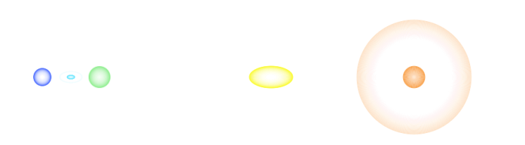
9. FlashMarker 组件
一个动效扩散组件(核爆炸式)
效果图
FlashMarker组件使用
引入
import Vue from 'vue'
import {FlashMarker} from 'special-ui'
Vue.use(FlashMarker)
使用
<template>
<div class="container">
    <flash-marker :width="1920" :height="1080" :dataset="dataset" @clickIndex="clickIndex"/>
</div>
</template>

<script>
export default {
    data () {
        return {
            dataset:  [
                {
                    position: {x: 300, y: 300},
                    color: '#5070FF',
                    type: 'circle',
                    speed: 0.2
                },
                {

                    position: {x: 350, y: 300},
                    color: '#6EE7FF',
                    type: 'ellipse',
                    speed: 0.3,
                    max: 40,
                },
                {
                    position: {x: 400, y: 300},
                    color: '#90EE90',
                    type: 'circle',
                    speed: 0.45,
                }, {
                    position: {x: 950, y: 300},
                    color: '#f8983a',
                    type: 'circle',
                    speed: 0.9,
                    max: 100,
                },
                {
                    position: {x: 700, y: 300},
                    color: '#FAFA32',
                    type: 'ellipse',
                    speed: 1,
                    max: 100,
                }
            ]
        }
    },
    methods: {
        clickIndex (index) {
            console.log(index)
        }
    }
}
</script>

<style lang="scss" scoped>
.container {
  height: 100%;
}
</style>
组件参数
| 属性 | 说明 | 默认值 |
|---|
| dataset | 数据 | [] |
| width | 画布宽度 | 0, 必传 |
| height | 画布高度 | 0, 必传 |
| zIndex | 视图层级 | 0 |
dataset数据项说明:
position: 动效中心坐标点;
color: 动效颜色;
type: 动效类型(circle | ellipse), 默认circle;
max: 动效最大范围, 默认20;
speed: 动效速度, 越大越快, 默认0.15
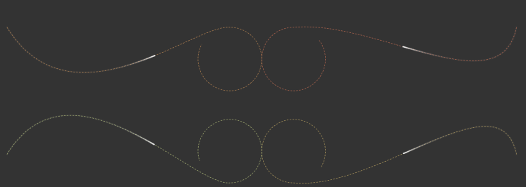
10. BesselArcFlyline 组件
三次贝塞尔加圆弧组成的飞线
效果图
飞线使用
引入
import Vue from 'vue'
import {BesselArcFlyline} from 'special-ui'
Vue.use(BesselArcFlyline)
使用
<template>
<div class="container">
<bessel-arc-flyline :width="1820" :height="900" :dataset="data" :config="config"></bessel-arc-flyline>
</div>
</template>
<script>
export default {
name: 'App',
data () {
return {
data: [
{
from: { x: 1700, y: 300},
to: { x: 1500, y: 500},
end: { x: 1000, y: 300},
r: 100,
firstControlFactor: -0.5,
secondControlFactor: 0.1,
speedBezierFactor: 8000,
speedArcFactor: 200,
startArcAngle: -Math.PI / 2,
endArcAngle: Math.PI * 1.8,
counterclockwise: true
},
{
from: { x: 100, y: 300},
to: { x: 600, y: 500},
end: { x: 800, y: 300},
r: 100,
firstControlFactor: -0.5,
secondControlFactor: 0.1,
speedBezierFactor: 8000,
speedArcFactor: 200,
startArcAngle: -Math.PI / 2,
endArcAngle: Math.PI * 3 / 2.6
},
{
from: { x: 1700, y: 700},
to: { x: 1500, y: 500},
end: { x: 1000, y: 790},
r: 100,
firstControlFactor: 0.5,
secondControlFactor: -0.1,
speedBezierFactor: 8000,
speedArcFactor: 200,
startArcAngle: -Math.PI * 3 / 2,
endArcAngle: Math.PI / 6,
arcDirction: 'top'
},
{
from: { x: 100, y: 700},
to: { x: 600, y: 500},
end: { x: 800, y: 790},
r: 100,
firstControlFactor: 0.5,
secondControlFactor: -0.1,
speedBezierFactor: 8000,
speedArcFactor: 200,
startArcAngle: -Math.PI * 3 / 2,
endArcAngle: Math.PI * 0.9,
counterclockwise: true,
arcDirction: 'top'
},
],
config: {
lineDash: [5, 4],
lineWidth: 1,
colors: ['#F9815C', '#F8AB60', '#EDCC72', '#E2F194', '#94E08A', '#4ECDA5'],
moveRadius: 2,
fillColor: '#fff',
shadowColor: '#fff',
shadowBlur: 1
}
}
}
}
</script>
<style>
.container {
height: 100%;
}
</style>
组件参数
| 属性 | 说明 | 默认值 |
|---|
| width | 画布宽度 | 0 |
| height | 画布高度 | 0 |
| dataset | 飞线数组 | [] |
| config | 飞线参数配置 | {} |
config: 数组
| 属性 | 说明 | 默认值 |
|---|
| markerRadius | marker点半径 | 3, 为0则没有圆点显示 |
| markerColor | marker颜色 | null, 不设置则和线条颜色一致 |
| lineWidth | 线条宽度 | 1 |
| lineDash | 虚线设置 | [], 为空数组则显示实线 |
| colors | 飞线颜色 | [] |
| moveRadius | 移动点半径 | 3 |
| fillColor | 移动点颜色 | '#fff' |
| shadowColor | 移动点阴影颜色 | '#fff' |
| shadowColor | 移动点阴影颜色 | '#fff' |
| shadowBlur | 移动点阴影大小 | 5 |
dataset对象参数说明:
| 属性 | 说明 |
|---|
| from | 三次贝塞尔起点坐标 |
| to | 三次贝塞尔中间点坐标 |
| end | 三次贝塞尔终点点坐标 |
| r | 连接贝塞尔的弧线半径 |
| firstControlFactor | 三次贝塞尔第一个曲线系数 |
| secondControlFactor | 三次贝塞尔第二个曲线系数 |
| speedBezierFactor | 贝塞尔动画系数,越大越慢 |
| speedArcFactor | 圆弧动画系数,越大越慢 |
| startArcAngle | 开始弧度 |
| endArcAngle | 结束弧度 |
| counterclockwise | 是否逆时针画弧度 |
| arcDirction | 圆弧朝向,默认朝下 |
11. GradientDashProgress 组件
渐变性间隔进度条
效果图

GradientDashProgress 使用
引入
import Vue from 'vue'
import {GradientDashProgress} from 'special-ui'
Vue.use(GradientDashProgress)
使用
<template>
<div class="container">
    <gradient-dash-progress :width="600" :raduis="2" :total="total" :num="num"/>
</div>
</template>

<script>
export default {
    data () {
        return {
            num: 20,
            total: 100
        }
    },
}
</script>

<style lang="scss" scoped>
.container {
  height: 100%;
}
</style>
组件参数
| 属性 | 说明 | 默认值 |
|---|
| width | 画布宽度 | 0 |
| height | 画布高度 | 0 |
| total | 总数 | 0 |
| num | 占比数 | 0 |
| bacColor | 间隔默认背景色 | '#244971' |
| formColor | 渐变开始颜色 | '#0B3C65' |
| toColor | 渐变结束颜色 | '#37C6EA' |
| raduis | 栅格矩形圆角 | 3 |
| dash | 栅格矩形宽、高和间隔 | [5, 20, 3] |
| padding | 左右间距 | {left: 5, right: 5} |


