Research
Security News
Malicious npm Packages Inject SSH Backdoors via Typosquatted Libraries
Socket’s threat research team has detected six malicious npm packages typosquatting popular libraries to insert SSH backdoors.
victory-chart
Advanced tools
Victory-chart is a composable charting library for React. It provides a set of modular charting components that can be combined to create complex data visualizations. The library is built on top of D3.js and offers a variety of chart types, including bar charts, line charts, pie charts, and more.
Line Chart
This code demonstrates how to create a simple line chart using Victory-chart. The VictoryLine component is used to render the line chart within a VictoryChart container.
import React from 'react';
import { VictoryChart, VictoryLine } from 'victory';
const data = [
{ x: 1, y: 2 },
{ x: 2, y: 3 },
{ x: 3, y: 5 },
{ x: 4, y: 4 },
{ x: 5, y: 7 }
];
const LineChart = () => (
<VictoryChart>
<VictoryLine data={data} />
</VictoryChart>
);
export default LineChart;Bar Chart
This code demonstrates how to create a bar chart using Victory-chart. The VictoryBar component is used to render the bar chart within a VictoryChart container.
import React from 'react';
import { VictoryChart, VictoryBar } from 'victory';

const data = [
  { x: 'A', y: 2 },
  { x: 'B', y: 3 },
  { x: 'C', y: 5 },
  { x: 'D', y: 4 },
  { x: 'E', y: 7 }
];

const BarChart = () => (
  <VictoryChart>
    <VictoryBar data={data} />
  </VictoryChart>
);

export default BarChart;
Pie Chart
This code demonstrates how to create a pie chart using Victory-chart. The VictoryPie component is used to render the pie chart.
import React from 'react';
import { VictoryPie } from 'victory';

const data = [
  { x: 'Cats', y: 35 },
  { x: 'Dogs', y: 40 },
  { x: 'Birds', y: 25 }
];

const PieChart = () => (
  <VictoryPie data={data} />
);

export default PieChart;Recharts is a composable charting library built on React components. It is similar to Victory-chart in that it provides a variety of chart types and is easy to use with React. However, Recharts has a different API and offers some unique features like animations and tooltips out of the box.
Nivo provides a rich set of dataviz components, built on top of D3 and React. It offers a wide range of chart types and is highly customizable. Compared to Victory-chart, Nivo provides more advanced features and customization options, but it may have a steeper learning curve.
React-chartjs-2 is a React wrapper for Chart.js, a popular JavaScript charting library. It provides a simple way to integrate Chart.js charts into React applications. While it offers a wide range of chart types and customization options, it relies on Chart.js for rendering, which may not be as flexible as Victory-chart's approach.
A flexible charting component for React. VictoryChart composes other victory components into reusable charts. Acting as a coordinator rather than a stand-alone component, VictoryChart reconciles props such as domain and scale for child components, and provides a set of sensible defaults.
This component works with:
Detailed documentation and interactive examples can be found at http://victory.formidable.com/docs/victory-chart/
This project is in a pre-release state. We're hard at work fixing bugs and improving the API. Be prepared for breaking changes!
Please see DEVELOPMENT
Please see CONTRIBUTING
33.0.0 (2019-08-21)
Changes for functional props and styles:
Related PR: #1360
Functional props like labels and functional styles will now be called with a single argument instead of datum and active. The argument passed to functional props and styles will be an object containing all the props that control the rendering of the the target the prop applies to. Including things like datum, active, index, data, scale, etc. We hope this will give users a lot more flexibility and control. In most cases, this change should be very straightforward to apply
old:
labels={(d) => `x: ${d.x}`}
new
labels={({ datum }) => `x: ${datum.x}`}
Gotchas:
cornerRadius function that depends on barWidth, do not also make barWidth a function of some other prop.y and x, and tickFormat. The arguments for these props have not changed.Changes for VictoryCandlestick labels
Related PR: #1295
VictoryCandlestick now has granular support for labels corresponding to each portion of the candle. The current labels and labelComponent props will be joined by new props corresponding to each part of the candle.
New props
lowLabels
lowLabelComponent
highLabels
highLabelComponent
openLabels
openLabelComponent
closeLabels
closeLabelComponent
This will be a breaking change affecting the positioning of the default label. In earlier versions, the default label was positioned above the candle, it will now be positioned next to the center of the candle.
To use older label positioning, use highLabels / highLabelComponent rather than label / labelComponent. If you are using tooltips with VictoryCandlestick, you will need to register a custom event to trigger your highLabels tooltip:
example:
<VictoryCandlestick
  highLabels={({ datum }) => datum.high}
  highLabelComponent={<VictoryTooltip />}
  events={[{
    target: "data",
    eventHandlers: {
      onMouseOver: () => ({ target: "highLabels", mutation: () => ({ active: true }) }),
      onMouseOut: () => ({ target: "highLabels", mutation: () => ({ active: false }) })
    }
  }]}
/>
The style prop for VictoryCandlestick now also has namespaces for the new labels in addition to the current labels namespace. When both labels and specific label styles (e.g. highLabels) are provided, the styles will be merged
Changes for VictoryVoronoiContainer
Related PR: #1371
Before this version VictoryVoronoiContainer had limited functionality for mouse-following tooltips, and for constraining a tooltip to the chart area, but it was only usable for multi-point tooltips (with voronoiDimension), and was not user configurable. This version aims to correct these limitations:
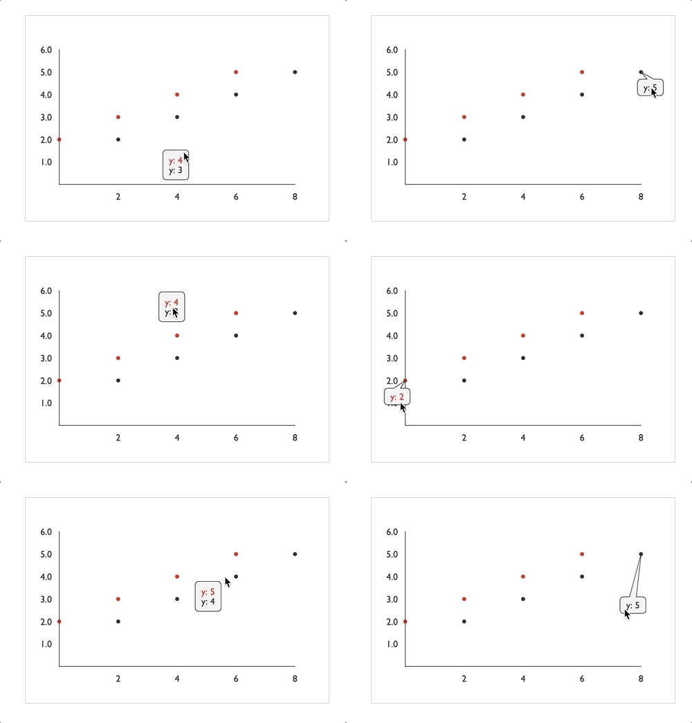
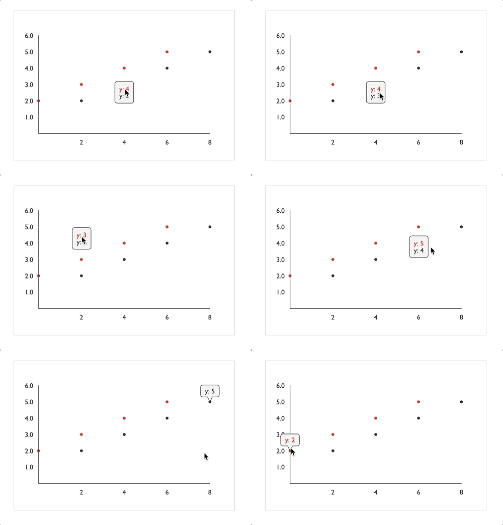
mouseFollowTooltips: This new boolean prop on VictoryVoronoiContainer determines whether the labels should follow the mouse position or snap into place. (Note that in charts using voronoiDimension, the tooltip still follows the mouse in the non-voronoiDimension, as demonstrated in the charts below (both with voronoiDimension="x")mouseFollowLabels={true}

mouseFollowTooltips={false}

VictoryVoronoiContainer will no longer be constrained to the chart area by default. Instead, add the constrainToVisibleArea prop to VictoryTooltip to enable this behavior for both multi-point and single point tooltips:
example:containerComponent={
<VictoryVoronoiContainer
labelComponent={<VictoryTooltip constrainToVisibleArea />}
/>
}
Changes for VictoryTooltip and VictoryLabel
Related PR:#1371
The changes we wanted to make to support new behaviors in VictoryVoronoiContainer required some changes to VictoryTooltip and VictoryLabel
New props for VictoryTooltip:
constrainToVisibleArea is a boolean prop that, when true, will alter the position of the tooltip so that it exactly fits within the svg Victory renders. The tooltip's center will be moved, but the pointer will remain pointing at the associated x, y value of the tooltip. When this prop is set to true, pointerLength may not be respected
center is a prop that may be given as an object with values or functions for "x" and "y". When this prop is set, it will position the center of the tooltip (centered around the main body of the tooltip, minus the pointer). When this prop is not set, it will be calculated from other props such as x, y, pointerLength, etc. This prop was added to enable mouse-following tooltips in VictoryVoronoiContainer.
centerOffset is a prop that may be given as an object with values or functions for "x" and "y". When this prop is set, the center of the tooltip will be offset by some amount from the x, y value it points to, resulting in a slanted pointer. When this prop is set, pointerLength will not be respected (because the pointer will be slanted)
flyoutHeight (formerly height): This optional prop determines the height of the tooltip flyout (minus pointer). The name of this prop was changed so that it would not conflict with the height prop now passed to VictoryTooltip by its parents
flyoutWidth (formerly width): This optional prop determines the width of the tooltip flyout (minus pointer). The name of this prop was changed so that it would not conflict with the width prop now passed to VictoryTooltip by its parents
width: the overall width of the parent svg. This prop will be passed down from any victory component that uses VictoryTooltip as a label
height: the overall height of the parent svg. This prop will be passed down from any victory component that uses VictoryTooltip as a label
Changes Affecting VictoryLabel and VictoryTooltip
x and y values passed to labels by their parent components have all been adjusted so that their values match the position of the data point they correspond to. All padding is now accounted for in the dx and dy props instead of being added directly to x and y.
This will be a breaking change for anyone who is wrapping label components and relying on the x and y props they receive, or providing their own dx / dy props. These breaking changes may take a bit of manual adjustment to correct, but we hope this change will make label positioning easier to reason about in the long run.Other Changes
We have been concurrently working on improving performance and the stability of events in victory-native. The following changes have been added to support these efforts:
Related PR: #1373
prependDefaultAxes boolean prop has been added to VictoryChart. This prop will be set true by default in victory-native to reduce the possibility of axis elements to interfere with events.Related PR: #1365
Bar, Path etc) with for function primitives to match performance-improving changes in victory-native. (This is a breaking change for anyone extending from victory components)FAQs
Chart Component for Victory
The npm package victory-chart receives a total of 266,159 weekly downloads. As such, victory-chart popularity was classified as popular.
We found that victory-chart demonstrated a healthy version release cadence and project activity because the last version was released less than a year ago. It has 21 open source maintainers collaborating on the project.
Did you know?

Socket for GitHub automatically highlights issues in each pull request and monitors the health of all your open source dependencies. Discover the contents of your packages and block harmful activity before you install or update your dependencies.

Research
Security News
Socket’s threat research team has detected six malicious npm packages typosquatting popular libraries to insert SSH backdoors.

Security News
MITRE's 2024 CWE Top 25 highlights critical software vulnerabilities like XSS, SQL Injection, and CSRF, reflecting shifts due to a refined ranking methodology.

Security News
In this segment of the Risky Business podcast, Feross Aboukhadijeh and Patrick Gray discuss the challenges of tracking malware discovered in open source softare.