Product
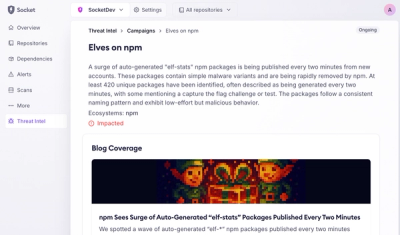
Introducing Supply Chain Attack Campaigns Tracking in the Socket Dashboard
Campaign-level threat intelligence in Socket now shows when active supply chain attacks affect your repositories and packages.
heapvis - visualizing heap profile diffs over time
while being able to visualize a given profile taken at a certain point in time is great, the great insights will come from looking at how that changes over time, as time passes.
heapvis aims at making that simple to do.
for instance, given 18 heap profiles, we can tell how the distribution of
inuse_space for certain functions look like:

heapvis generate \
  --profile='*.pprof' \
  --function 'github.com/concourse/concourse/atc.collectPlans' \
  --function='io.copyBuffer' \
  --function='github.com/concourse/concourse/atc/db.(*pipeline).LoadVersionsDB' \
  --function='encoding/json.(*decodeState).literalStore' \
  > ./sample.csv
data <- read.table("./sample.csv", header=TRUE, sep=",")
ggplot(data, aes(x = inuse_space, y = fn)) +
  geom_density_ridges()
FAQs
Unknown package
Did you know?

Socket for GitHub automatically highlights issues in each pull request and monitors the health of all your open source dependencies. Discover the contents of your packages and block harmful activity before you install or update your dependencies.

Product
Campaign-level threat intelligence in Socket now shows when active supply chain attacks affect your repositories and packages.

Research
Malicious PyPI package sympy-dev targets SymPy users, a Python symbolic math library with 85 million monthly downloads.

Security News
Node.js 25.4.0 makes require(esm) stable, formalizing CommonJS and ESM compatibility across supported Node versions.