Security News
Crates.io Users Targeted by Phishing Emails
The Rust Security Response WG is warning of phishing emails from rustfoundation.dev targeting crates.io users.
@happyfresh/grid
Advanced tools
Grid based on the flex display property. Grid packages consists of Container, Row, and Column. This grid system support responsive divs based on 3 breakpoints: mobile (width < 768px), tablet (768 > width < 992), and desktop (width > 992). You can also insert styles props if you want to override current css.
source: http://flexboxgrid.com/ with a few modification.
yarn add @happyfresh/grid
import { Container, Column, Row } from '@happyfresh/grid';

export const Example = () => (
  <React.Fragment>
    <Container fluid styles={{backgroundColor: 'black'}}>
      <Row styles={{backgroundColor: 'white'}}>
        <Column sm={12} md={6} lg={3}>
          <Row>
            <Column sm={12} md={6} lg={6} className='start-md end-lg'>
              text
            </Column>
            <Column sm={12} md={6} lg={6} className='start-md end-lg'>
              text
            </Column>
          </Row>
        </Column>
        <Column reverse sm={12} md={6} lg={3}>
          <Row className='center-sm start-md end-lg'>Another text2.</Row>
          <Row>Another text3.</Row>
        </Column>
        <Column sm={12} md={6} lg={3}>
          <Row>Another text2.</Row>
        </Column>
        <Column sm={12} md={6} lg={3}>
          <Row>Another text2.</Row>
        </Column>
      </Row>
    </Container>
    <Container fluid>
      <Row>
        Another short text.
      </Row>
    </Container>
  </React.Fragment>
)
FAQs
HappyFresh UI components that is a grid
We found that @happyfresh/grid demonstrated a not healthy version release cadence and project activity because the last version was released a year ago. It has 7 open source maintainers collaborating on the project.
Did you know?

Socket for GitHub automatically highlights issues in each pull request and monitors the health of all your open source dependencies. Discover the contents of your packages and block harmful activity before you install or update your dependencies.

Security News
The Rust Security Response WG is warning of phishing emails from rustfoundation.dev targeting crates.io users.

Product
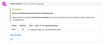
Socket now lets you customize pull request alert headers, helping security teams share clear guidance right in PRs to speed reviews and reduce back-and-forth.

Product
Socket's Rust support is moving to Beta: all users can scan Cargo projects and generate SBOMs, including Cargo.toml-only crates, with Rust-aware supply chain checks.