Material Tailwind - Free Tailwind CSS Components Library
Material Tailwind is a free and open-source collection of customizable, production-ready UI components built with Tailwind CSS. Designed to be developer-friendly and performance-focused, Material Tailwind streamlines the creation of modern, visually appealing interfaces, helping you deliver high-quality user experiences faster.
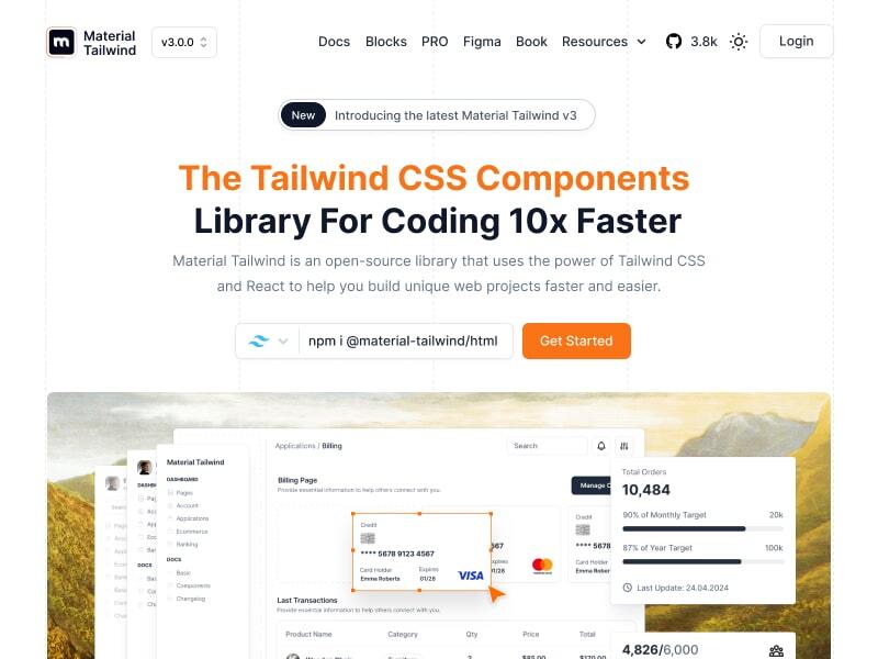
Table of Contents
Getting Started
Learn how to use @material-tailwind/html components to quickly and easily create elegant and flexible pages using Tailwind CSS.
@material-tailwind/html is working with Tailwind CSS classes and you need to have Tailwind CSS installed on your project - Tailwind CSS Installation.
Using with CDN
You can include @material-tailwind/html via a CDN and initialize alerts globally in the browser. Add the following script to your HTML file:
<script
  src="https://cdn.jsdelivr.net/gh/creativetimofficial/material-tailwind@3.0.0-beta.2/packages/dist/material-tailwind.min.js"
  defer
></script>
Basic Usage NPM
npm i @material-tailwind/html@3.0.0-beta.2
After installing, you can use the components in your project across different frameworks:
import { initAlert } from "@material-tailwind/html";
initAlert();
Using with Global Access
If you prefer, you can use the Material Tailwind global object instead of directly importing initAlert:
import * as MaterialTailwind from "@material-tailwind/html";
MaterialTailwind.initAlert();
TypeScript
Material Tailwind components can be used in two ways - through simple ESM imports or programmatically with TypeScript support. Here's how to use both approaches:
Simple ESM Import
The quickest way to use components is through direct ESM imports:
import { initAlert } from "@material-tailwind/html";
initAlert();
Programmatic Usage with TypeScript
For more control and type safety, you can use the programmatic approach with full TypeScript support:
This programmatic approach provides:
- Full TypeScript support
- Fine-grained control over component behavior
- Access to component instance methods
- Proper cleanup on unmount
import { Accordion } from "@material-tailwind/html";
import type { AccordionConfig, IAccordion } from "@material-tailwind/html";
document.addEventListener("DOMContentLoaded", () => {
const container = document.getElementById("accordion-container");
if (container) {
const config: AccordionConfig = {
exclusive: true,
allOpen: false,
};
const accordion: IAccordion = new Accordion(container, config);
const showAllButton = document.getElementById("show-all");
const hideAllButton = document.getElementById("hide-all");
const toggleFirstButton = document.getElementById("toggle-first");
showAllButton?.addEventListener("click", () => {
accordion.showAll();
});
hideAllButton?.addEventListener("click", () => {
accordion.hideAll();
});
toggleFirstButton?.addEventListener("click", () => {
const firstButton = document.getElementById("button-1") as HTMLElement;
if (firstButton) {
accordion.toggle(firstButton);
}
});
window.addEventListener("unload", () => {
accordion.cleanup();
});
}
});
For detailed usage of each component, check out their respective documentation:
Congratulations 🥳, you did it, now you're ready to use @material-tailwind/html.
Documentation
Material Tailwind’s documentation includes code snippets, previews, and detailed usage instructions for each component, ensuring a smooth implementation process.
Visit the Material Tailwind Docs to explore the entire library.
Explore Components
|
|
|
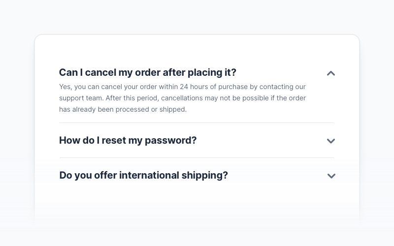
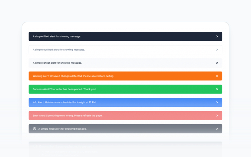
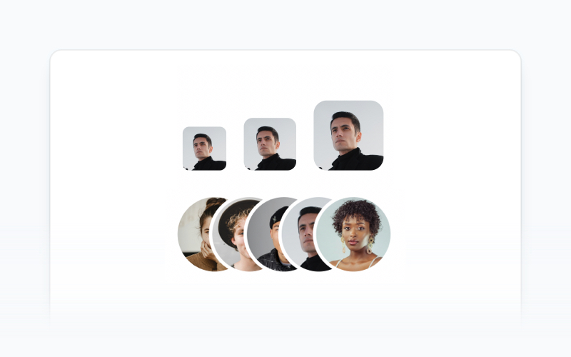
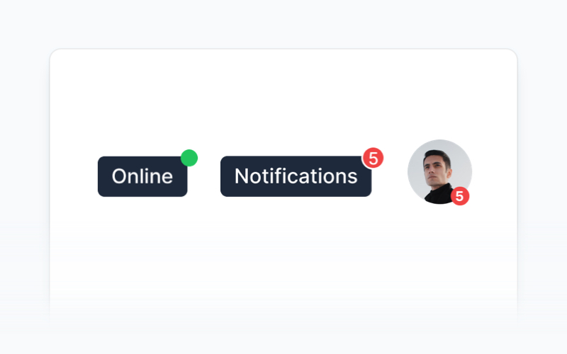
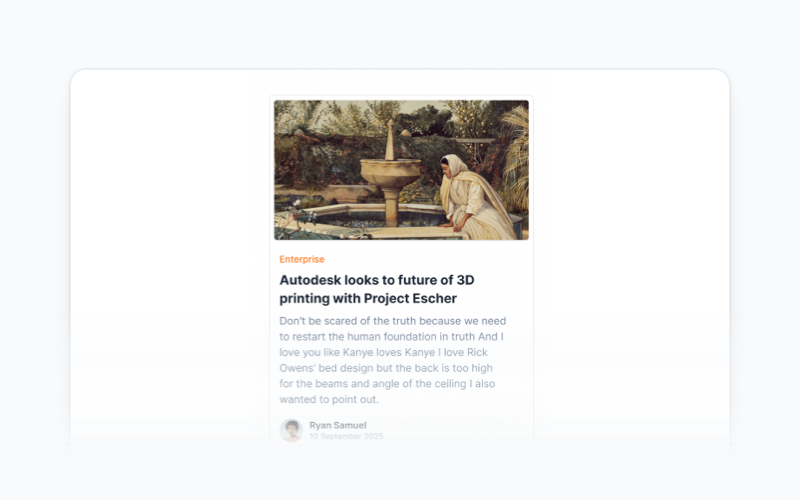
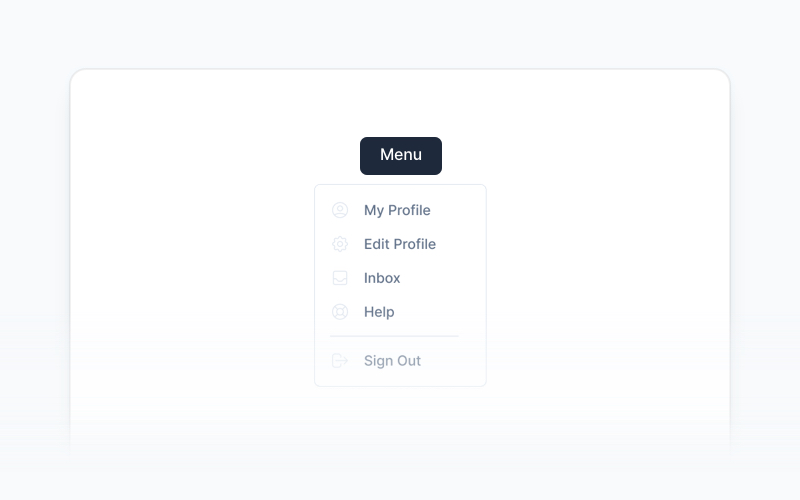
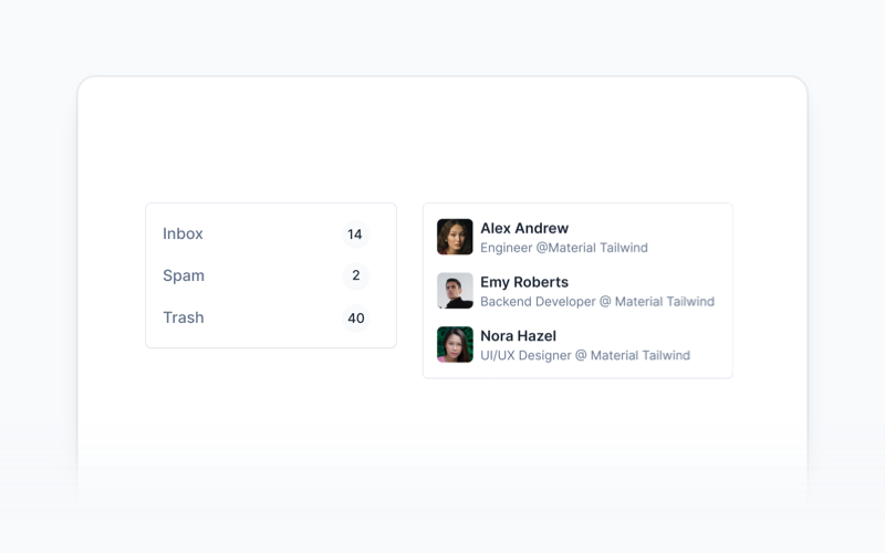
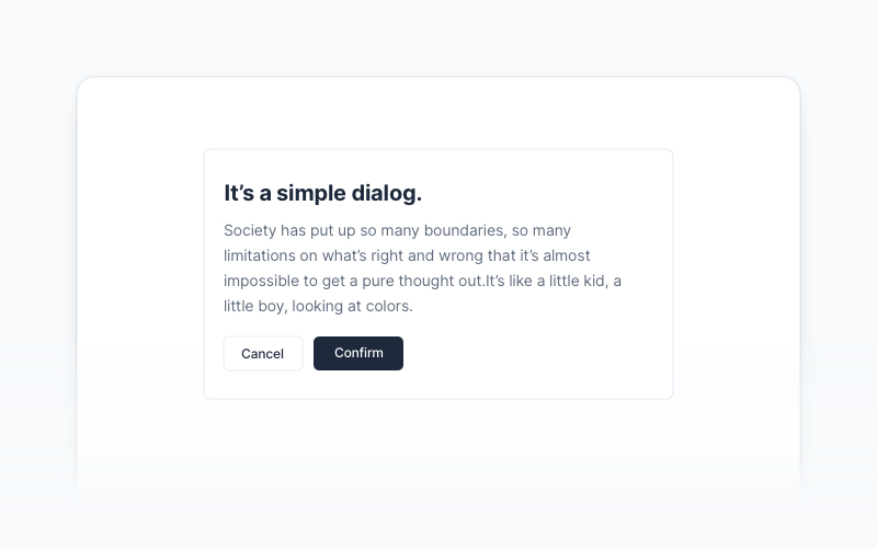
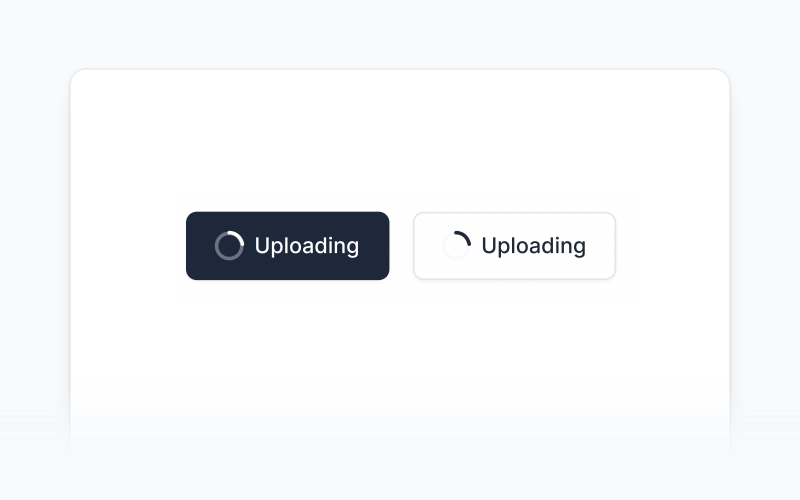
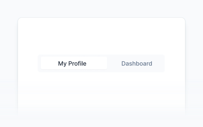
| Accordion | Alert | Avatar |
|
|
|
|
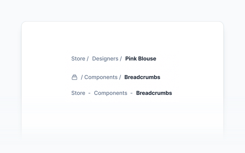
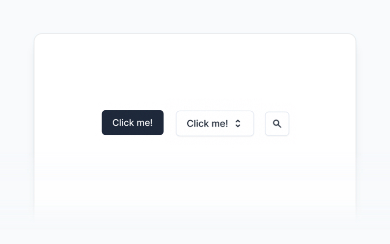
| Badge | Breadcrumbs | Button |
|
|
|
|
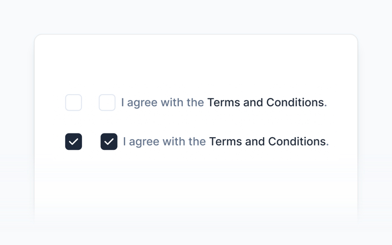
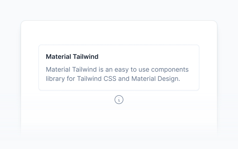
| Button Group | Card | Checkbox |
|
|
|
|
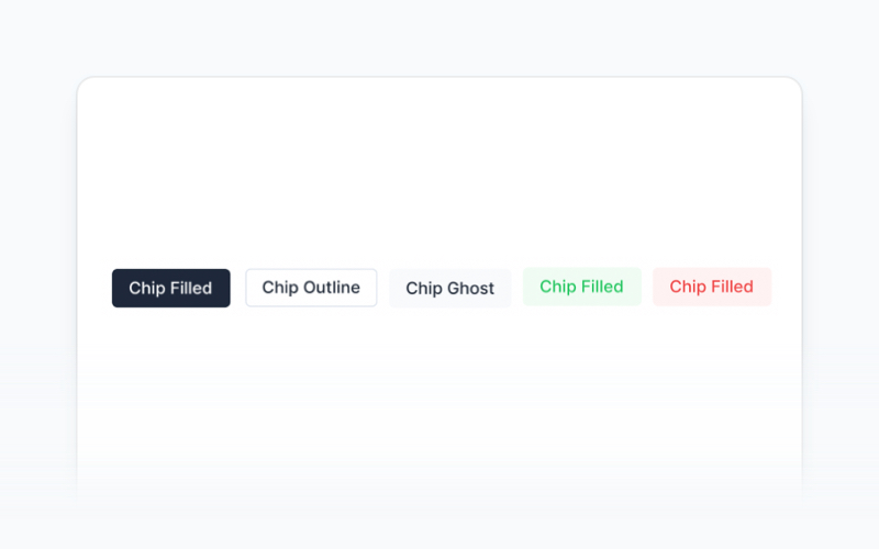
| Chip | Collapse | Dropdown |
|
|
|

|
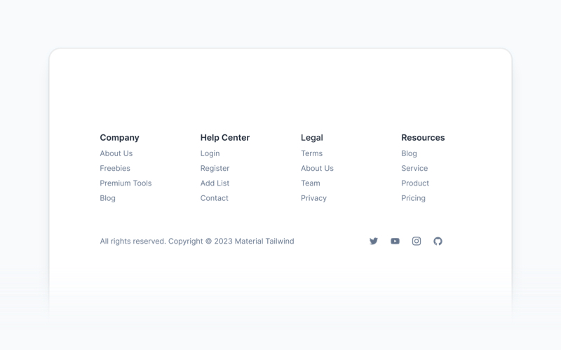
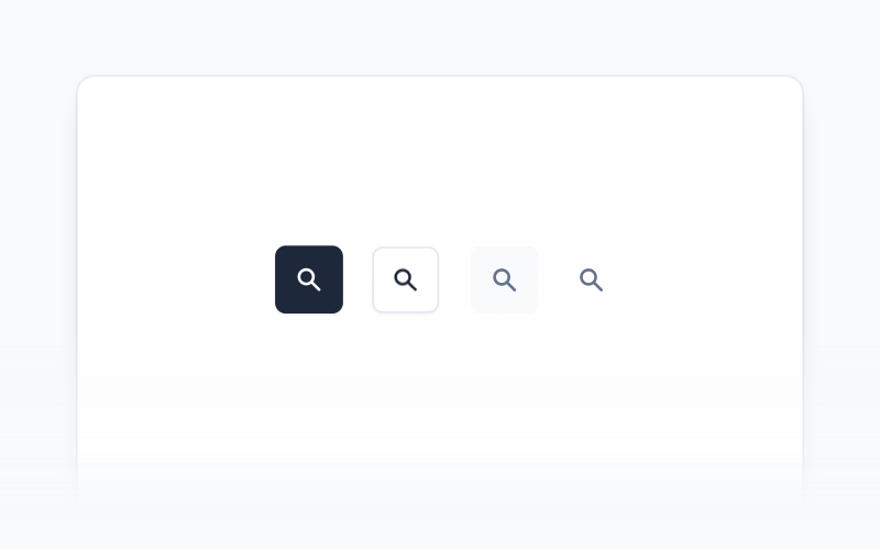
| Footer | Icon Button | Image |
|
|
|
|
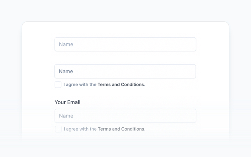
| Input | List | Modal |
|
|
|
|
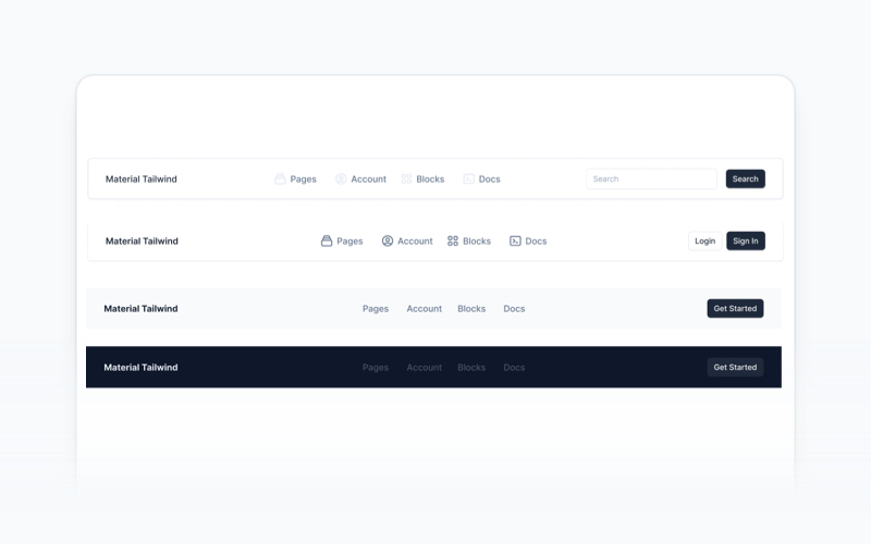
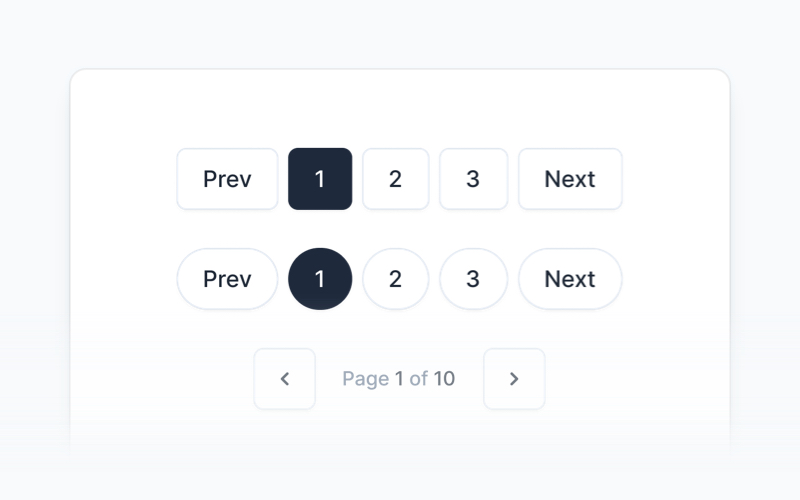
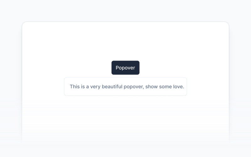
| Navbar | Pagination | Popover |
|
|
|

|
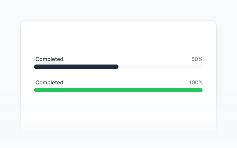
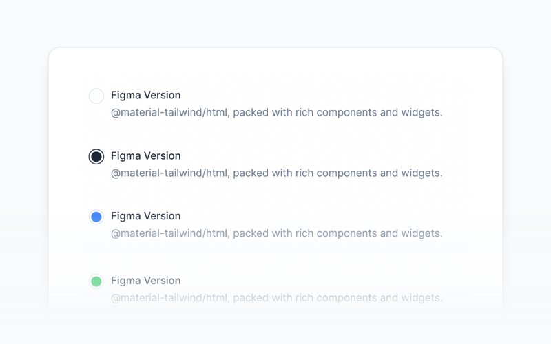
| Progress Bar | Radio Button | Rating Bar |
|
|
|
|
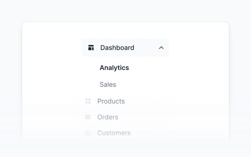
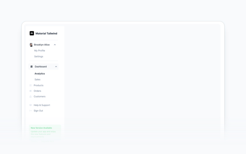
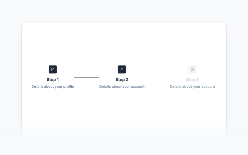
| Sidebar | Spinner | Stepper |
|
|
|
|
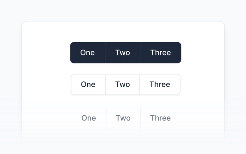
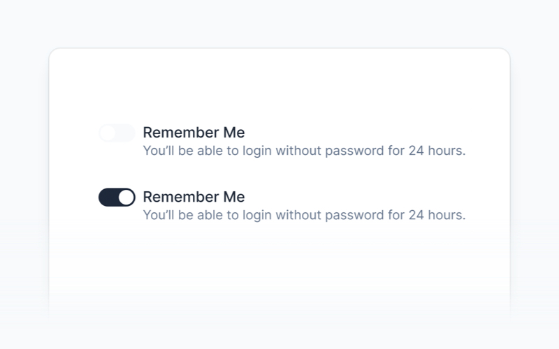
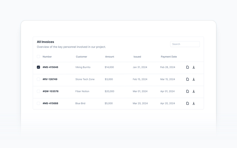
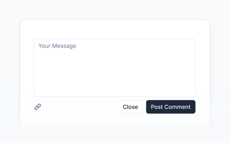
| Switch | Table | Tabs |
|
|
|
|
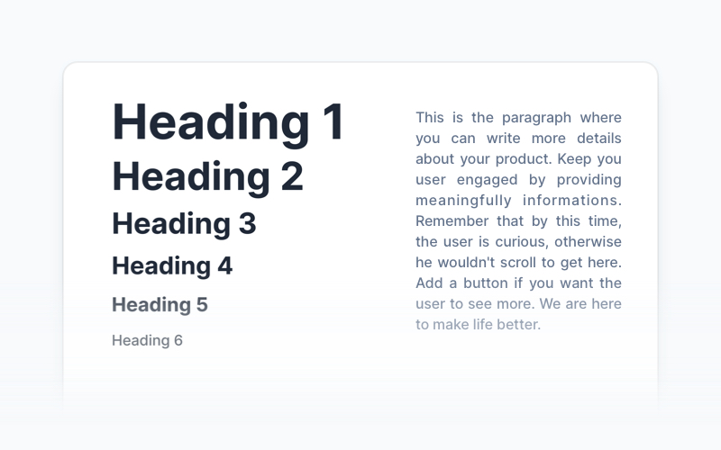
| Textarea | Tooltip | Typography |
|
|

|
| Timeline | Video |
- We're excited to see the community adopt Material Tailwind, raise issues, and provide feedback.
- Whether it's a feature request, bug report, or a project to showcase, please get involved!
License
Copyright (c) 2020-2025 Creative Tim
Material Tailwind is distributed under the MIT License, providing freedom and flexibility for all projects.
Contribute & Feedback
We welcome contributions and feedback! If you have suggestions, encounter issues, or want to propose new components, feel free to open an issue or submit a pull request on our repository. Your input helps make Material Tailwind better for everyone.
Build better, faster, and smarter with Material Tailwind. Explore the documentation and start leveraging our components to deliver polished, user-friendly interfaces with ease.


