Product
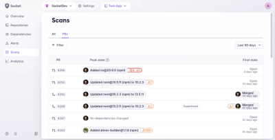
Introducing Pull Request Stories to Help Security Teams Track Supply Chain Risks
Socket’s new Pull Request Stories give security teams clear visibility into dependency risks and outcomes across scanned pull requests.
@sourcegraph/icons
Advanced tools
This package contains Sourcegraph's icon set Primaries as React components.
yarn add @sourcegraph/icons
# or
npm install --save @sourcegraph/icons
Make sure you have access to @sourcegraph private packages
import * as React from 'react'
import RocketIcon from '@sourcegraph/icons/lib/Rocket'

class SourcegraphSlogan extends React.Component<{}, {}> {
    public render(): JSX.Element {
        return (
            <span className="sourcegraph-slogan">
                <RocketIcon className="sourcegraph-slogan__icon" /> The future sooner
            </span>
        )
    }
}
You can give the icons a className prop.
Icons have the CSS class icon and the kebab-case version of the icon name attached.
They have no styling by default, you can freely style them with CSS or apply global styles.
.sourcegraph-slogan {
    &__icon {
        width: 32rem;
        height: 32rem;
        fill: currentColor; // This makes the SVG match the color of the text
    }
}
The React components are generated with Gulp. Change the gulpfile to modify the generation.
$ git clone git@github.com:sourcegraph/icons.git
Copy new icons into icons/svg
Install dependencies
$ npm install
Build
$ npm run build
git add, commit & push
Publish new version
$ npm version <patch|minor|major> # please see http://semver.org/
$ npm publish
$ git push
$ git push --tags
Link to local repo switch to sourcegraph/web
$ npm install @sourcegraph/icons@latest --save
Modify the SVGs, then regenerate & publish.
FAQs
Sourcegraph's icons
The npm package @sourcegraph/icons receives a total of 25 weekly downloads. As such, @sourcegraph/icons popularity was classified as not popular.
We found that @sourcegraph/icons demonstrated a not healthy version release cadence and project activity because the last version was released a year ago. It has 20 open source maintainers collaborating on the project.
Did you know?

Socket for GitHub automatically highlights issues in each pull request and monitors the health of all your open source dependencies. Discover the contents of your packages and block harmful activity before you install or update your dependencies.

Product
Socket’s new Pull Request Stories give security teams clear visibility into dependency risks and outcomes across scanned pull requests.

Research
/Security News
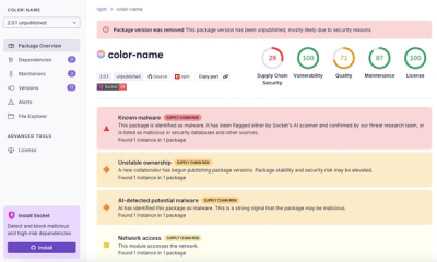
npm author Qix’s account was compromised, with malicious versions of popular packages like chalk-template, color-convert, and strip-ansi published.

Research
Four npm packages disguised as cryptographic tools steal developer credentials and send them to attacker-controlled Telegram infrastructure.