
Research
Security News
Quasar RAT Disguised as an npm Package for Detecting Vulnerabilities in Ethereum Smart Contracts
Socket researchers uncover a malicious npm package posing as a tool for detecting vulnerabilities in Etherium smart contracts.
@syncfusion/ej2-calendars
Advanced tools
A complete package of date or time components with built-in features such as date formatting, inline editing, multiple (range) selection, range restriction, month and year selection, strict mode, and globalization.
@syncfusion/ej2-calendars is a comprehensive package for implementing calendar-related functionalities in web applications. It provides a variety of components such as DatePicker, TimePicker, DateRangePicker, and DateTimePicker, which are highly customizable and easy to integrate.
DatePicker
The DatePicker component allows users to select a date from a calendar popup. It supports various date formats and customizations.
import { DatePicker } from '@syncfusion/ej2-calendars';
let datePicker = new DatePicker({
value: new Date(),
placeholder: 'Select a date'
});
datePicker.appendTo('#element');TimePicker
The TimePicker component enables users to select a time from a list of time values. It supports different time formats and customizations.
import { TimePicker } from '@syncfusion/ej2-calendars';

let timePicker = new TimePicker({
    value: new Date(),
    placeholder: 'Select a time'
});
timePicker.appendTo('#element');
DateRangePicker
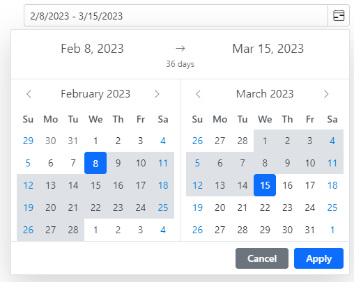
The DateRangePicker component allows users to select a range of dates from a calendar popup. It supports various date formats and customizations.
import { DateRangePicker } from '@syncfusion/ej2-calendars';

let dateRangePicker = new DateRangePicker({
    startDate: new Date('1/1/2023'),
    endDate: new Date('1/10/2023'),
    placeholder: 'Select a date range'
});
dateRangePicker.appendTo('#element');
DateTimePicker
The DateTimePicker component combines the functionalities of DatePicker and TimePicker, allowing users to select both date and time from a single popup.
import { DateTimePicker } from '@syncfusion/ej2-calendars';

let dateTimePicker = new DateTimePicker({
    value: new Date(),
    placeholder: 'Select a date and time'
});
dateTimePicker.appendTo('#element');react-datepicker is a simple and customizable date picker component for React. It offers basic date selection functionalities and is easy to integrate into React applications. Compared to @syncfusion/ej2-calendars, it has fewer built-in features and customizations.
react-dates is a date picker library for React developed by Airbnb. It provides a range of date picking functionalities, including single date, date range, and date range with presets. It is highly customizable but may require more configuration compared to @syncfusion/ej2-calendars.
Ant Design (antd) is a comprehensive UI library for React that includes a DatePicker component among many other UI elements. The DatePicker in antd is feature-rich and integrates well with other components in the library. However, it is part of a larger UI framework, whereas @syncfusion/ej2-calendars is focused solely on calendar functionalities.
The JavaScript Calendars package contains date and time components such as calendar, date picker, date range picker, date time picker, and time picker. These components come with options to disable dates, restrict selection, and show custom events.
The JavaScript Calendars package includes the following list of components.
The JavaScript Calendar control is a graphical user interface component that displays a Gregorian or Islamic Calendar and allows selection of a date.
Getting Started . Online demos . Learn more
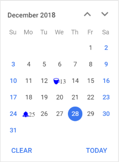
min and max properties.month, year, and decade views that provide flexibility to select dates.The JavaScript DatePicker component is a graphical user interface component that allows selection or entry of a date value.
Getting Started . Online demos . Learn more
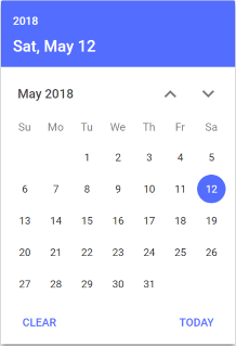
The JavaScript TimePicker component is a simple and intuitive interface component that allows selection of a time value from the popup list or setting a desired time value.
Getting Started . Online demos . Learn more
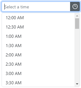
min and max properties.The JavaScript DateTimePicker component is a graphical user interface component that allows an end user to enter or select a date and time values from a pop-up calendar and time list pop-up.
Getting Started . Online demos . Learn more
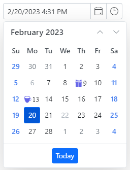
min and max properties.The JavaScript DateRangePicker component is a graphical user interface control that allows an end user to select start and end date values as a range from a calendar pop-up or by entering the value directly in the input element.
Getting Started . Online demos . Learn more
Trusted by the world's leading companies

To install calendars and its dependent packages, use the following command.
npm install @syncfusion/ej2-calendars
Calendar controls are also offered to following list of frameworks.
 Angular |  React |  Vue |  ASP.NET Core |  ASP.NET MVC |
|---|
Product support is available through the following mediums.
Check the changelog here. Get minor improvements and bug fixes every week to stay up to date with frequent updates.
This is a commercial product and requires a paid license for possession or use. Syncfusion® licensed software, including this component, is subject to the terms and conditions of Syncfusion® EULA. To acquire a license for 80+ JavaScript UI controls, you can purchase or start a free 30-day trial.
A free community license is also available for companies and individuals whose organizations have less than $1 million USD in annual gross revenue and five or fewer developers.
See LICENSE FILE for more info.
© Copyright 2024 Syncfusion® Inc. All Rights Reserved. The Syncfusion® Essential Studio® license and copyright applies to this distribution.
FAQs
A complete package of date or time components with built-in features such as date formatting, inline editing, multiple (range) selection, range restriction, month and year selection, strict mode, and globalization.
The npm package @syncfusion/ej2-calendars receives a total of 48,128 weekly downloads. As such, @syncfusion/ej2-calendars popularity was classified as popular.
We found that @syncfusion/ej2-calendars demonstrated a healthy version release cadence and project activity because the last version was released less than a year ago. It has 0 open source maintainers collaborating on the project.
Did you know?

Socket for GitHub automatically highlights issues in each pull request and monitors the health of all your open source dependencies. Discover the contents of your packages and block harmful activity before you install or update your dependencies.

Research
Security News
Socket researchers uncover a malicious npm package posing as a tool for detecting vulnerabilities in Etherium smart contracts.

Security News
Research
A supply chain attack on Rspack's npm packages injected cryptomining malware, potentially impacting thousands of developers.

Research
Security News
Socket researchers discovered a malware campaign on npm delivering the Skuld infostealer via typosquatted packages, exposing sensitive data.