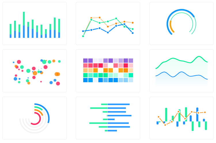
What is apexcharts?
ApexCharts is a modern charting library that helps developers create beautiful and interactive visualizations for web applications. It supports a wide range of chart types and is highly customizable, making it suitable for various data visualization needs.
What are apexcharts's main functionalities?
Line Chart
This code creates a simple line chart to visualize sales data over a period of months. The `series` array contains the data points, and the `xaxis` object defines the categories for the x-axis.
const options = { chart: { type: 'line' }, series: [{ name: 'sales', data: [30, 40, 35, 50, 49, 60, 70, 91, 125] }], xaxis: { categories: ['Jan', 'Feb', 'Mar', 'Apr', 'May', 'Jun', 'Jul', 'Aug', 'Sep'] } }; const chart = new ApexCharts(document.querySelector('#chart'), options); chart.render();
Bar Chart
This code creates a bar chart to visualize revenue data across different quarters. The `series` array contains the data points, and the `xaxis` object defines the categories for the x-axis.
const options = { chart: { type: 'bar' }, series: [{ name: 'revenue', data: [10, 15, 25, 30, 40, 45, 50, 55, 60] }], xaxis: { categories: ['Q1', 'Q2', 'Q3', 'Q4', 'Q5', 'Q6', 'Q7', 'Q8', 'Q9'] } }; const chart = new ApexCharts(document.querySelector('#chart'), options); chart.render();
Pie Chart
This code creates a pie chart to visualize the distribution of data among different teams. The `series` array contains the data points, and the `labels` array defines the labels for each slice of the pie.
const options = { chart: { type: 'pie' }, series: [44, 55, 13, 43, 22], labels: ['Team A', 'Team B', 'Team C', 'Team D', 'Team E'] }; const chart = new ApexCharts(document.querySelector('#chart'), options); chart.render();
Area Chart
This code creates an area chart to visualize temperature data over a week. The `series` array contains the data points, and the `xaxis` object defines the categories for the x-axis.
const options = { chart: { type: 'area' }, series: [{ name: 'temperature', data: [31, 40, 28, 51, 42, 109, 100] }], xaxis: { categories: ['Mon', 'Tue', 'Wed', 'Thu', 'Fri', 'Sat', 'Sun'] } }; const chart = new ApexCharts(document.querySelector('#chart'), options); chart.render();
Scatter Plot
This code creates a scatter plot to visualize two sets of sample data. The `series` array contains the data points for each sample, and the `xaxis` and `yaxis` objects define the tick amounts for the axes.
const options = { chart: { type: 'scatter' }, series: [{ name: 'Sample A', data: [[16.4, 5.4], [21.7, 2], [25.4, 3], [19, 2], [10.9, 1]] }, { name: 'Sample B', data: [[36.4, 13.4], [1.7, 11], [5.4, 8], [9, 17], [1.9, 4]] }], xaxis: { tickAmount: 10 }, yaxis: { tickAmount: 7 } }; const chart = new ApexCharts(document.querySelector('#chart'), options); chart.render();
Other packages similar to apexcharts
chart.js
Chart.js is a popular open-source library for creating simple yet flexible charts. It supports a variety of chart types and is known for its ease of use and integration. Compared to ApexCharts, Chart.js offers a more straightforward API but may lack some of the advanced customization options.
highcharts
Highcharts is a powerful charting library that provides a wide range of chart types and extensive customization options. It is suitable for complex data visualization needs and offers features like exporting and accessibility support. Highcharts is more feature-rich compared to ApexCharts but comes with a steeper learning curve.
d3
D3.js is a highly flexible and powerful library for creating data-driven visualizations. It allows for fine-grained control over every aspect of the chart, making it suitable for custom and complex visualizations. However, D3.js has a steeper learning curve and requires more effort to create basic charts compared to ApexCharts.
plotly.js
Plotly.js is a versatile charting library that supports a wide range of chart types and interactive features. It is known for its high-quality visualizations and ease of use. Plotly.js offers more advanced interactivity and data exploration features compared to ApexCharts.


A modern JavaScript charting library to build interactive charts and visualizations with simple API.
Our Partner

ApexCharts is now a partner of FusionCharts to bring a wider range of data visualization components.
They offer data driven maps, gauges, widgets, advanced timeseries charts and much more.
Browsers support

Firefox | 
Chrome | 
Safari | 
Edge | 
IE11 |
|---|
| 31+ ✔ | 35+ ✔ | 6+ ✔ | Edge ✔ | (IE11) ✔ |
Download and Installation
Installing via npm
npm install apexcharts --save
Direct <script> include
<script src="https://cdn.jsdelivr.net/npm/apexcharts"></script>
Wrappers for Vue/React/Angular
Integrate easily with 3rd party frameworks
Unofficial Wrappers
Useful links to wrappers other than the popular frameworks mentioned above
Usage
import ApexCharts from 'apexcharts'
To create a basic bar chart with minimal configuration, write as follows:
var options = {
  chart: {
    type: 'bar'
  },
  series: [
    {
      name: 'sales',
      data: [30, 40, 35, 50, 49, 60, 70, 91, 125]
    }
  ],
  xaxis: {
    categories: [1991, 1992, 1993, 1994, 1995, 1996, 1997, 1998, 1999]
  }
}

var chart = new ApexCharts(document.querySelector('#chart'), options)
chart.render()
This will render the following chart

A little more than the basic
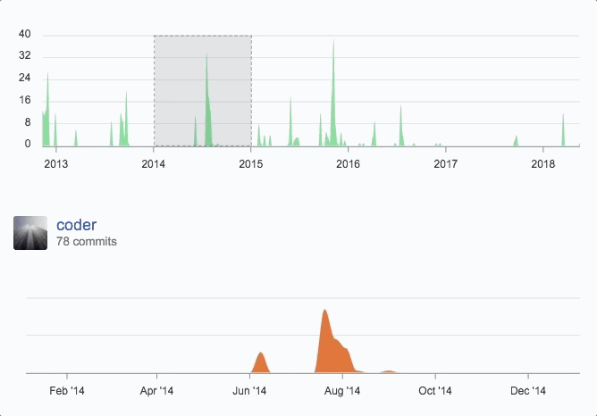
You can create a combination of different charts, sync them and give your desired look with unlimited possibilities.
Below is an example of synchronized charts with github style.
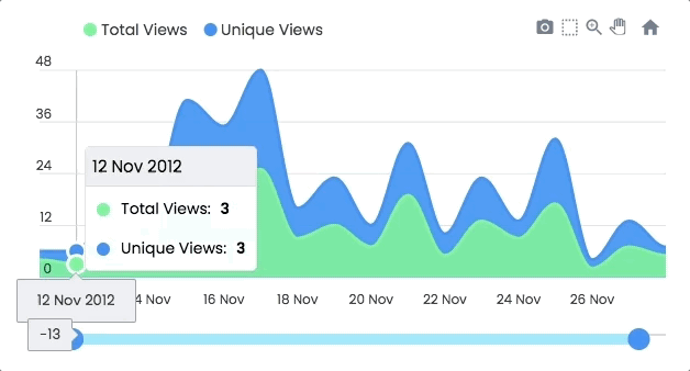
Interactivity
Zoom, Pan, Scroll through data. Make selections and load other charts using those selections.
An example showing some interactivity
Dynamic Series Update
Another approach to Drill down charts where one selection updates the data of other charts.
An example of loading dynamic series into charts is shown below
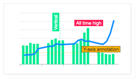
Annotations
Annotations allows you to write custom text on specific values or on axes values. Valuable to expand the visual appeal of your chart and make it more informative.
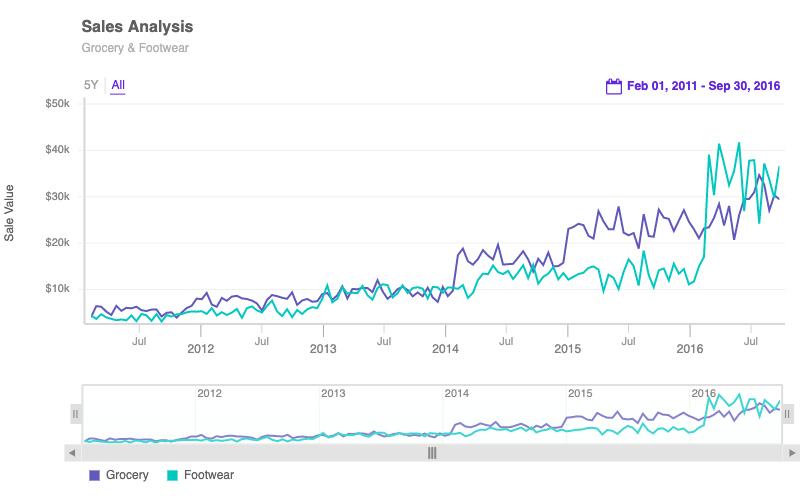
Mixed Charts
You can combine more than one chart type to create a combo/mixed chart. Possible combinations can be line/area/column together in a single chart. Each chart-type can have it's own y-axis.

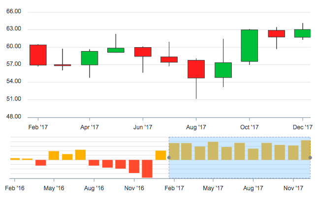
Candlestick
Use a candlestick chart (a common financial chart) to describe price changes of a security, derivative, or currency. Below image show how you can use another chart as a brush/preview-pane which acts as a handle to browse the main candlestick chart.
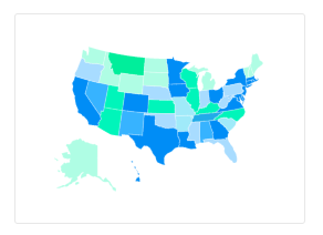
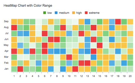
Heatmaps
Use Heatmaps to represent data through colors and shades. Frequently used with bigger data collections, they are valuable for recognizing patterns and area of focus.
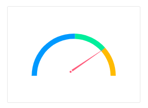
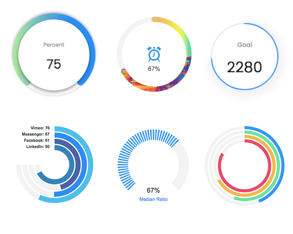
Gauges
The tiny gauges are an important part of a dashboard and are useful in displaying single series data. A demo of these gauges:
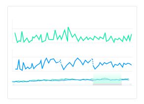
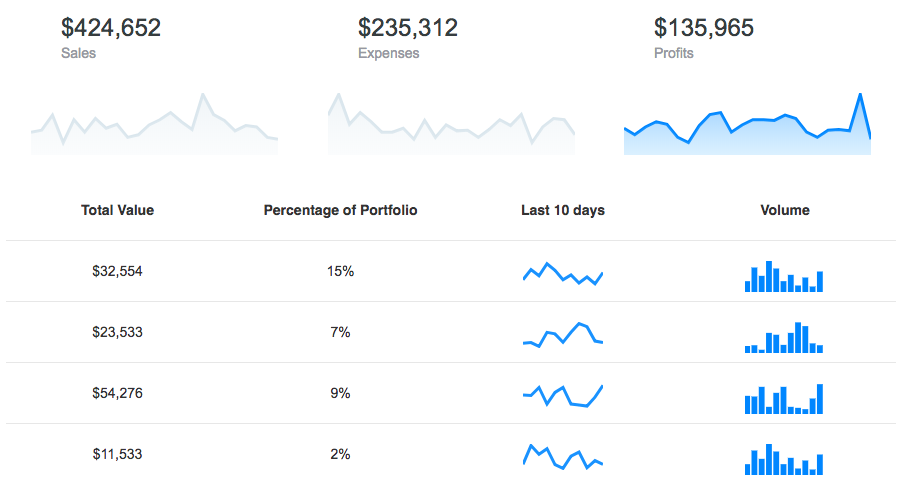
Sparklines
Utilize sparklines to indicate trends in data, for example, occasional increments or declines, monetary cycles, or to feature most extreme and least values:
More advanced chart types from our friends at FusionCharts 
Thanks to our friends at FusionCharts, you now have a better data experience of your time-series data with features like visual time navigator, annotations with the date and event markers, multi-variate analysis, and real-time support.
Export full dashboards
Want to export your dashboards to PDF, send them via email or simply export a chart on the server-side? You can do these and more with FusionExport, a new product from our friends at FusionCharts.

What's included
The download bundle includes the following files and directories providing a minified single file in the dist folder. Every asset including icon/css is bundled in the js itself to avoid loading multiple files.
apexcharts/
├── dist/
│   └── apexcharts.min.js
├── src/
│   ├── assets/
│   ├── charts/
│   ├── modules/
│   ├── utils/
│   └── apexcharts.js
└── samples/
Using it with IE11
If you need to make it work with IE11, you need to include these polyfills before including ApexCharts
Development
Install dependencies and run project
npm install
npm run dev
This will start the webpack watch and any changes you make to src folder will auto-compile and output will be produced in the dist folder.
Minifying the src
npm run build
Where do I go next?
Head over to the documentation section to read more about how to use different kinds of charts and explore all options.
Contacts
Email: info@apexcharts.com
Twitter: @apexcharts
Facebook: fb.com/apexcharts
Dependency
ApexCharts uses SVG.js for drawing shapes, animations, applying svg filters and a lot more under the hood. The library is bundled in the final build file, so you don't need to include it.
Supporting ApexCharts
ApexCharts is an open source project. Financial contributions to ApexCharts go towards ongoing development costs, servers, etc. You can help by becoming a supporter on Patreon or doing a one time donation on PayPal
Our Partners
While ApexCharts brings you the goodness of open-source charts, FusionCharts offers additional visualizations for your dashboards. With extensive documentation, consistent API, and cross-browser support, FusionCharts is loved by 28,000+ customers and 750,000+ developers across the globe.
License
ApexCharts is released under MIT license. You are free to use, modify and distribute this software, as long as the copyright header is left intact.